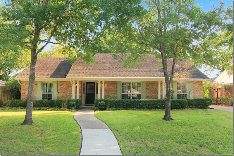
This 60s era house for sale in Houston is a total renovation – completely updated – and all done on a budget. The owner is a reader who sent in the HAR listing, thinking others might be interested in seeing the befores and afters. Or course! There’s nothing better than looking at terrible before pictures next to wonderful afters!! Additionally, there are tons of ideas here to incorporate into your own house if you are currently updating - you might want to grab and a pen and some paper to take notes. This ranchburger was built in 1962 and is typical for houses built in Houston during that era. Thousands were built here with this same exact floor plan. In fact, my own nephew and niece just bought a house with almost this same layout – built in the exact same decade. This Briarbend house is considered small by today’s standards, just under 2,000 sq ft. with 3 bedrooms and 2 bathrooms. But, growing up in the 60s – we all lived in houses with this same square footage and thought our houses were quite large. It’s a real statement of our times that unless a house is 4,000 sq. ft and more, it is thought to be a smaller starter home. If you live in Houston, the house is zoned to Briargrove Elementary – one of the best elementary schools in the city. The price was recently lowered to $465,000 and the listing can be found HERE. Enjoy!!
From the outside, there is no doubt the house was built in the 60’s. It’s also obvious that the floor plan consists of a living room and dining room located to the right of the front door. Past the entry hall will be the family room and the kitchen will be to the right of it. This floor plan was built all over Houston during the 50s on through to the 80s.
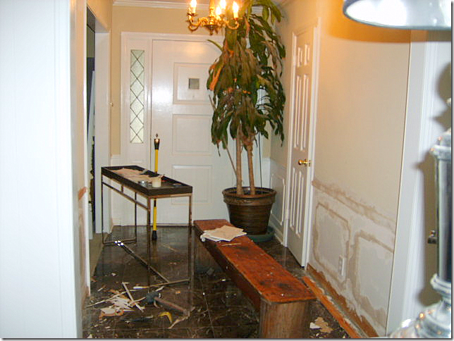
BEFORE: The entry hall. Molding was removed from the walls. Not sure what the floor was – but it looks like a marble tile.
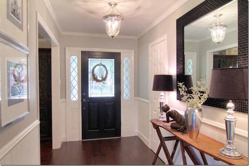
The entry hall. New hardwoods were laid in the entry, dining room, study and all the bedrooms. Beadboard was installed under the wainscot molding – which is a great alternative to new sheetrock – plus it adds a nice texture. New front door and lantern. Notice the antique wooden ironing board that is used as a console. What a cute idea!!! Pretty gray painted walls are offset by bright white molding and beadboard.
All paint colors are listed at the end of this post.
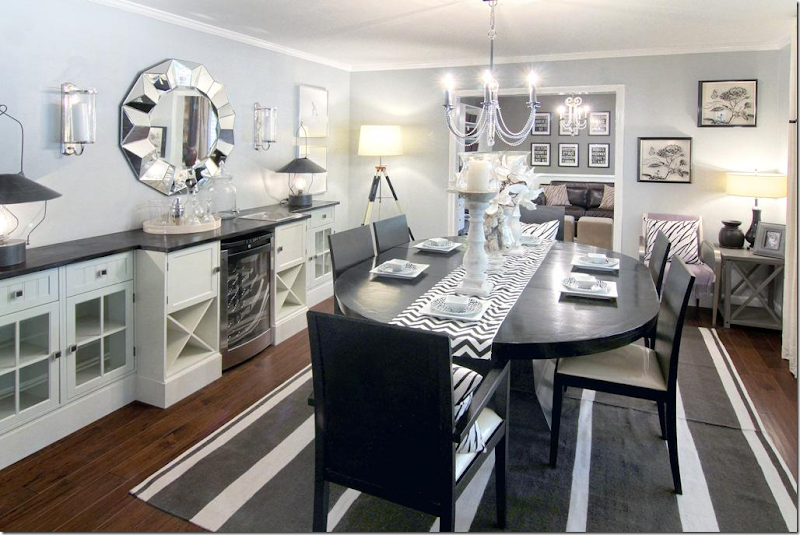
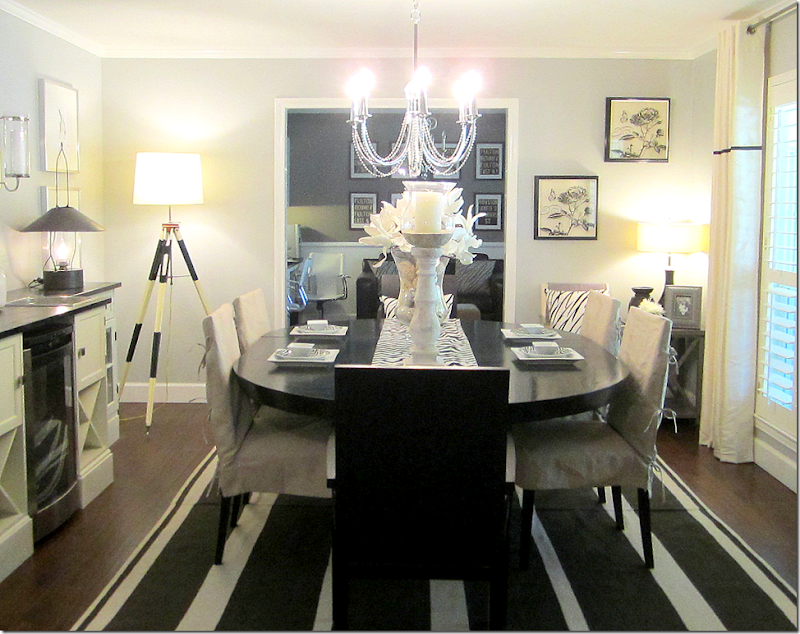
To the right of the entry hall is the living room, then the dining room. Most couples today are switching these two rooms – as shown here. The dining room is now located in the larger living room and the former dining room becomes a study or a small sitting room. Love those black lanterns on the console to the left. That looks like a wine refrigerator – which if you are lacking a bar – is good idea placed between cabinets. One piece of granite or wood tops the assorted built-ins making them look more substantial.
This view shows the windows – which are all new and all with plantation shutters. Simple drapes with a black trim have grommets – a nice contemporary, youthful look. Here, the modern chairs are slipped for a less contemporary look, adding the linen color and texture – which I prefer.
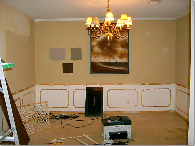
The former dining room, now a study. Again, the molding was removed from the walls.
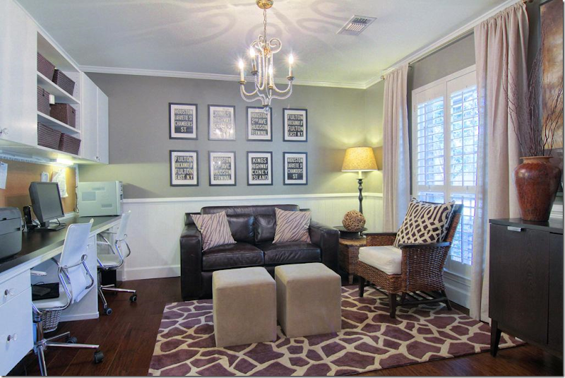
The former dining room is now a study, complete with new built-ins. All new windows with plantation shutters are found throughout the house. Again, once the molding was removed, beadboard was added to the walls below the wainscot molding. Notice the one large pillow with expensive KWID fabric. If you can’t afford curtains or upholstery out of a favorite fabric – opt for a few large pillows. You get a lot of mileage out of a few yards of pricey fabric. Clear gray walls mixed with white molding.
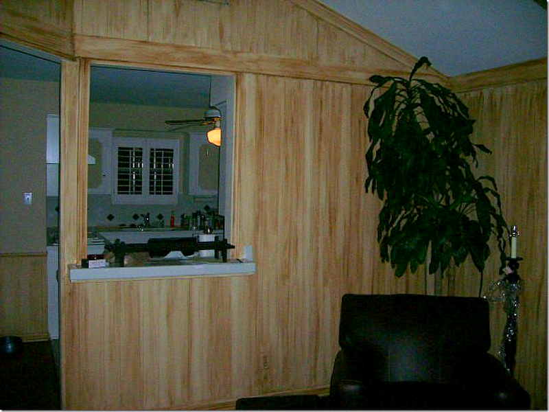
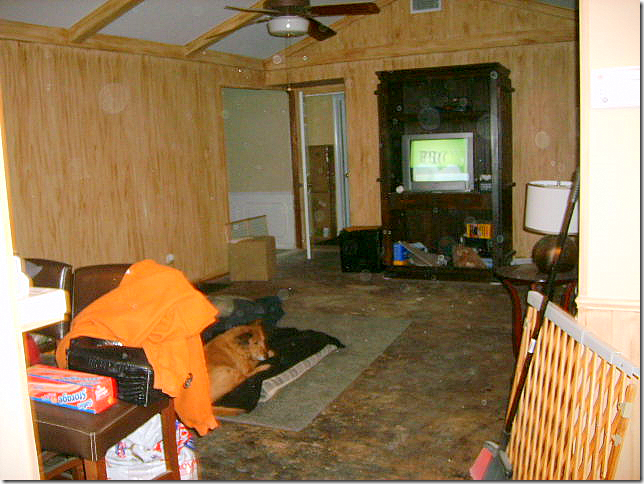
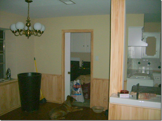
BEFORE: The family room looks into the kitchen via a pass-through. The walls have 60s yellow paneling. Just awful.
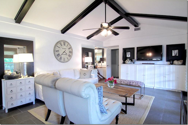
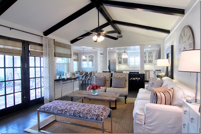
AFTER: WOW!!!!! The family room is located past the living and dining rooms – and overlooks the back yard through new French doors. The flooring is a 20X20 porcelain tile instead of hardwoods, which lends a more contemporary look – especially with the white grout. The wall between this room and the kitchen was removed – opening up the area and giving it a much more 2000s feel. The columns are probably load bearing – yet they add a substantial looking touch. I love this room – how open and fresh it looks. Most of the rooms are painted gray with white trim – but this room looks like it is all white. Matching end tables flank a contemporary styled slipcovered sofa. A Belgian inspired coffee table adds some needed texture, as does the seagrass rug. Love the large clock over the sofa and the painted black beams really add punch. Even the ceiling fan looks good with its black blades. (taking notes Brooke? – that’s my niece who is moving into their similar house next month!!)
BEFORE: Looking the opposite direction. What is that flooring material? This couple really had a vision!!
Looking the other way – you can see the entry hall with the antique ironing board at the left. Through the open door are the bedrooms. Newly installed built ins anchor the flat screen tv – it almost disappears when flanked by two large black framed prints - another great idea. Notice how behind each end table is a floor to ceiling mirror – I believe these came from Ikea, if not, Ikea has very similar ones for under $100 – a steal. They really give a lot of look for the money when two are used this way. I’m not sure if the owner removed the paneling or painted over it. Either way is fine. For clocks like this – look to Wisteria, Ballard Designs and Restoration Hardware – another big look easy on the budget.
This view shows the new French doors leading into the backyard. Painted black – they add pop to the all white room. Here, you can see the breakfast room. The mirror in the breakfast room mimics the x motif in the kitchen overhead cabinets.
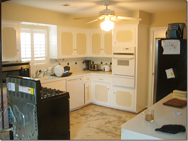
BEFORE: The kitchen was totally redone – even the appliances were moved.
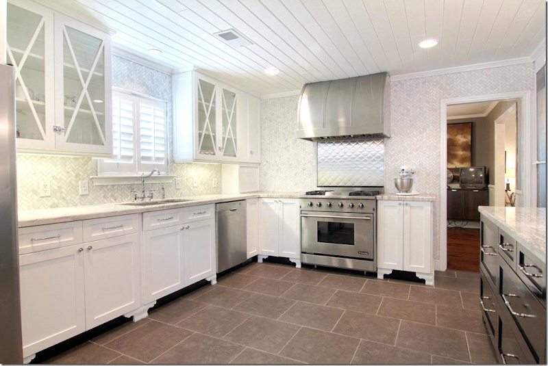
AFTER: Another huge WOW!! This kitchen is fabulous and is full of ideas. First, notice the beadboard on the ceiling – it really adds great texture – I love how they used beadboard throughout the house. Again, it is a very inexpensive material with a great look. These are all new cabinets – but adding feet to existing cabinets is always a great idea if you have the space for it. The fur down was removed – giving a more streamlined look. Carrara marble mosiac tile is used as the backsplash and is installed all the way to the ceiling in a herringbone pattern – what a great luxe look. It’s beyond fabulous!!!!! Notice the tile was extended all the way to the doorway. There are very few upper cabinets – another great, modern look. The few upper cabinets there are, all have an X motif. Kashmir valley granite was used on the counters as an alternative to white marble. Carrara would have been good economical choice too. Notice that the cabinets dividing the kitchen from the family room are painted dark gray for contrast. Great stainless hood and quilted stainless backsplash behind the range makes this a focal point of the room. Here, the oven and stove were combined. The refrigerator was moved across the room – to the left of the sink. (You can see it in the above picture of the living room.) The cabinet pulls are from Restoration Hardware and the cabinet latches are from Cliffside Industries. Through the door on the right is the study and dining room.
BEFORE: The breakfast room, off the laundry room.
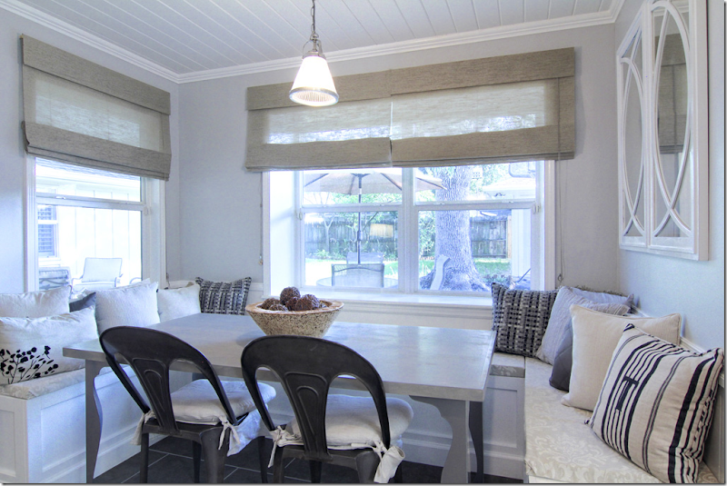
AFTER: Beadboard ceiling is carried in here from the kitchen. U shaped banquette was built for seating. Such a cute room – the banquette really makes a huge difference and is another great idea. Wonderful gray table and industrial looking chairs.
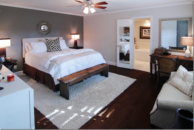
The master bedroom had hardwoods – nice and dark, love that. Can’t make them too dark. Hardwoods today should be dark as can be – or light as can be. No more middle of the road. Notice one gray wall is painted much darker – an accent wall. There’s another KWID pillow – notice what a statement it makes.
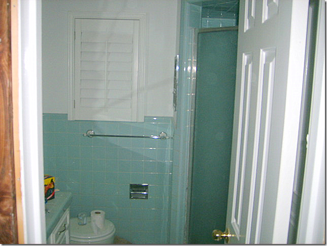
BEFORE: Master bathroom – all in 60s styled green tile.
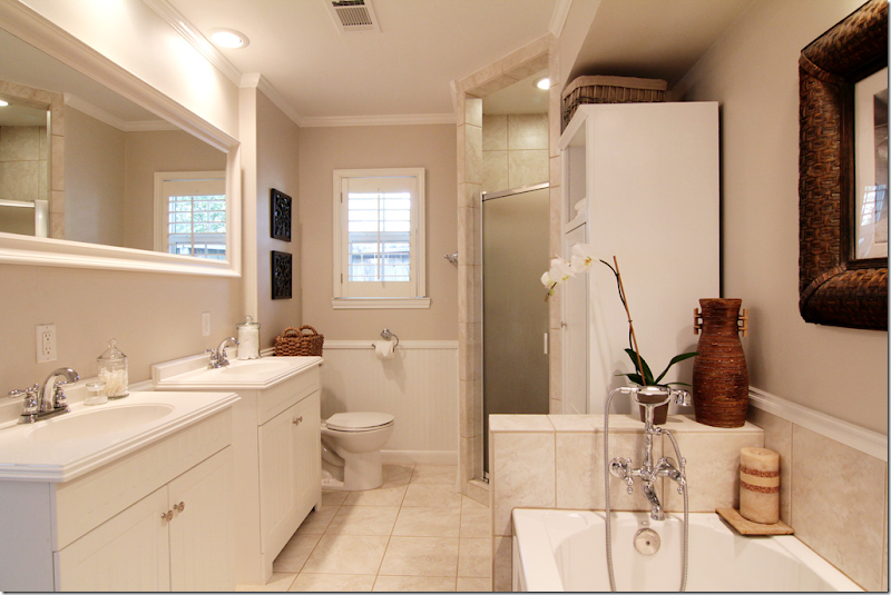
Beadboard replaced the green tile. Two new sink cabinets – easy to install as opposed to built ins. Look to Ikea for similar cabinets. It looks like the bathroom was enlarged to twice its former size, with a new tub added. Beautiful plumbing fixture in the bathroom – adds “jewelry” to the bath. Plumbing fixtures are a great place to splurge – the prettier the better.
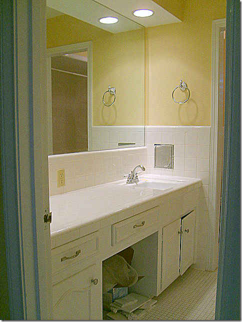
BEFORE: 2nd bathroom.
New built in cabinet hold two large sinks with great faucets. Carrara marble tile used on counter and floors. Great lights add sparkle for a kids bath that doubles as the powder room.
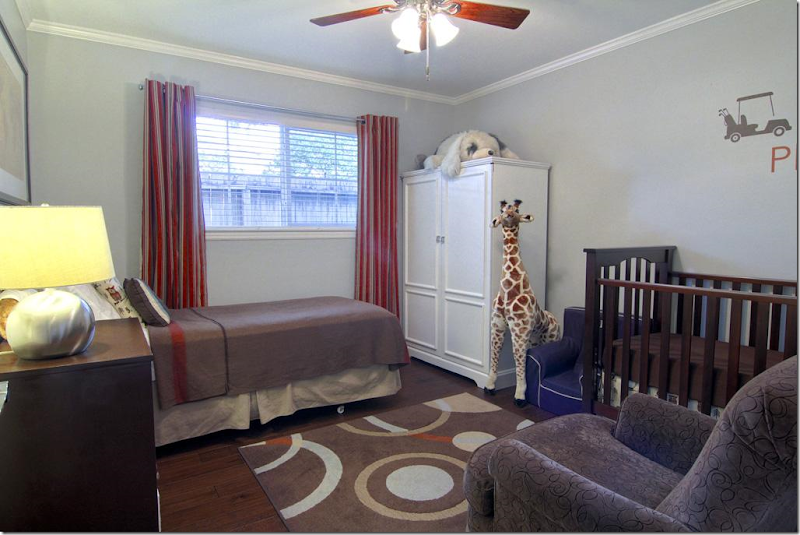
Bedroom #2 is the little boy’s room – with a darling giraffe! Again, the curtains have the grommet ring for a more modern look. Inexpensive area rug adds big color punch.
Bedroom #3 – the guest room. All the bedrooms and halls have the newly installed dark hardwood floors. If you can opt out of carpet in favor of hardwoods – do it. You never have to replace hardwoods, but you’ll be replacing your carpet every 5 to 10 years. Trust me. If you have pets – all the more reason to get hardwoods. Figure the added cost of hardwoods over carpet and divide in by 30 years x 12. You’ll be shocked how cheap it will be over the life of a mortgage to upgrade to hardwoods.
The large back yard has a newly laid flagstone terrace with French doors leading into the family room.
Nice shady backyard. When you move into a mature neighborhood – you are blessed with large trees!!! That’s a plus over moving to a new neighborhood with tiny trees.
And finally, the Briarbend neighborhood park is for your use if you move into this house!
PAINT COLORS: The main colors in the kitchen/family/bath/breakfast/foyer are Benjamin Moore's Chantilly Lace (white) and Stonington Gray. In the office they are Restoration Hardware's Slate and Benjamin Moore Chantilly Lace. The Master has Restoration Hardware Slate and Ash.
I hope you’ve enjoyed this renovated ranchburger and I hope you were able to get a few or a lot of ideas if you are currently remodeling. I really loved the kitchen – with all the tiled walls. That was stunning. I also loved the beadboard everywhere, especially on the ceiling in the kitchen and breakfast room! What was your favorite element they added?
A huge thank you to the homeowners for showing their house. For more information – go HERE.
Total Renovation for a 1960’s Houston Ranchburger
A Great Giveaway - Patina Style!!
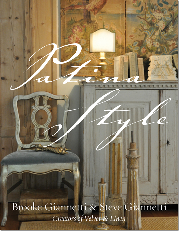
One of my favorite design books this year is without a doubt “Patina Style.” Written by interior designer and blogger, Brooke and her architect and artist husband Steve Giannetti, the book takes you through a pictorial journey into their personal aesthetic – Patina Style. What a gorgeous world these two have created! Through their two houses, their clients projects, and their design shop – the Giannettis together have created a style that will forever be linked to them – Patina Style. How many in the design world can claim that feat?
What exactly is Patina Style? “It is the celebration of the beauty that the passage of time brings to the things in your life. The antique and imperfect, the slightly worn combined with natural materials and a subtle color palette create a look that is both timeless and fresh.”
I “met” Brooke through the blogging world when she started writing “Velvet and Linen” which instantly became a huge hit. People loved seeing glimpses inside the Giannetti’s homes, their shop and their clients houses that they created sometimes together, and sometimes apart. Brooke’s blog is one that I read each time she has a new post. I love seeing what she and Steve are working on – whether it’s creating a new line of furniture or rearranging their shop. I especially love seeing the images Brooke posts of their own houses in Santa Monica and Oxnard. Recently they purchased some land in Ojai where they are building their dream house – Patina Farm, of course! Brooke has been so kind to let her readers in on the process of designing the new house. Readers can’t wait until they break ground and we get to see the house going up. It promises to be a learning lesson for us all.
Besides decorating, running a design shop, organizing two households, building a new home, and mothering 3 children – Brooke, along with Steve, found time to write, Patina Style. Where they found this time, I have no idea! The book is filled with gorgeous images – along with text - that explains how their Patina Style evolved and what exactly it means. It’s also a primer in how to achieve this look for your own home. Each page is eye candy – one image is prettier than the next. Even the cover is luscious. It might be my favorite design book cover – ever. Needless to say, the book has been a success. It quickly sold out of its first printing and more had to be ordered to keep up with the demand. Here are few of my favorite images from the book:
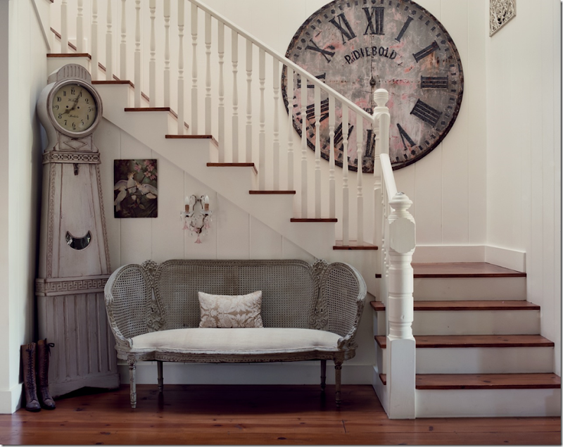
The Giannetti’s Santa Monica entry way – it sets the tone of the house and shows exactly what Patina Style means. I love the large antique clock face juxtaposed next to the Mora clock. The painted settee perfectly fits the space. It’s a study in scale and a vignette worth painting.
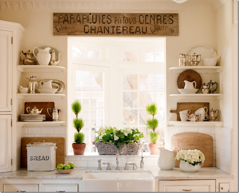
The Giannetti’s recently redecorated their Santa Monica house. Before the shelves held a collection of green glass. Now, it holds white ironstone and hotel silver – placed next to warm, antique bread boards. This mixture of colors and textures represents Patina Style exactly.
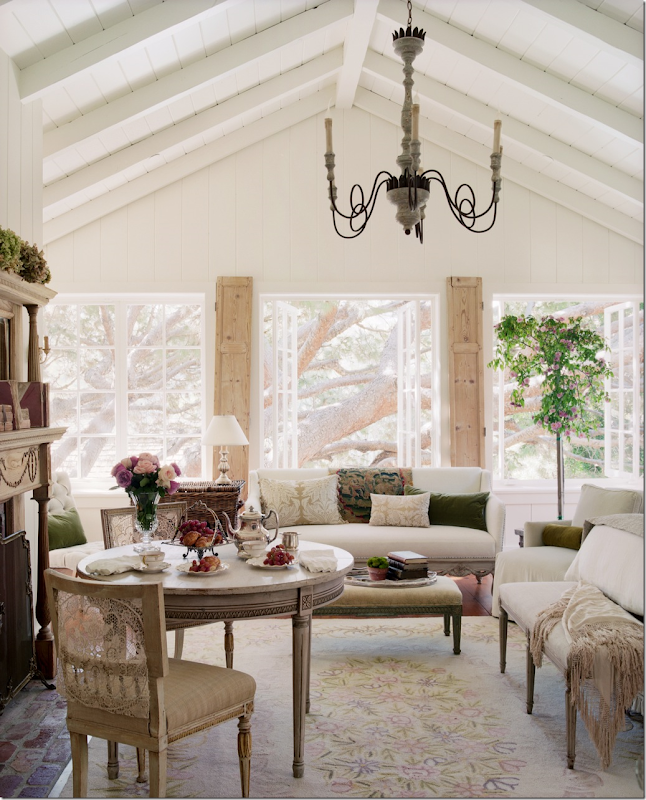
The Santa Monica master bedroom – a treehouse overlooking the backyard. The room is filled with a collection of antique furniture from different countries and eras. Shutters are used to flank the French door.
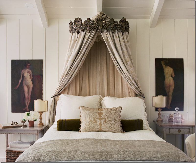
So gorgeous! The master bed in Santa Monica sits underneath a corona draped with vintage Fortuny fabric. Gauzy linen lines the back. I adore the nudes that flank the bed – one facing front, one facing back.
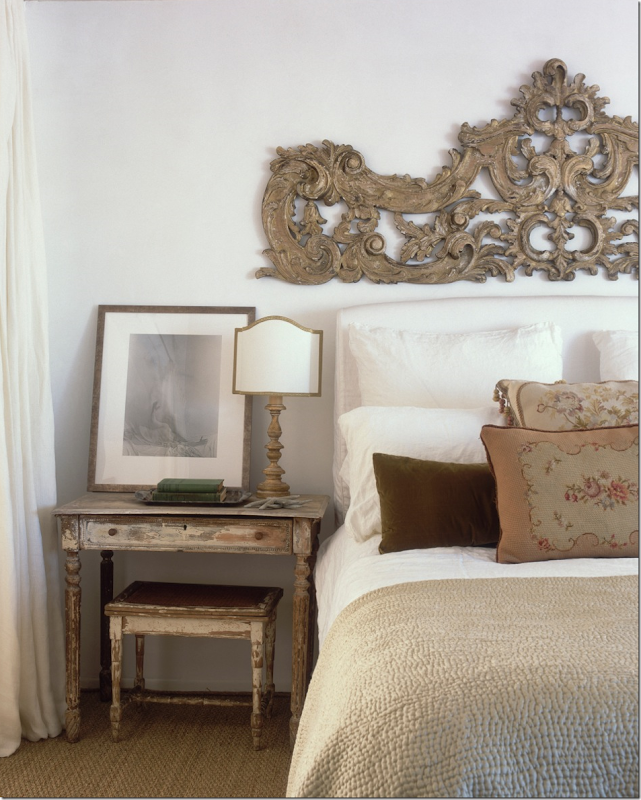
In their Oxnard house, an antique Italian scroll sits above a simple white headboard. The romantic scroll becomes the focal point in this room. The curtains to the left of the bed hide the bathroom. The wall between these two rooms was removed during their renovation of this property. What a great idea to make a room appear larger and yet, cozier at the same time.
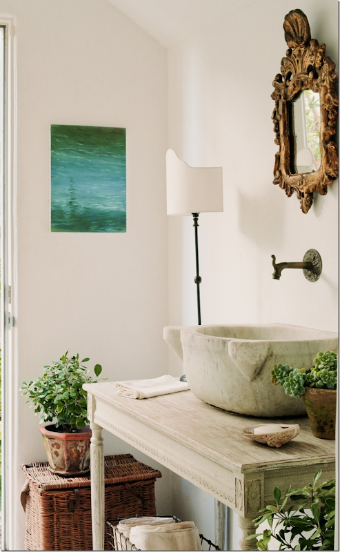
The powder room at Oxnard. So many different textures and colors – yet, it is all so soothing and calm. The painting hanging next to the door is one of Steve’s recent works depicting the ocean.
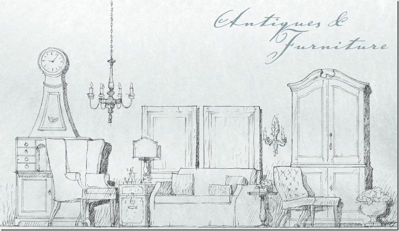
Besides being an accomplished and highly sought after architect, Steve is a gifted artist. His charming sketches are used to introduce each new chapter in Patina Style.
To order the book, go to Amazon HERE. I promise, you will love the images – and you will learn so much from the informative text.
Wait – isn’t this a giveaway???? Oh, my, I almost forgot! Yes, this IS a giveaway!!!
Recently Giannetti Home signed up with Dering Hall – a new online shopping venue that features well known designers such as Michelle Nussbaumer, Rose Tarlow Melrose House, Steve Gambrel, and a host of others.
For the giveaway - you will need to go to Dering Hall – Giannetti Home HERE, look around at the product available and pick out a piece of Steve’s artwork that you would like to own!
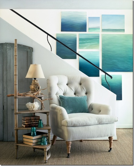
That’s right! The giveaway is a work of art by Steve Giannetti. You might be partial to his water pictures:
Or his travel sketches:
Or his nudes:
After you pick which art work you would like to win, please come back here to the comment section and tell me which one you picked. Be SURE to leave your email address if you want to win!!!
The contest will end this Friday night at 11:59 p.m. Remember also, if you want to order the book Patina Style, go HERE.
A huge thank you to Brooke and Steve for this great giveaway!
