It’s been a while since I’ve updated my list of the top ten design elements in an interior that I love. These are the ten things that make a room speak to me. But, take it all with a grain of salt, obviously, because the list is very personal. There’s no reason why if someone hates linen and designs mostly with chenilles – their room isn’t as nice as mine. No, of course not. But I just know that – for me - if that room was designed using linens instead of chenilles, I would like it better. Don’t know why, and can barely even explain why one fabric appeals so much more than another. But it does. My list so far has contained the following elements, starting with that all important fabric, to me, linen:
Linen
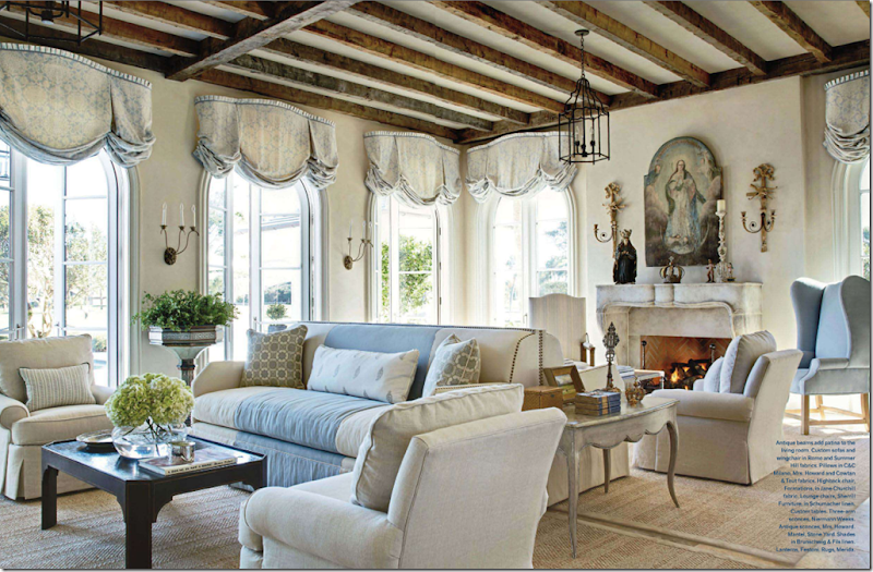
This room by James Howard is done in a mixture of Romo, Summer Hill and Schumacher linens. For this house on the water, the linen is a perfect choice. And note, just because you use linen, doesn’t mean you have to use slipcovers! The two are not synonymous.
Slipcovers
The caption states that slipcovers here tone down the formality. Yes! That’s exactly why I love slipcovers so much – they are casual. But, also, they are so user friendly. I say – would you not wash your jeans after wearing them for five years? Well, think about that sofa you sit on day after day. A slipcover is easily removed, washed, and put back on – clean. I love them for children and pets especially. Now, if this was my living room – I would have slipped the fauteuils too, but that’s just me.
Seagrass
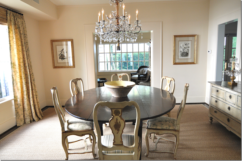
If you read this blog with any frequency, you know that my favorite floor covering is seagrass. And I love linen, slipcovers and seagrass together. I wonder if I will ever get tired of that look? Hard to imagine, but ask me in another five years. This dining room was designed by Jane Wood Interiors.
Curtains
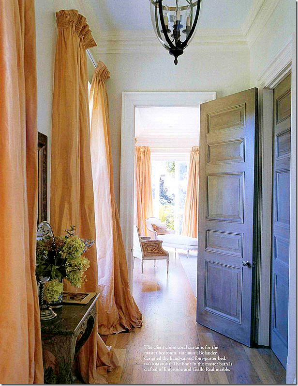
If I could, I would put curtains on every window! I am a sucker for silk taffeta curtains and printed linen ones. Either one. I know sheers are in, but I’ve just never been a sheer fan. I have a formula for curtain making, so be sure to read the original Top Ten Favorites – Curtains if you want to copy my formula.
Light fixtures
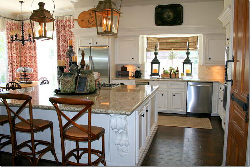
I love light fixtures in every room – especially crystal chandeliers and lanterns. This kitchen has two antique lanterns which really dress up the room. The story of this house – a complete and total renovation that took 20 days to complete - was one of the highest commented stories ever. I just sat there and watched the comments pour in, one after another. It was amazing! To read this story again, go HERE. By the way, this house is going to be published in a magazine!
Wall décor
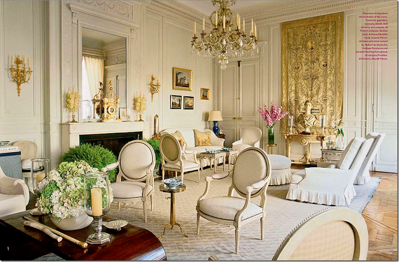
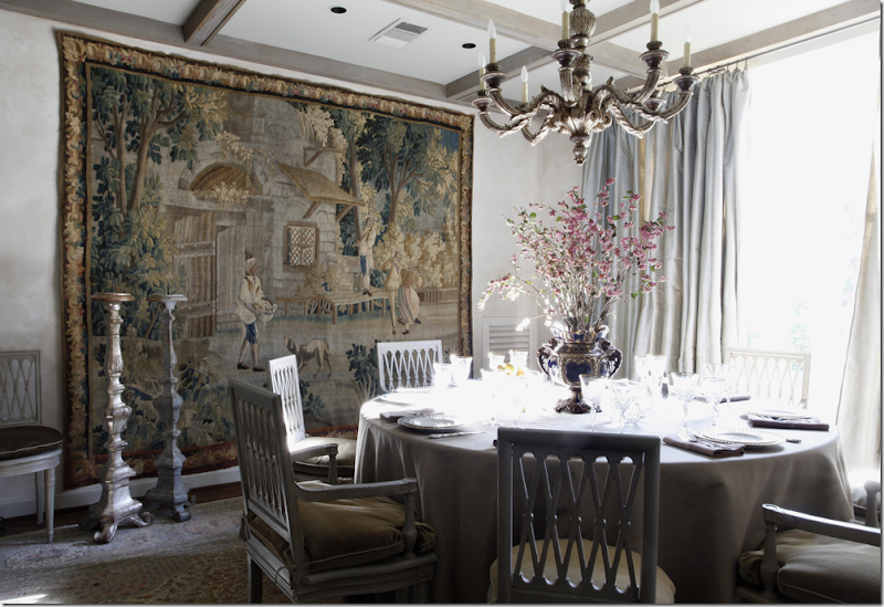
Wall décor doesn’t have to mean fine art work, antique or contemporary. It can mean mirrors, plates, sconces, clocks, or medallions. Here a beautiful tapestry becomes the focal point.
Antiques
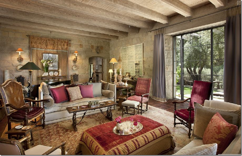
Antiques make a room. They don’t have to be dressy and forbidding, antiques can also be casual and welcoming. Imagine this space, John Saladino’s living room, furnished instead with new furniture with no patina, or a rather poorly fauxed one. Nothing gives a room texture like an antique. If you are just starting out – try to save and buy one piece of antique furniture for each public room. This will anchor your room and give you something to work around with different decors –for the rest of your life.
Top Ten Design Elements #8 – Symmetry
Today, I am adding the element, symmetry to the list. According to the dictionary, symmetry means: beauty based on or characterized by such excellence of proportion. OK, but what is proportion: symmetry, harmony, or balance. Sounds like a circle. To me, symmetry means placing a pair of chairs flanking a fireplace mantel, a chest, an armoire, or a desk. It is the balance of what is on the left equaling what is on the right. Simply, matching pairs: matching lamps on matching night stands or end tables. Symmetry means not placing things on a angle like a sofa or a bed. Everything is on a 90 degree angle, nice, sharp and clean. Symmetry means no asymmetry! Asymmetry: lack or absence of symmetry in spatial arrangements or in mathematical or logical relations. Well, lets take math and 90 degree angles out of it. I never did good in math, but I do know what is symmetrical. It’s two vases on the mantel, not one on the left side and a stack of books on the right. No. That would never do. Asymmetry makes me feel funny, unbalanced. It makes me want to pull things together in a more orderly way.
To some symmetry is boring. I suppose it can be overdone if there are pairs of different things everywhere – notice I said suppose, because nothing pleases me more than pairs of things everywhere! I just like balanced interiors. I like one sofa and two side chairs, that match. I like symmetry in my pillows. Two or four, your pick. Symmetry extends to architecture. In my own house there is one main wall that is not 90 degrees. It’s slanted and I hate it to death. I’ve obsessed over that wall for 17 years now. I like houses with a central hallway and rooms that lead off it. I like living rooms and dining rooms that face each other with mirror dimensions. Of course – my own house couldn’t be more different, unfortunately. When working with clients, I don’t add symmetry purposely – it reveals itself naturally without much thought. I don’t ever say, ok. now I need to add symmetry. It just is always there in the floor plan or in the accessories I buy. If I buy one vase for a client – I’ll usually buy two. I will rarely look for two night stands that aren’t matching. It’s not that I don’t like unmatched night stands, it just wouldn’t occur to me to say – lets break all this symmetry up!!! Bring in some element of surprise! And saying that makes me think that maybe I just don’t understand when designers say “I like to add that element of surprise in my design. I like to add fun or folly.” I just don’t understand that thinking. I like interiors to be pretty, soothing, welcoming, calming. Fun and surprise are two adjectives I just wouldn’t use when telling a client what look I am going for. Not that one way is better or not – like I said. It’s all so personal. But, look at the pictures below and see if you prefer symmetry over asymmetry:
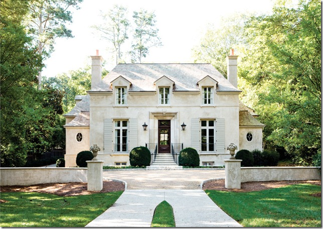
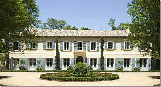
The beautiful house is perfectly symmetrical – the left side mirrors the right. It’s so pleasing and balanced.
I’ve always been attracted to the French mas – long facades with matching windows and door. This house is actually in Atlanta, designed by William T. Baker
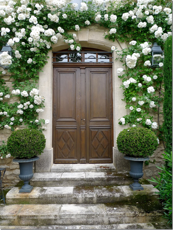
Both houses from Things That Inspire
Symmetry starts at the front porch with matching urns and lanterns.
An entry hall with perfect symmetry – two matching staircases with flanking consoles and sconces.
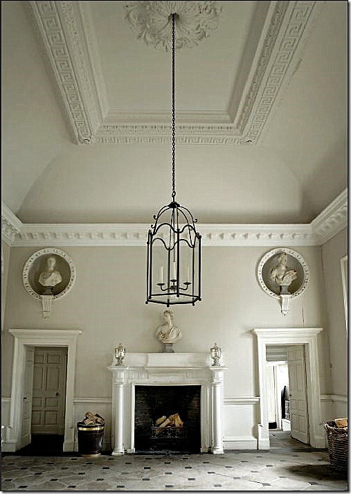
A large entry in an Irish house. Matching niches with sculptures flank the welcoming fireplace.
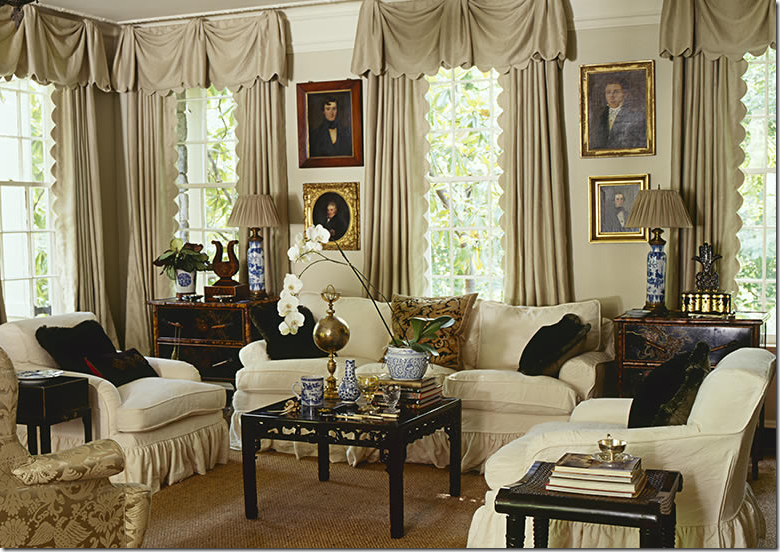
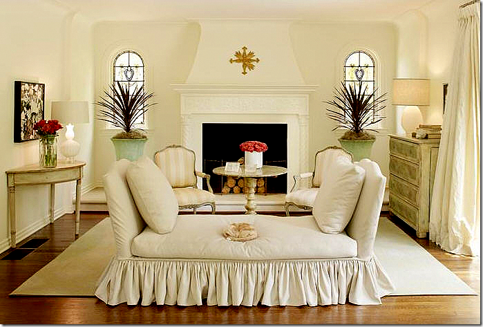
This beautiful living room is furnished symmetrically – sofa, matching side chairs. The bay window is treated as a separate sitting area. This room shows that symmetry doesn’t have to be uptight.
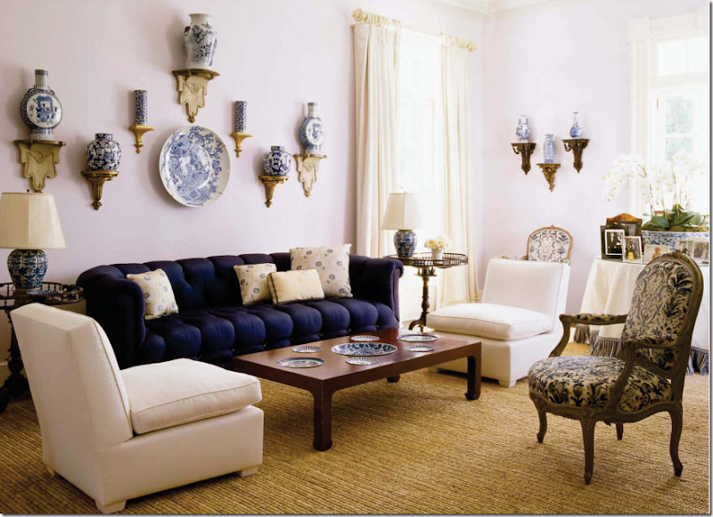
A favorite living room – matching seating with matching end tables and lamps. Everything is balanced and serene, inviting. Isn’t this what a home should be?
A simply furnished living room – the fireplace is the focal point and all is placed around it symmetrically.
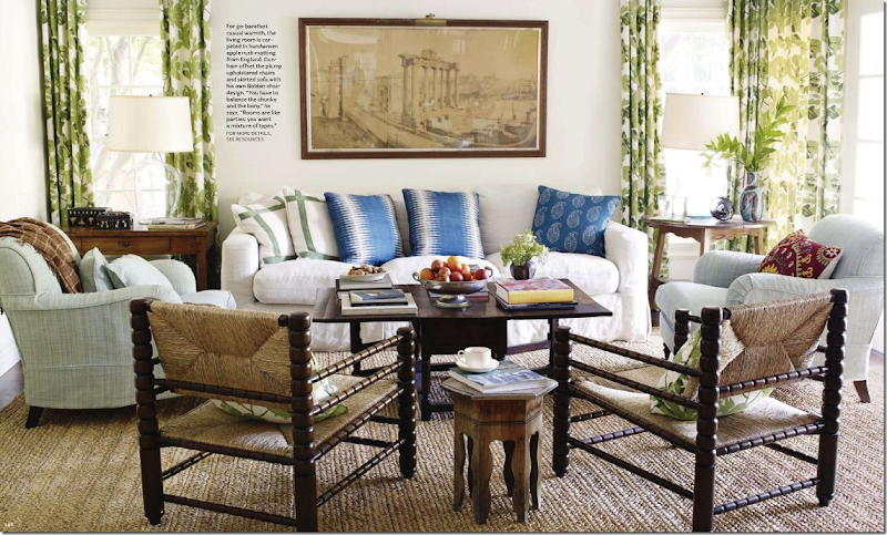
I love Peter Dunham’s aesthetic. So many elements here – linen, slipcovers, seagrass (apple matting actually,) curtains, wall décor! No wonder I love this room. I just love the man!
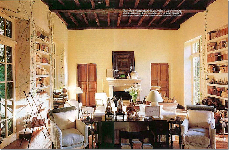
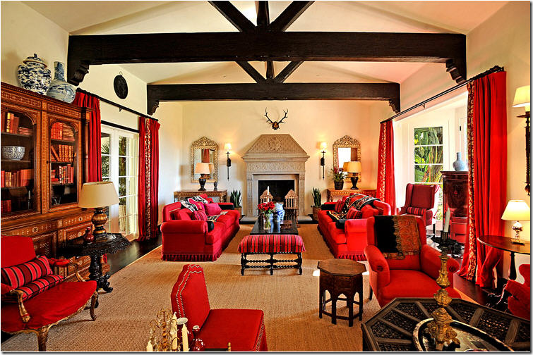
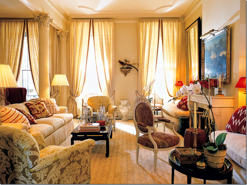
Here, at Rose Tarlow’s house, the room itself is symmetrical. This large space mirrors itself on each end with a fireplace and two flanking wood doors. The windows and bookshelves are mirrored across from each other also. The room is divided into two living areas. I would love to see this house in person.
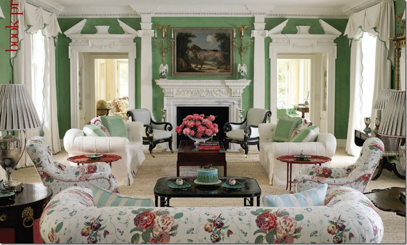
In this classic living room – everything symmetrically flanks the fireplace. I think this room is so gorgeous. It matches the dressiness of the architecture without being stodgy.
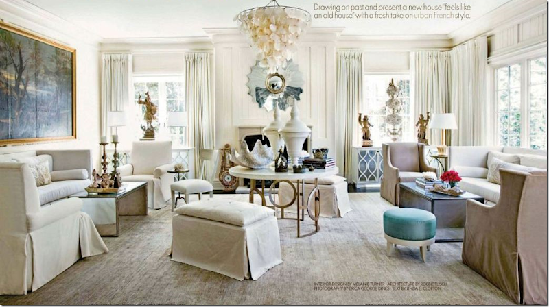
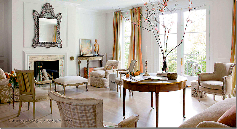
This large living room is divided into two seating areas by a large center table. The painting balances out the space that the window occupies on the right side.
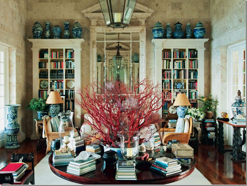
Another large living room with mirror images on both sides. Here, in Oscar de la Renta’s beach house, a large wood table divides the room into two seating areas. In the mirror you can can see the bookshelves and mirror on the opposite side. This room with its native stone walls is so gorgeous, so classic – perfection!!
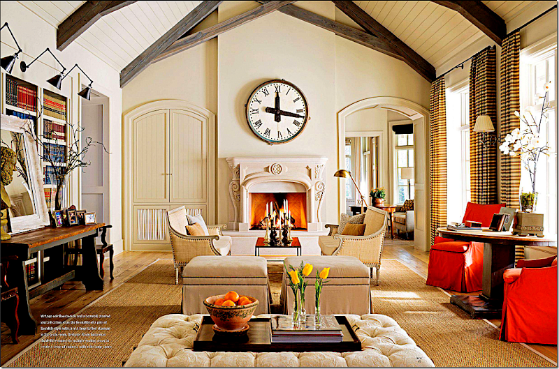
In this room – to maintain symmetry and to trick the eye, the left side of the fireplace mimics the door on the right side. The large round clock is the perfect shape to break up all the straight lines. The furniture around the fireplace is symmetrically placed – everything is balanced, yet not strictly so giving it a more interesting look.
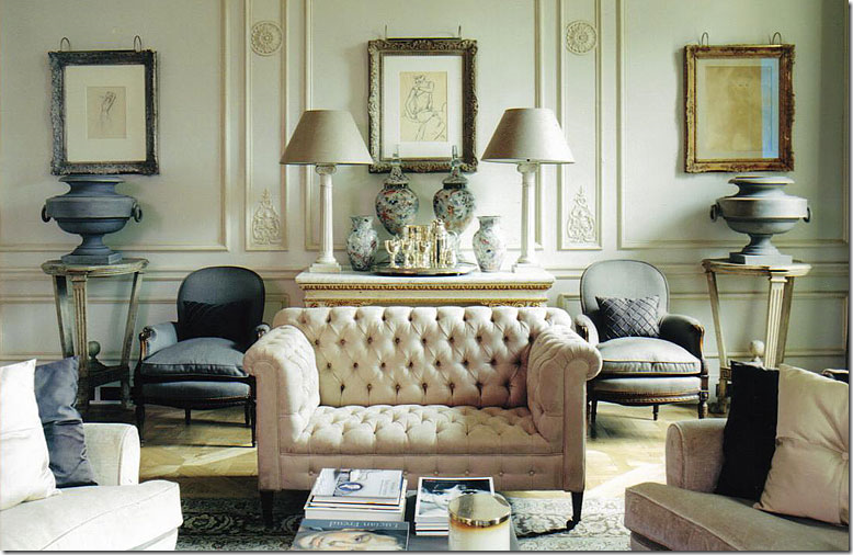
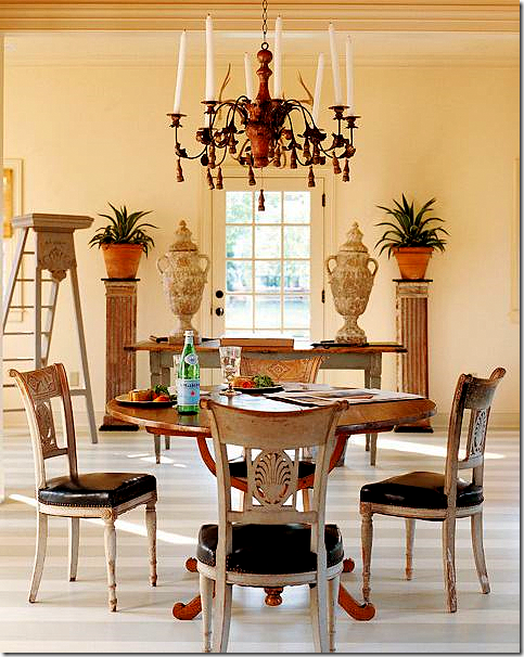
Strict symmetry, yet to me its pleasing, not boring. The interest comes from the juxtaposition of the materials used – heavy zinc urns next to fragile antique porcelains and silver. I’d love to see the rest of this room!
Symmetry that seems relaxed, not stiff. Perhaps it’s the airiness of the room, the leggy furniture, the lack of a grounding rug – despite being filled with fine antiques, the room seems like a wonderful space to entertain.
In this popular image, the symmetry extends to the back of the sofa with perfectly matched pedestals and urns. Wouldn’t this room seem boring with just a painting behind it?
Another popular way to achieve symmetry is to flank a sofa with built in bookcases. The bookcases feel as enveloping as a warm pair of arms.
Without a pair of built ins, you can still achieve the same symmetrically enveloping look with a pair of bookshelves.
While I love the interior design here, the asymmetry of this room drives me crazy! It looks like Faudree tried to correct this by installing the wood paneling behind the fireplace, but the room still looks off balanced to me.
I’ve used this living room in every element story so far: linen, slipcovers, seagrass, curtains, light fixture, wall décor and antiques. Trying to see if it will make all 10 elements. It is a symmetrical room, both architecturally and in the way the furniture is placed.
Soothing and calming, this room is just so relaxing. The symmetry of the furniture placement ensures nothing is jarring or out of place – perfect for a family tv watching room.
Mary McDonald loves symmetry and most of her designs are balanced with strong linear lines. This showhouse with its extra large living room is divided into several seating areas, each symmetric.
A back to back sofa is another way to divide a large room into two seating area – each side the same size as the other. Windsor Smith. I love the way Windsor is using blues lately, along with printed wallpapers.
Perfectly symmetrically hung collection. Notice that although the sizes are different, it is still balanced.
A beautiful corner of a room, perfectly balanced.
The symmetry of the mirrors, the consoles, the side tables and lamps – and the two pink pillows make this vignette. The curtains behind it and the chandelier ground it all. Gerrie Bremermann.
Alessandra Branca is another interior designer who designs very symmetrically. Her tables and lamps often match. Everything is always in its place.
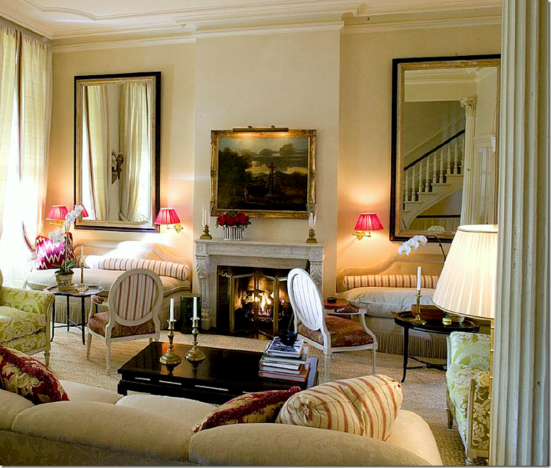
In her own living room, Branca plays up the symmetry that the windows create. Flanking the fireplace are two matching banquettes – a tool she often employs.
Looking the opposite way at Branca’s living room – you can see the matching banquettes. Boring? Never!
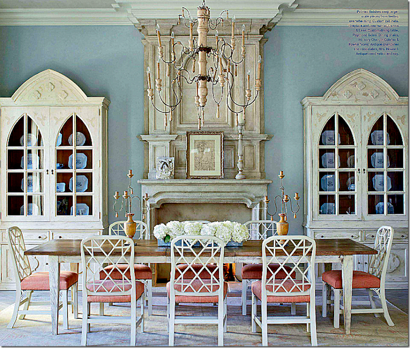
Dining rooms are a natural place for symmetry. Here matching bookcases flank a fireplace in this Florida house by James Howard.
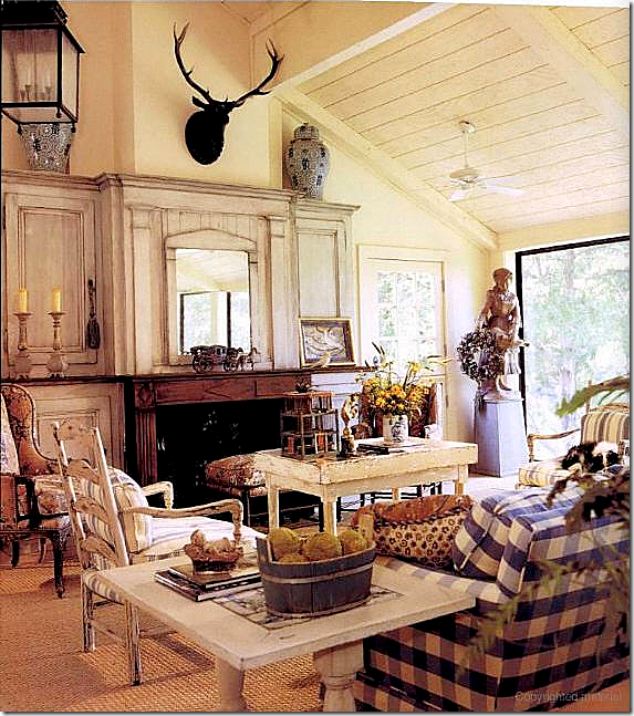
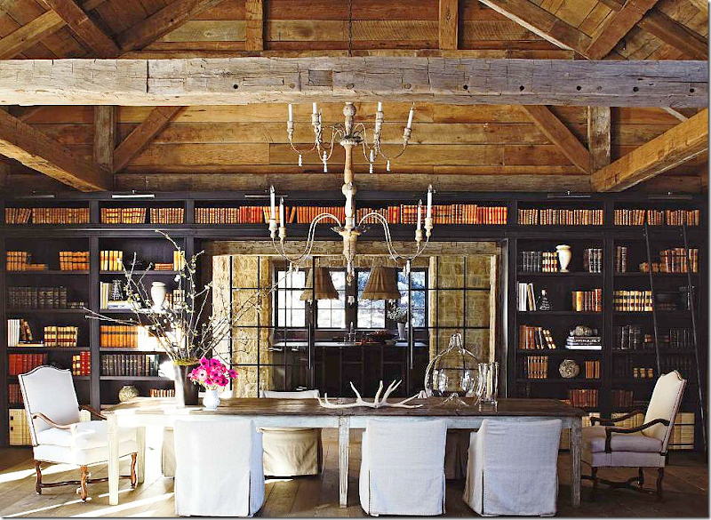
Gorgeous. In a large barn where strict symmetry wouldn’t be expected, here the furniture and bookcases create a nice balanced look.
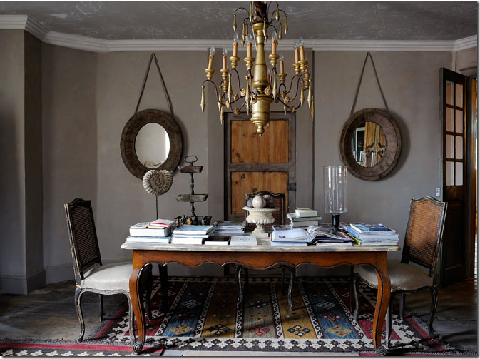
A pair of round mirrors flanking a door create balance in this dining room/library.
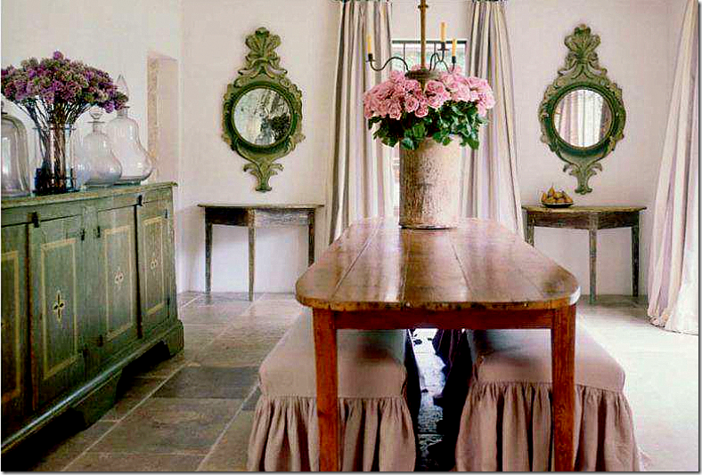
Again, a round pair of mirrors, matching consoles and matching benches create symmetry. Pam Pierce.
Does the yellow chair throw you off balance or do you like the unexpected touch? Would it be too boring for you to be all symmetrical, or do you like the surprise? Myself, I would probably have added two yellow chairs instead of just one – but truthfully, I think this looks perfect as it is.
This fireplace with its asymmetrical design leaves me feeling unbalanced but…
This fireplace, with its asymmetrical design has just enough symmetry to be perfectly balanced in my mind. Perfecting asymmetry is so much harder than strict symmetry.
I love the chaises with their open arms, but slanted walls just don’t do it for me, despite the fact that I have to live with one myself!!!!
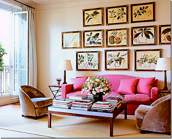
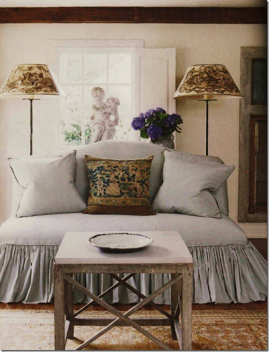
I’ve always loved this symmetrically pleasing vignette – with the two lamps, the balanced pillows, the one table, the one statute. Just perfect.
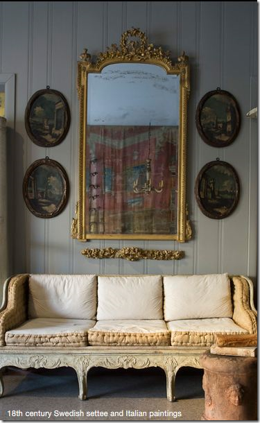
Another pleasing vignette – the oval paintings perfectly balance the antique mirror. Notice the carving below the mirror that adds to the symmetry.
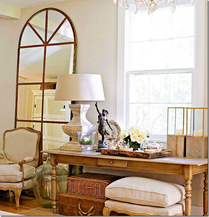
While I love this arrangement, I would never leave it so asymmetric. This vignette is perfectly designed, but I just need more balance. It’s obviously a very personal choice.
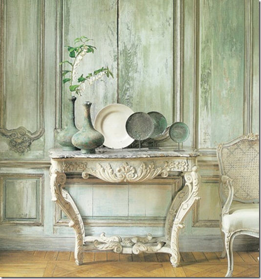
This popular image is asymmetrically designed. It’s perfect and actually is quite balanced looking. Would I have arranged the objects like this? Maybe. But, I’m not sure it would look better symmetrically!
Suzanne Rheinstein designed this space. Here, the ladder is the off center “surprise.” Better with, or without??
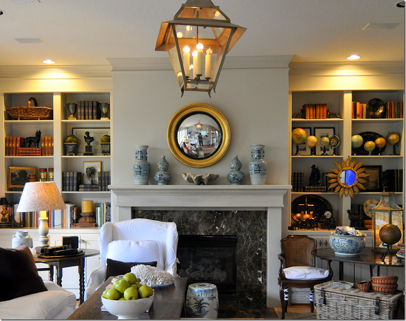
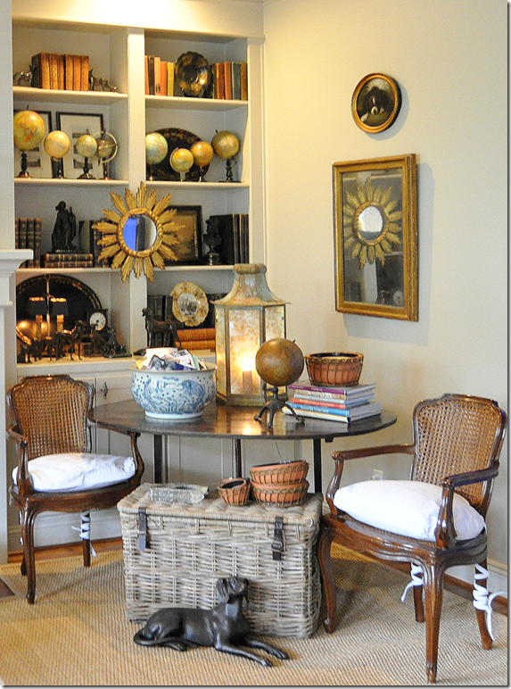
In my own living room, my fireplace is totally symmetrical. I try to keep my shelves balanced too. But, while I love my globe collection…..
I just can never make them look balanced! It drives me crazy – they never look good. I’ve tried them in all sorts of configurations but they just never look good. Hints anyone?
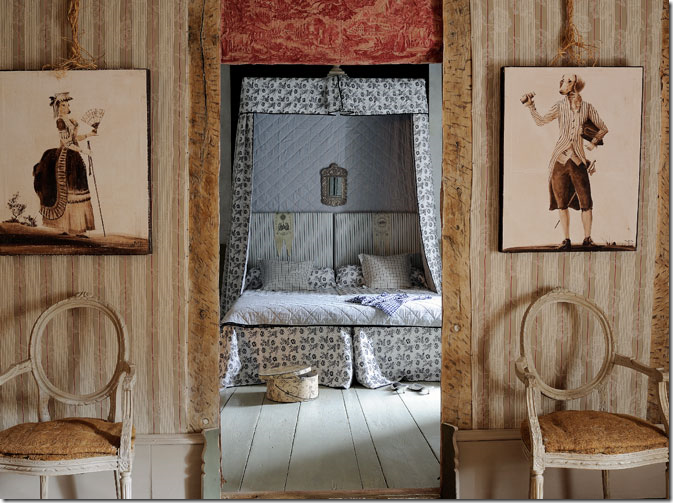
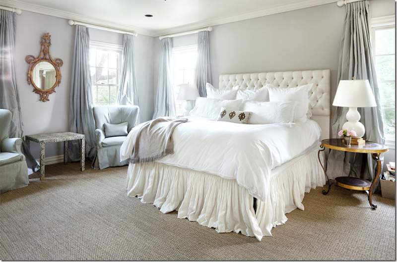
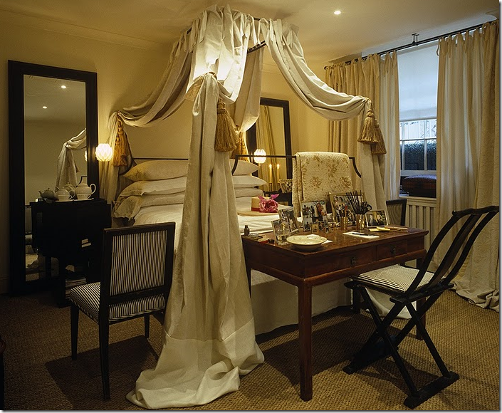
In this bedroom – everything is framed leading into the bed, including a pair of chairs and paintings.
Matching nightstands and lamps frame a bed between two matching windows. Across the room, two matching chairs flank an oval mirror. Balanced, symmetrical, so pretty.
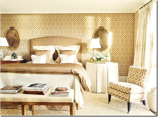
One tool many designers use in bedrooms is to frame the bed with oval or round mirrors or paintings. Here Suzanne Rheinstein used two beautiful medallions to frame the bed.
Suzanne Kasler used the same tool with beautiful oval paintings.
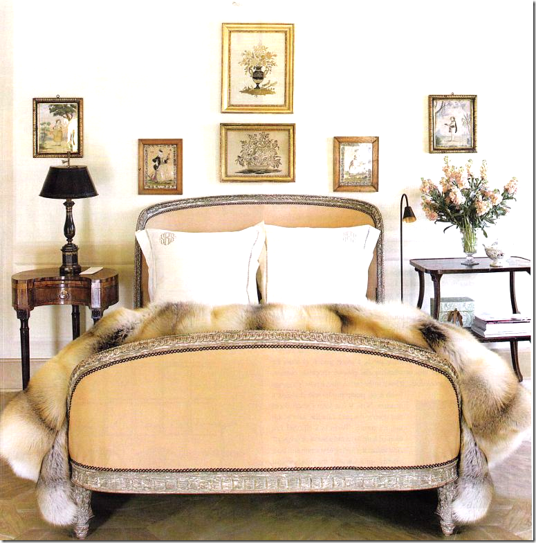
In Suzanne’s own bedroom, which I love, she used different end tables and lamps. Somehow, I think I would prefer matching stands, but that’s me. What do you think?
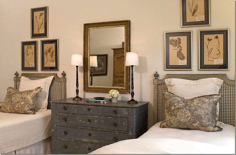
In this Houston guest room, Ginger Barber used a totally symmetrical design with matching lamps, pillows, and botanicals. It’s so pleasing and cozy looking. Love, love this room!
In this guest room in a beach house, Phoebe Howard used matching boats, bedding and lamps to create symmetry. The oval mirror anchors the design.
For this teenager, I used oval mirrors to frame her bed.
Another lover of symmetry is Mimmi O’Connell – here her bedroom has matching mirrors and lamps. She also uses chairs to frame her beds – which is such a cute idea. She loves ticking stripes – with their linear quality which fits right into her need for straight lines – as opposed to asymmetry.
Symmetry extends from the house to the landscaping – what is prettier than an allee of trees? Picture from French Essence.
Of course, straight lines of trees do not come naturally but are designed. These trees from Oak Alley, a centuries old plantation in Louisiana, are some of the most gorgeous oaks. The allee perfectly frames the house – in another nod to symmetry.
These young trees – will they one day resemble the ones at Oak Alley?
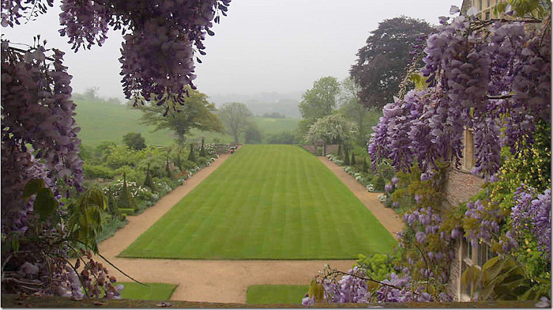
Even just a rectangle of grass, lined with flower beds, is stunning.
No room for an allee of trees? Try pots of blooming plants – here, hydrangeas. Oh, I wish I had the land to do this!!!
I hope you’ve enjoyed this study in symmetry. I’m thinking of designers that I love who rarely design symmetrically – and I like them as much as those that do. But, for myself, I need those straight lines, I need those pairs, I need the tidy ends to match up.
To read all the other Top Ten Design Elements, go HERE.
Top Ten Design Elements: #8
Labels:
top,
Top Ten Design Elements
Subscribe to:
Post Comments (Atom)

















No comments:
Post a Comment