 Kristin and John Mullen’s house in Dallas. Stone gates stand at the gravel drive. The house is flanked by two wings.
Do you know someone who is really talented and detailed oriented? Someone whose house is beautifully styled down to the last accessory? A few years ago when I asked readers to send me pictures of their houses, Kristin Mullen did just that – and my mouth dropped open when I saw them. Does anyone really live like this??? Kristin’s house was gorgeous. Her pictures looked like they came straight out of a magazine and her house stood ready to be photographed at a moment’s notice. In short, it was very impressive. It didn’t take me long to figure out that Kristin is a perfectionist, a talented one at that. She enjoys fussing over her house and it shows. It IS perfect - not a newspaper or piece of mail is out of place, nor is there a corner in her large house that isn’t finished or filled with grandma’s hand-me-downs. It’s so wonderful that catalogues rent her house for their photoshoots! And on top of all that, Kristin decorated it herself. It is all the more admirable when you realize she is the mother of three sons and one daughter! Amazing. I was in awe.

The front door and main part of the stucco and stone house.
After Kristin sent me the photographs of her house, I put her in touch with a scout who quickly got her in a magazine Beautiful Kitchens and Baths (not yet published.) She deserves it. Her house was designed to be published. It was a lot of hard work to get it so beautifully furnished, but she did it, in spite of all her other responsibilities. I had never meet Kristin in person, but last Round Top, there she was: she stopped me with “Joni, is that you?” Of course she would recognize me. I am not sure any detail goes unnoticed by her. And of course she was out antiquing with a friend, shopping away. She loves designing and staging for clients and charity too. Besides being a full time mom and running a busy household, she has her own business, Covetable Designs. It’s an interior design business, a staging business (which she is just perfect at!) and she also designs and sells luxury table linens. Whew. I’m exhausted just thinking about it!!
Kristin and her husband John have lived in many different cities. They moved around a lot but seem to now be happily settled in Dallas. Looking at her life, her house, her work, you would think that everyday is a fairytale for Kristin. And it is to be sure, yet she stoically and lovingly tends to her special needs teen-aged daughter, Darcy. Darcy has been sick for most of her life and this past year she has taken a terrible turn for the worse. Kristin has written about Darcy several times on her blog and each time it rips my heart apart, knowing how painful it all must be. But still, no matter how busy she is taking care of Darcy, sleeping at her bedside at home or at the hospital, taking her to endless appointments with doctors, she never complains. She always has a smile on her face and she still makes time to create a beautiful haven for her husband and her children. Kristin is a real gem, a true one of kind inspiration. I hope you enjoy seeing her house and some of her recent design projects:

Looking from the back of the property on to the house and the loggia. A water rill leads from a fountain to the swimming pool.

The view towards the hot tub and swimming pool. Kristin says the pool was designed for both family fun and for Darcy’s physical therapy.

A closer look at the water rill leading into the swimming pool. I love the ornamental grasses in the stone beds.

One of the my favorite parts of the house is the entry and gallery that runs through the main section. Here, looking through the front porch, to the gallery, and on to the loggia and swimming pool.

A view of the entry hall with the staircase. I love the gray painted trim and the skirted table. Of course, the table is styled with accessories and an open book. The loggia is through the French doors.

On both sides of the front door are gray painted benches, piled high with cushions. Down the gallery is the dining room.

The gallery is furnished with bookcases that are filled with accessories that Kristin loves to collect.
 At the end of the gallery is the dining room, entered through double French doors.

On each side of the French doors are a pair of gray painted chests with carefully selected accessories atop them.

The dining room is a study in chinoiserie. Red lacquer cabinets are built into the sides of the door leading into the living room (left.) Oriental styled crystal pagoda chandeliers further set the atmosphere. Notice the darling pillows in each red lacquered chair.

A look back towards the gallery through the French doors.

Along the right wall is a red lacquer chinoiserie chest.

Connecting to the dining room, is the living room. The walls are lacquered a deep brown-black. Kristin loves bright and bold colors and patterns and she really outdid herself in his room. A tall table divides the room into two sitting areas with matching red sofas, though each arrangement is slightly different than the next. A crystal chandelier hangs over the center of the room.

The sitting area nearest the dining room.

An interesting arrangement of mirrors and frames on the mantel.

The second sitting area overlooks the front yard. I love the corner shelf unit!
 The pine paneled family room is more masculine in design – after all five men live here!! A large antler chandelier hangs over the room.

A detail shot of the bookcases in the family room. Notice how Kristin covered all her books to make them more uniform.

John’s study: notice the wainscot is made of wood, leather and nailheads.

The powder room – more chinoiserie styling with an Oriental themed wallpaper. The sink is made of a large blue and white porcelain bowl. So beautiful!

The covered loggia. Kristin decorated it with lanterns and zebra patterned pillows.
Kristin Mullen: Interior Design Project

BEFORE: The staircase and entry hall of a project Kristin Mullen recently completed for a client.

AFTER: The entry hall. Notice how Kristin wallpapered the entry hall using nailheads to highlight it and create added textural interest. So pretty!!! The newly stained dark brown/black hardwoods are so beautiful. The dark wood really pops the staircase.

Close up of the area under the staircase.

BEFORE: The living room.

AFTER: The living room after. What a difference!! Kristin completely redid the fireplace, replacing the black marble with a light white and gray marble. She wallpapered the room and stained the hardwood floors a dark brown/black. I love her KWID curtains, they really punch up the room.

Looking the other direction. I love how Kristin accessorized the shelving unit. The room looks so different, it is amazing!

One final view of the newly decorated living room. Great job Kristin!
Details of Kristin’s Attention to Details!

After Kristin’s house was photographed for the magazine, she felt compelled to send me a thank you gift for introducing her to the scout. Her gift was totally unnecessary but a very, very pleasant surprise. I took a picture of the wrapping so you can appreciate her attention to the tiniest of details. She used antique French household ledger paper, photocopied it, and then wrapped my gift in it, along with a special ribbon AND sealed it with hot wax. OY! But doesn’t the package look great next to my faux antique books from Tara Shaw? I didn’t want to unwrap it, it looked so pretty as is, and actually didn’t for a few days.

Kristin describes her gift wrapping techniques HERE. I TOLD you she was detailed oriented!!!! She even talks about the process: “Nothing other than the French ledger paper, the upholstery strapping, and duck egg blue ribbon were going to make the cut to wrap the gift that Joni gets. I am this way about wrapping gifts - it’s a sickness and I can’t help myself…” Kristin really demonstrates how such attention to details makes the common, uncommon.
 Inside, the gift was so perfect: a leaf sprig, an antique remnant – perhaps a gilded piece off a mirror frame or a cornice! Attached to a piece of lucite, it looks so perfect mixed with my own collection of shells, gold framed antique prints and mirrors. A huge thank you Kristin! I love it.
I hope you enjoyed seeing Kristin’s house and her client’s house and learning about her unique aesthetic. To read Kristin Mullen’s blog, Covetable Designs, go HERE and to visit her web site, go HERE.

Finally, here’s a sneak peak at my new paint color! I recently got rid of all the yellow in my house - painting the downstairs a warm gray, Pratt and Lambert’s Feather Gray. At first I tried a more traditional gray, but everything I own is so creamy, the gray went blue. I know I’m a professional, but let me tell you – I spent all day with a crew of painters waiting while I tested over 15 samples of paint. Paint is one of the hardest things to get right because the little sample cards do not represent the actual color! In the end I picked a winner – only to find it out it was the color of my already painted trim!!!!! Urggggh. I could have saved myself hours of aggravation where I had almost pulled out all of my frizzy, curly hair (no great loss!) But I’m thrilled with the new color. Ever since I replaced the tile in my kitchen with the white Carrera marble, the yellow walls had been driving me crazy. It just didn’t look right. Now, I can’t even remember ever having the yellow paint, the gray is completely neutral and very soothing. I’ll post more pictures of it later.
AND: I have three really great giveaways planned. The first one will be this Sunday – so stay tuned!!!`
![image_thumb[2][3]](http://lh3.ggpht.com/_t8-Y4w1UKrc/S7K7G9qxHPI/AAAAAAAAvfk/0ZYYvrH9tcc/image%5B6%5D.png?imgmax=800 "image_thumb[2][3]")

Close up of barometer.


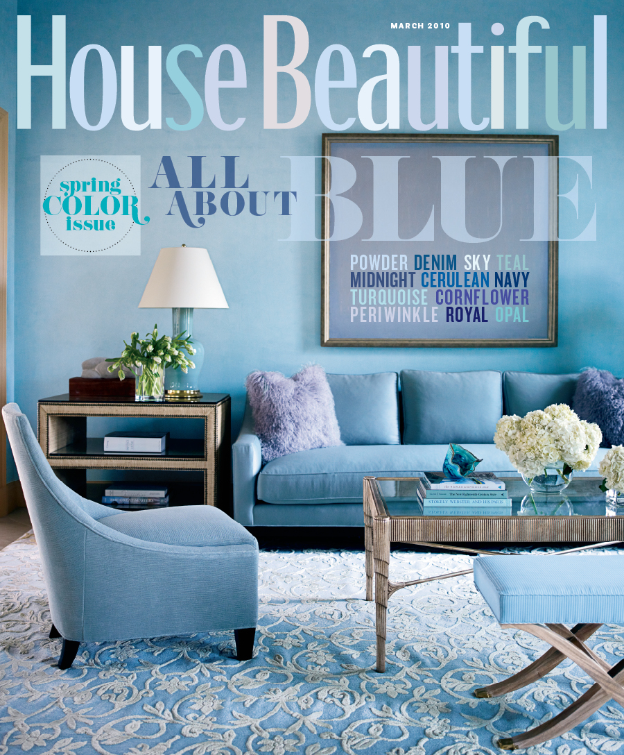 Tobi Fairley’s project on the cover of the March House Beautiful.
![[tf.jpg]](https://blogger.googleusercontent.com/img/b/R29vZ2xl/AVvXsEjP-PR5ozJLdeTGTwVIiyheFpnst5VhXJRSfbPeB4vpyK1AWcjh5cQ3eVEZmcyUYounH2XBBaMBHTj4NMVzSBQbvdrU6HnpnrbglflBcyccr5HoEf5zqTioSyewdSea13zXCsZ1IYHCyp0s/s1600/tf.jpg)


