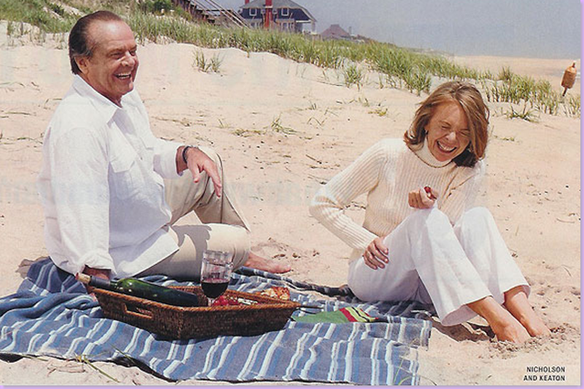
I can't do a series on beach houses without discussing my favorite beach house ever (or my favorite movie house ever, because they are both the same) - the house from the movie "Something's Gotta Give." For those of you who haven't heard of this movie because you have been living on the moon for the past five years or you have been kidnapped by the Taliban and are wearing a burka - the movie stars Diane Keaton and Jack Nicholson and a Hamptons house where most of the action takes place. In fact, the house should take top billing over Keaton and Nicholson. Years later, it's not the script that stands out, it's the Hamptons house itself. Never before has any movie house created such adulation. Countless numbers of kitchens were built copying the movie's kitchen. Scores of newspaper and magazine articles were written about the house. Google the subject and copycat house after copycat house pops up on the screen. Architectural Digest states that their article on the Hamptons house is their subscribers' all-time favorite piece. A Victorian Hagan cover for Elle Decor that looks very similar to the movie house was one of their best sellers ever. And for me, personally, the biggest Google Search topic that lands strangers onto my blog is "Something's Gotta Give" (and for those of you who've never been to my blog before today but came here to read about this house after a Google search - welcome!).
The first time I ever heard about the house was the night the movie premiered. A client of mine called me breathless, "go see this movie, I want my house to look EXACTLY like the house in the movie I just saw!" Little did I realize that night how many other people throughout the nation would feel exactly the same. Periodically I get questions from bloggers in my email about the house which was designed by set decorator Beth Rubino: " I want my house to look just like this - how would you do that?" or this, "Do you know where I can get a blue and white striped rug like that one?" and even this "You said the dining room chair fabric is Bennison, but you are wrong! It's Lee Jofa!" Yes, it's true, I confess right here for all to snicker, I DID once say it was a Bennison fabric, but I've been corrected by an over zealous fanatic. The dining room chair fabric is Lee Jofa - a gorgeous linen. And I should know, I ordered the samples for a potential client who, of course, loved the house. And yes, I have written about this house on my blog a few times before, quite a few times in fact. But, I'm not the only blogger who's written about the house ad nauseam, Linda Merrill of Surroundings has too. She even sourced many pieces of the furniture in the house. To read all of Linda's fabulous posts on the Something's Gotta Give house go here!
So what's left to discuss about the Something's Gotta Give house? I don't know, but I'll figure out SOMETHING to talk about. Like I said, I can't do a series about beach houses and not talk about it!!! But first, a disclaimer, although the Something's Gotta Give house is located on the beach in the Hamptons, of course, it is not a beach house in the typical sense of the label. Yes, it has colors taken from the ocean, the blues of the water, the creams of the sand, the tans of the pebbles - and yes, the home is warm and inviting, cozy and friendly like a beach house should be, it is something else too. Elegant. Elegant in a way that says, don't sit around here all day in your bathing suit in the middle of the living room. And elegant in the way that some care is needed to keep the house up other than just a light cleaning every summer season or so like you do in a beach house. This is a house that actually could be located anywhere, not just at the water. And perhaps that is part of it's universal appeal for people around the country, not just for those that do live on the ocean.
So if you are one of those who loves this house and is thinking about moving or redecorating and want to incorporate the look of this house into your own, or even if you are just interested in knowing how, read on. There are steps you can take to copy the look of this house, this style, and make it your own. First, there are several design elements here that are essential to replicate the look. What are the most important elements of this design? What would you have to have in your space to get the feeling, the look of the Hamptons House?
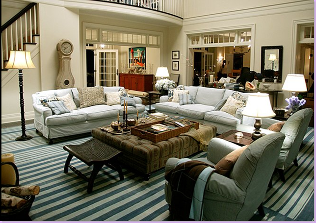
Contrast is the number one key design element in the house. The walls are light - not quite white, but with just a hint of warmth in the shade. The light walls contrast with the very dark hardwood floors. Light vs dark is vital to this design. Take this design element further: the dark wood furniture contrast with the light colored upholstered furniture. The only dark upholstered piece is the ottoman/coffee table which anchors the large seating group. More contrast: the dark wicker furniture against it's light striped upholstery fabric. More contrast: the dark hardwood floor against the light blue and white rug. More contrast: the white balusters against the dark stair rails. More contrast: dark lamp bases against white shades. It's all about contrast in the Hamptons House: light vs. dark.
The second most important element in the design, after contrast, is the blue and white rug. Nothing quite says Something's Gotta Give more than the blue and white striped rug. Again, this is such an important element that at the beach scene pictured above, the rug is represented by a blue and white striped towel. It can't be stressed enough the importance of the rug in the design. To duplicate this look in your space, there would have to be a blue and white dhurri - otherwise, it would just be a pretty room. The rug is key to the design. So much so, that the owners of the Aspen Rug Company have profited greatly by the success of this movie. Before the movies' release, they stocked dhurris, but they did not carry any blue and white striped ones. After receiving several hundred enquiries, they fortuitously made up about 60 Something's Gotta Give rugs and took to the decor message boards to advertise this fact. Today, they have several different versions of the rugs available and The Aspen Rug Company remains the best place to buy the Something's Gotta Give dhurri. A design element that spurns on such business is obviously a very important element.
You now know the two most important, basic design elements of the house #1 contrast: dark floors (which can be either hardwoods or slate or even painted concrete - the important element would be dark brown or black floor) with light, flat wall paint, and #2 the blue and white rug, so what comes next? The architecture plays an important role, though it is not always possible to recreate it. But, if you were building a house with the Hamptons House style as your goal, what architectural elements should be included? First would be french doors with true wood divided panes. These doors are prominent in the design. And above each french door, a transom should be included. In the living room, notice how the transoms play a role in dividing the space between rooms. Notice also, how even where there are no doors present, there are transoms between each room. The row of transoms between the rooms becomes an important design element that is very linear in quality, and this quality is repeated in the balusters next to the transoms and in the balcony above the transoms.
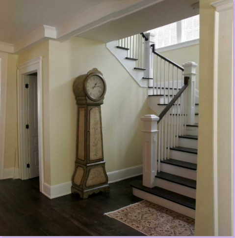
Another architectural element that should be faithfully copied is the staircase and the balcony railings. Wood, not iron should be used. The balusters should be white, the risers white, and the handrails, along with the treads, should be dark wood. Anything else will comprise the architectural design and would take the house off on a totally different look.
What about the furnishings? How to emulate the furnishing and get the effect of the Hamptons House? Again, the important element is contrast. In the living room, the furniture is all dark wood. Antiques really aren't necessary in this design. The tables can or can not be antiques and the effect would be the same, though of course, the more well made the furniture, the more interesting. The lamps have dark bases with light shades. The couches and chairs take center stage in this living room. The upholstery should be cushy, down filled, and slipcovered, not overscaled, but comfortably sized. And note, though many people believe the slipcovers are white, they are actually light blue with darker blue piping. Personally, I would prefer white slipcovers in here and would suggest you do that. The director felt that Erica would not have chosen white because it was the too common or safe choice. Either light blue or white will work in the design. The important detail is that the sofas be slipcovered, that the wood legs be exposed, that the look is casual not stuffy, comfortable not stiff. The slipcovers should be cotton, denim or linen - nothing else would be acceptable to achieve this look. The sofas have classic English saddle arms, which is a softer profile than a large rolled arm. In the center, the large, square, tufted, and dark ottoman could be substituted with a square, wood coffeetable and the effect would be same.
And one very important element is looming over it all: the Swedish Mora clock with its sensuous curves that contrasts with all the vertical lines of the transoms and the stair rails. Though not absolutely essential to the design, the Mora clock is certainly almost as famous as the blue and white dhurri in the Hamptons House.

This picture above shows more important design details to consider: all the windows have curtains that are the color of the walls. The curtains appear to be either linen or cotton or even a sheer wool, but what's important is that the fabric be matte with no sheen - which means no silk! A simple dark, wood or metal rod with small rings was used throughout the house. Any other drapery treatment would distract. The curtains should be duplicated as closely as possibly. After the curtains, bookcases filled with books play an important role. Lots and lots of books, not knickknacks, in the shelves, add visual weight and help anchor the room. Books are warm and add to the coziness of the design. Next, the dark wicker chairs with their striped fabric add more texture and warmth to the design. When recreating the look of the house, try to add some pieces of dark wicker and an odd basket or two. If you look around the room, though not cluttered per se, the room is inviting and welcoming and the accessories add to this feeling. Books are piled everywhere, on every table top and underneath them too. Candles and candlesticks are scattered about as are shells. There are soft throws over the chair arms and cushy pillows everywhere - all soft and cozy. There's not one accessory that stands out, not one "look at me" oversized urn or bust, but instead there's a layering of smaller accessories that build on each other and together, as a whole, they add to the appeal of the room.
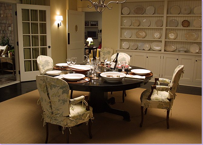
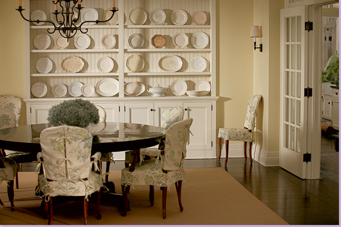
Moving into the dining room, the look is softer, the colors more muted, the contrasts less important than in the living room. This large room has a seagrass or sisal rug covering almost the entire floor. This takes away from the important contrast element found in other rooms. The color of the natural rug becomes an important shade in this room. In the center is a large 70" round table. Now, of course a rectangular table could be substituted, but the roundness of this table, with no hard, pointed edges further adds to the softness and femininity of the room. The stand outs here are the slipcovered chairs. In order to copy this design, the chairs should be remain as they are here. The dark wood arm chairs have a large, rounded back, which again, adds to the soft, flowing feeling of the room. And most important to recreate here are the slipcovers with their dressmaker details. The slips should be made as closely to these as possible, with the arm slips and the skirts, and with fabric ties holding them in place. The fabric can be substituted, but the Lee Jofa fabric used is perfect. Linen would be the only acceptable material for its propensity to wrinkle. And the fabric's muted colors work so wonderfully in here to continue the muted tones of the ironstone collection. This plate collection is the next important element in the dining room to include.
Here the plate collection is housed in a built in with a beadboard back, but a freestanding cream painted hutch would be acceptable. If a hutch was substituted, then a wainscot of beadboard could be added to the room to bring in that important texture here. What is so wonderful about the collection of plates is that they are not all white or cream but rather a range of tones from tan to white. Although, a collection of just one tone would be acceptable, this mixture is just beautiful. In the dining room, you can see one other element that is repeated throughout the house: the iron sconce. The single candle with its dark iron base and light shade again plays up the constant theme of high contrast. A large iron chandelier finishes off the design elements in this room. With movie goers, many people state the dining room is one of their favorite rooms in the house, which is easy to see, with it's soft, ethereal, atmosphere.
But, it's the Hamptons House kitchen that has garned the most buzz, the most adulation. The movie is responsible for starting a trend that swept through the states: the SGG kitchen. People freeze frame the DVD at the kitchen scene and bring the DVD into meetings with architects and interior designers to show them exactly what they want. Newspaper articles have been written about people and their SGG kitchens.
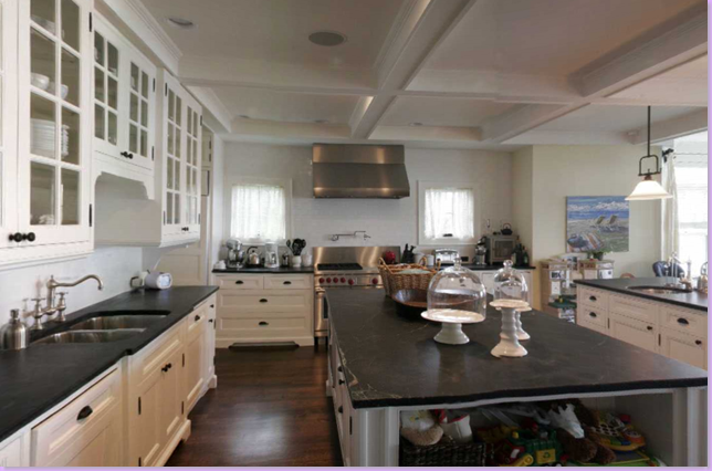
But what exactly is it that makes it so appealing? At the heart of the kitchen is it's country appeal. This is not a slick, shiny kitchen with highly carved, fancy cabinets. It's a kitchen that might be found in another era, with the emphasis on might. How can you recreate the kitchen? Again, it's the contrast that's important, the contrast between the dark floors, the white cabinets, the black, soapstone countertops (though in the actual movie, painted wood substituted for soapstone), and white subway tiles. Large, commercial sized stainless appliances were used. The upper cabinets have glass doors and are supported by large brackets and the bottom cabinets have bracketed feet. The hardware used is the old fashioned bin type pulls and most importantly the hinges are visible! No longer are hidden hinges an asset. And there are not one, but two large islands in the design. Pendant lights over the counters and an oversized, round clock are the finishing touches.

To recreate the kitchen is really not hard. Soapstone can be substituted with honed black granite or even tile, the important detail is that the countertops have a black, dull finish. Cabinets must be white and the floor must be dark. The appliances can only be stainless, but they don't have to be so big or so industrial feeling. Upper cabinets should have glass insets, but it isn't necessary to all be that way. The white subway tile could be substituted with another shape, the important element would be white and shiny. Not every cabinet has to be bracketed underneath - one or two would be sufficient. And lastly, one large island would certainly be enough instead of two.
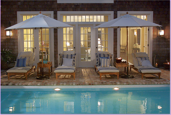
This exterior shot further shows the important design elements of the Hamptons House. The wood shingles, the white trim work, the paned French doors with the important transoms above. The furniture, as inside, is inviting and cozy - the lounges almost look like beds piled high with cushions and pillows in, of course, the blue and white stripe design element that is so vital to the look. Add to the stripes, the cream colored market umbrellas and the color scheme of the living room is carried outside to the patio. Lastly, the accessories become important: lanterns, both electric and candlelit are used and scalloped edged side tables add layered details.
There are very few bedroom shots from the movie - this one is probably the best. Again, we have the cream walls, the dark hardwoods, the seagrass - all easily recreated. A plain upholstered headboard in a khaki denim fabric is used as is a white scalloped mattelese bedspread and white hotel sheets. Crystals lamps with white shades add to the layering. One side table is a round mirrored Oly Studio table, the other wood, with candles of course.

This shot taken by Linda Merrill of Surroundings from the actual movie shows the fireplace with the white wood mantle and more bookcases. The side chair and ottoman is Hanna from Oly Studio with a Rose Tarlow side table. The bedroom is muted and soft - more in keeping with the dining room than the living room or kitchen.
And Erica at her desk in her bedroom. As the director says - why wouldn't she have her desk in her bedroom? Nothing else is going on in there! The desk is a wood classic and antique looking. Again, lots of flowers and again, the linen drapes that blend with the paint color.
So, now that you have the recipe for how to emulate the design elements of the movie, let's look at people who have already tried to copy certain rooms from the Hamptons House. Are they successful? Did they bring in their own personalities to the rooms? Are the rooms better or worse for their personal input?

This kitchen from New Old House Magazine proclaims itself to be a reproduction of the SGG kitchen and it is quite a near perfect one at that. And gorgeous to boot! What elements did they copy? Dark hardwoods, white cabinets, black countertops, glass front upper cabinets, upper brackets and lower footed details, white subway tiles, hinges and bin pull hardware, stainless appliances, and a large center island with pendants. The owners added their own touches: beadboard to the built in hutch, plate rack over the stove hood, and they painted the walls a barely there blue. This kitchen is a great Hamptons House reproduction. While I would have used another barstool, probably a slipcovered chair in a white linen with scalloped details, the chair choice is all theirs. Great job, A+
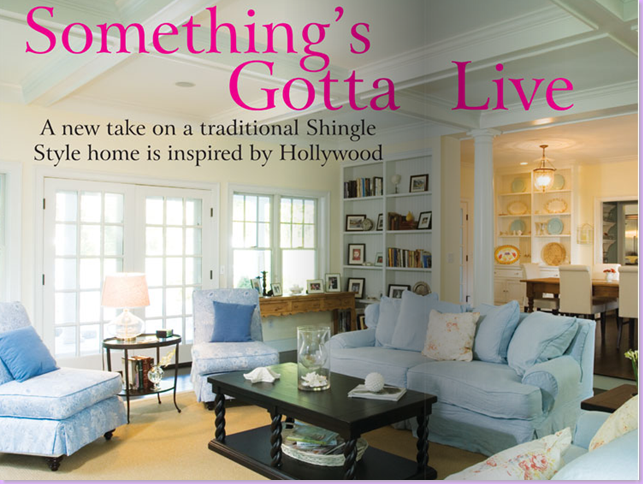
Correction: this kitchen actually belongs with the house shown below in Maine titled "Something Gotta Live" - I'll add it to the house below, also.
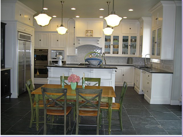
This kitchen was taken off of a web photo sharing site. This homeowner proudly proclaims this is her Something's Gotta Give kitchen. How does it rate? She gets good marks for high contrast elements - although her floors are black slate and not hardwoods, the proper contrast is there. More important contrasts: white cabinets, black countertops with shiny black granite - although the shiny black granite should have honed. With the shiny white subway tile, there's no contrast between those two surfaces texturally. Stainless appliances, pendant lighting (though I wouldn't have put two more pendants over the dining table,) bin pulls, glass cabinets. I don't see any brackets except under the hood and there's just a cooktop range which mean you have to add built in ovens which adds to an endless parade of appliances. The dining room table is all wrong for the room in every way - the light colored wood, the green painted wood, these two colors are distracting and the size of the table seems too small for the space. Grade: B
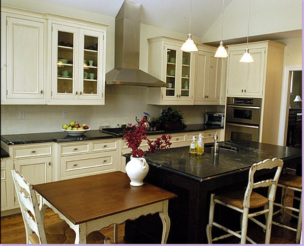
This copycat Something's Gotta Give kitchen garnered a lot of national press, though I think it really misses the mark compared with the two others we've just seen. The shiny marble is awful. The island is painted black which is really a departure. Not sure if that's a table or another island to the left, but that has nothing to do with the look of the SGG kitchen. The floors are too light to provide the important contrast. The hardware is a miss, as are the appliances. There are pendant lights and glass fronted cabinets, but the cabinets don't have that country farm feeling to them. No brackets on top or bottom cabinets. While this is a pretty kitchen itself, it's a failure as an imitator. Grade: F (I'm a strict teacher!)

This kitchen bills itself as a copy of the SGG kitchen. Nice contrast between the hardwoods and the cabinets. Nice hardware. Black countertops, but they look shiny. No brackets on bottom cabinets, but they are there on the top stove hood. No pendant lights, but there is a clock. Hinges and bin pull hardware. White appliances!!! Oh no!!!!! The bar stools are really wrong. Nice ceiling. Overall pretty kitchen, but really doesn't have the "look." Grade: C-

House Beautiful touts this as a Something's Gotta Give kitchen in Las Vegas, of all places! Good start: matte countertops, bin pull hardware but no visible hinges, stainless steel range and hood - a real plus!, large island, dark hardwoods (but could be darker), white subway tiles, pendant lights, glass fronted cabinets with brackets. Personally I don't care for the blinds, but overall this is a very faithful reproduction and I can see Diane and Jack cooking pancakes in this kitchen in the middle of the night. Grade: A-
Another kitchen that received national press for being a Something's Gotta Give recreation. The elements: dark hardwoods, black countertops, although they are too shiny and dressy to appear country at all, bin pulls and exposed hinges hardware, pendant lights (again too contemporary), no glass doors or top brackets. Not sure about the appliances. Very pretty kitchen, but there is too much of a contemporary element to make this authentic. The owner should have gone with either one style and stuck with it, instead she has a mish mash. Grade: D.
How about owners that tried to copy the ENTIRE Something's Gotta Give house? Yes! This couple (probably just the wife, I'd be willing to bet) loved the Hamptons House so much, they built their own home and furnished it in what they think is an exact copy:
The entry hall: let's judge the elements, the contrast is good - very dark hardwoods, light creamy walls. Off to a good start. The stairway is right on the money. White risers and balusters, dark treads and handrails. They even tried to copy the Mora clock! While this is pretty for this couple, it's not an antique and it's not a Mora clock. I wonder why they didn't get the authentic Mora clock - there are plenty of reproductions out on the market. Grade B+
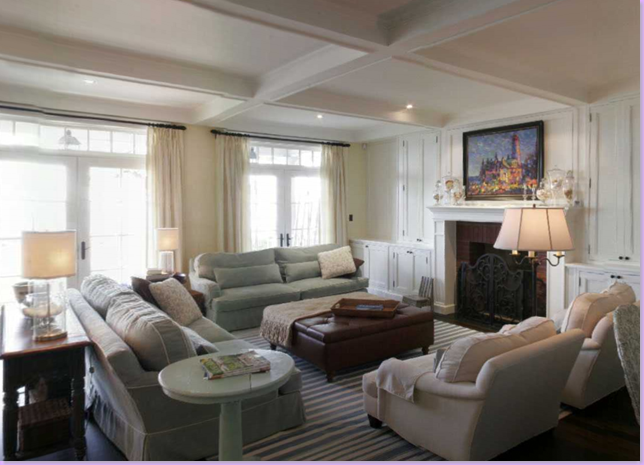
The living room - wow! Pretty good actually, though of course I have lots of comments. The sofas are the right blue and even piped, but NO slipcovers which really ruins it. And the fabric looks like ultrasuede to me. Didn't I tell you it had to be cotton, or linen???? ONLY??? These sofas are really, really ugly. I hate those lumbar pillows - they don't have the casual feel of the pillows in the original room. And what's with those arm protectors from the 50's? The white side table is all wrong - too high and too white. The square dark ottoman is nice as is the rug which is extremely important in recreating the look. Also nice - the windows with the transoms and the light curtains, both extremely important elements. Even the art work is an attempt to emulate the original SGG home. The lamps though are clear and their shades are way too small. All in all, it's very obvious that a sincere attempt to copy the house was made. It's attractive, but the sofas and chairs are cheap looking and totally miss the mark, as does the side table. Grade C.
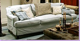
A close up. Those sofas, are sooo fuggggglllly. The ultra suede is just awful. A nice linen or cotton slipcover would have been so much better - these just look old fashioned. The lumbars add to the horribleness. Compare the stiff ultra suede upholstered sofa with the original, cotton, down cushioned slipcovered one with all the loose pillows from the movie, below. No comparison. Also note, there are no transoms dividing the room - wouldn't transoms in the hallway have been such a great addition?
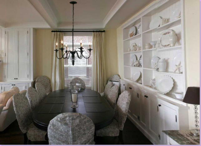
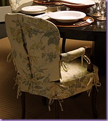
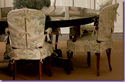
The dining room: again, a nice attempt. The built in with the beadboard is very authentic, even the way they placed the white dishes is nice. But the table is too large and it is cramped here - you don't get that nice open feel. Too many chairs for the space. I see they tried to duplicate the slipcovers - but they did it all wrong - there are no dressmaker details, and the fabric looks cheap. Compare this chair to the original chairs below, with their charming arm detailing, the dressmaker details, the closure ties, the beautiful printed linen fabric - no comparison. This really shows the importance of quality fabric and expert workmanship. Grade: C-
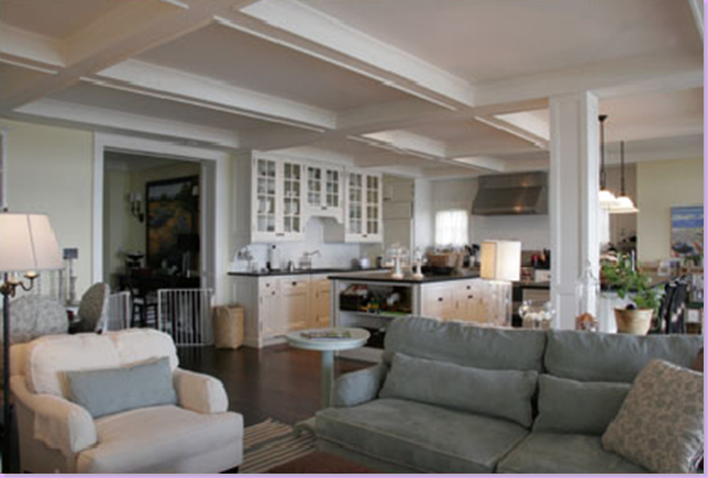
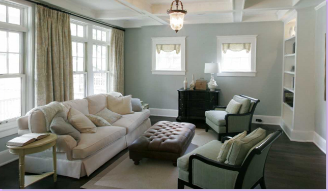
The formal living room - the sofa is somewhat better. Again, nice windows and curtains and hardware (though what are those things in the small windows - awful!!?), nice ottoman, chairs, but it's just all so boring. There's no layering, no tables except for one, the chairs are too contemporary for the rest of the room, there are no accessories, no lamps, the bookcases look bare, even the rug isn't enough - it's way too small. The room needs more. Like this: OK, I just wanted and excuse to the get the real room back in here! Grade: C-
The kitchen: good contrast - dark hardwoods, white cabinets, soapstone counters (the first one to have the real thing!) brackets on bottom and top cabinets, glass fronted cabinets, subway tiles, exposed hinges and bin pull hardware, large island, stainless appliances with an actual Wolf stove, pendant lights - all in all a wonderful copy. But boy - how cluttered! Instead of cookbooks in the island shelves, it looks like they store shoes there! And the back counter has every small appliance out for display. Overall though, it's perfect. A+
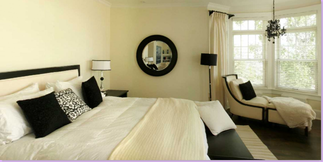
The bedroom is just alright. It seems very creamy, almost yellowy. The headboard is high contrast where as in Erica's bedroom, it's not. Too many harsh black accents. This misses the softness of the SGG bedroom completely. Not bad, but nothing like the original bedroom. Grade: C-
Below, the original bedroom with its off white walls and off white furniture and books. The copied bedroom is missing the quiet elegance of the real SGG room.

Another SGG House: This house bel0w was designed by James Radin who is Nancy Meyer's (the director and producer of SGG) interior designer. Meyers asked Radin to help on the movie with the set design. Here is a house he designed that was published in House Beautiful where Radin said this was his version of the SGG house. Although it is only an interpretation, it's interesting to see his work:

A much more restrained blue and white rug. Much more elegant than the original SGG home. Much more sparse. Very nice, very pretty but really not much like the original home at all.

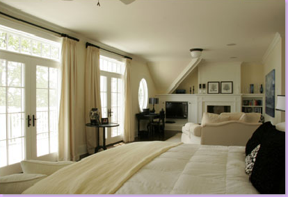
The bedroom has much more of the feel of the SGG house than the living room. The dark hardwoods are just visible under the creamy area rug which creates a nice contrast. Though not an upholstered bed per se, this is much prettier than the original SGG bed and one that I would chose also. Nice upholstered chairs, though not sure how they would keep these from getting dirty without slips. Perhaps they do have slips made for them in real life.

The kitchen: all the correct design elements except one: the black countertops are white carrara marble! And this is exactly how I love it! I adore this kitchen!!!! Except for that bank of appliances on the right. Fabulous choice of bar stools, couldn't get much better.

Interior designer T. Keller Donovan told House Beautiful he designed this room for a client who loved the decor in Something's Gotta Give. Not exactly what the room looked like at all. Poor woman. I hope she wasn't disappointed, I would have been.
In this magazine based out of Maine, we have another interpretation of the Something's Gotta Give house. Nice contrast between floors and walls, but where is the striped rug??????? Forget it! With the absence of such an important design element, there's no hope to recreate the look. The only resemblance to the original living room is a slipcovered blue sofa - and a messy sofa at that with huge rolled arms. The original sofa had neat, English saddle arms. Nice coffee table, but the bookshelves are way too sparse. The slipper chairs seem out of place and scale here. No curtains and no transoms. Again, a transom between the two rooms would have been nice. Grade: D
This is just Shabby Chic, not the low keyed elegance of Something's Gotta Give.
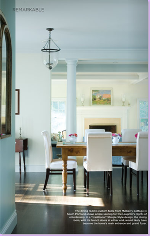
The dining room: the table is too light, the chairs are not slipcovered, they are too contemporary, the built in shelf is nice even with the yellow plates. The floors are dark and the contrast with the walls is correct. Grade: C

Correction: The kitchen, which I inadvertently pictured in a story above from the magazine The New Old House, should have been shown with the entire house from the Maine Home and Design Magazine. My mistake! The kitchen, as I stated before, is an excellent reproduction of the SGG kitchen. Every element is correct and beautiful, especially since the owners added their own design features. Grade A+
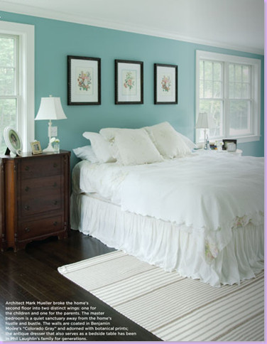
Here's the rug! Sort of! Green and white striped rug in the bedroom. A very very Shabby Chic bedroom. Grade: D-

The editor of Elle Decor told Linda Merrill of Surroundings that this Victoria Hagan designed cover in 2002 was their biggest seller EVER. It is rumored that the set decorators for Something's Gotta Give toured this house and based the Hamptons House on this home. True? Maybe. It certainly has the elements. The room resembles the original SGG house somewhat with it's high ceilings and balcony overlooking it. The striped rug, of course is a definite similarity. The book cases are similar, just the over all feel of the room is very similar.

Another view of the inspiration house: the contrast is much sharper in this house. The white furniture and white walls and the blue and white rug are much crisper and more dramatic than in the SGG home. Yes, I can understand how this was a jumping off point for the set decorators. Do you see it?

Another view of the great room taken from the balcony.

Here's another house by Hagan that could have been an inspiration too. In fact, this one resembles the SGG more to me than the previous one! Since this house was published two years after the movie premiered, perhaps Hagan herself was also influenced by the SGG movie? Anything's possible. This home is located on Nantucket.

Imagine this room with the blue and white striped rug. If this house were in a movie, would Americans have gone as crazy over this house as the Something's Gotta Give house?

One more view. Imagine the walls and curtains with a just a little more color.

The stairs are correct!

The kitchen is a good match in every element. Now THESE are proper bar stools! I love these pendant lights and the plank wood ceiling. Just beautiful.
If you have made it to the end, congratulations! I've hoped you've enjoyed this in-depth look at the Something's Gotta Give house! Be sure to visit Linda Merrill for her extensive writings on the house. I swear, this is the last time I will write about the house, that is until I find another 'look alike." OK, I am exhausted!!




No comments:
Post a Comment