This year, Christmas Day is meaning one thing to me it seems – It’s Complicated finally arrives in theatres! The newest eagerly awaited movie from Nancy Meyers has gotten early so-so reviews. But what’s new? Most of her movies don’t get raves from the critics, but the audiences love them. Maybe this one will be the one that gets Nancy Meyers the respect she deserves. It was recently nominated for Best Comedy by the Golden Globes and its star Meryl Streep was nominated for Best Comedic Actress for blogger favorite Julie and Julia AND It’s Complicated. The buzz, despite early mixed reviews, is huge. And of course, the 1920’s Santa Barbara house where Streep’s character lives is getting a lot of attention. Traditional Home featured it in their latest magazine and recently added more pictures on their web site. Even the New York Times has gotten into the act with a lengthy cover story of Meyers in its previous weekend magazine HERE. Right now, Nancy Meyers is hot – for once.
The youthful looking Nancy Meyers with her trademark glasses. Does she look like the most powerful woman in Hollywood? Maybe more like a friend or a sister? I am a huge fan of the woman – reading in the NYT story of how she was booted out of her “power booth” in a trendy LA restaurant in favor of lawyer to the stars, Howard Weitzman, makes me admire her all the more. The list of movies she’s either written, produced or directed includes so many blockbusters – it’s shocking she still can’t get a “good” table at restaurants – yet I’m not surprised. She doesn’t look like a major Hollywood player, yet the author of the NYT article postulates Meyers is THE woman in Tinsel Town – the most powerful female working in film today.

Private Benjamin: One of the funnier scenes in the movie. Eileen Brennan almost steals the movie from Goldie Hawn.
Nancy Meyers’ first screen credit was in 1980 with Private Benjamin – which she co-wrote and produced along with her partner and now ex-husband Charles Shyer. I was a single, 26 year old when I saw that movie and related tremendously to Judy Benjamin, the spoiled Jewish princess who finds herself stuck in the army (well, ok. I didn’t exactly relate to the Army part!!!) One scene contains what I still consider a genius piece of comedic editing: meeting the hopelessly gorgeous Frenchman, Henri, Judy is aloof. A romantic Frenchman for a Jewish princess? Not going to happen. She ignores the handsome Henri’s attentions as a “lost cause” – he obviously is not marriage material, so why bother? When in conversation he softly utters the words “I’m Jewish” – the scene immediately cuts to the two of them in bed together. So funny, yet so true! My friends and I howled over that scene. It’s no wonder I related to Judy – Nancy Meyers was another Jewish princess, only five years older than myself. But at that time, I had no idea we shared another quality – a love of interior design.

Meyers and Charles Shyer on the set of “Irreconcilable Differences” in 1983. Once her partner and husband, Shyer is now remarried with young children. That hair! It looks like they even went to the same beautician!
On the heels of the success of Private Benjamin, other hits followed: Irreconcilable Differences, Baby Boom (with wonderful set design, a hint of things to come), Father of the Bride, Parts I and II, I Love Trouble, The Parent Trap, and then came the blockbuster hits – Something’s Gotta Give, and The Holiday. While she produced and directed What Women Want, she didn’t write it, which probably explains why it’s not a favorite of mine. It’s Complicated is sure to be another huge hit. Helping fuel the excitement is “the house” – the silent star of Meyer’s latest movies. She is becoming known more for her set design than the script itself. Father of the Bride was her first movie where the house upstaged the actors. I remember a friend bragging that her own new George Smith sofa was featured in that movie. A George Smith sofa? In a movie? Seriously? It really is no surprise that Meyers’ films would feature beautiful interiors when you learn her background - she grew up around antiques and good interior design. Her mother was a decorator and other close relatives were in the antiques business. She spent her childhood traipsing through the fields at antique shows with her parents. Her love of interior design spills over to her leading ladies, especially since the characters seem based on herself. Meyers own house is a beauty that rivals any she has created for a movie, and indeed, her designer James Radin helped create the decorating themes for SGG, The Holiday and It’s Complicated. Touring Nancy Meyers own house, the line is sometimes blurred between reality and cinema.
Father of the Bride, Part I and II were the start of Meyer’s career as the Interior Designer Movie Maker. The house featured two slipcovered George Smith sofas and other expensive furnishings. Steve Martin remembers thinking it was all a bit too fancy for audiences to relate to. He couldn’t have been more wrong – Meyers interiors are a huge part of her appeal.
Father of the Bride – The Living Room.
Looking at the Father of the Bride living room from the opposite direction, this fabulous slipcovered wing chair is covered in an expensive tea-stained English linen fabric. In the recent New York Times article, Meyers discusses and defends her reasoning behind using good fabrics and expensive furniture on her sets: it’s part of the narrative. The characters, women who resemble Nancy Meyers herself, are successful and independent. Of course they would have fine furnishings – Meyers does herself. If this movie was made today – the walls would probably be painted white, not yellow. There would be very few pillows on the sofa, instead of the dozen there now. The rug would be seagrass, and there would be a more important coffee table. The lace curtains would be banned, the framed prints would have white mats, not dark ones, and the accessories would be larger and fewer. The Father of the Bride was released in 1991 – 18 years ago and it’s amazing to see how much interior decoration has changed since then.
The wonderful white Colonial in the Father of the Bride series. With the picket fence and climbing ivy – how more American apple pie can you get? One criticism of Meyers is her films have all white casts with very few ethnic minorities showing up in her world.
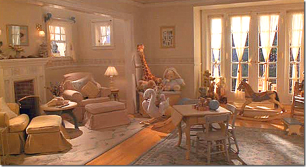 Father of the Bride Part II revolves around the remodeling of the house with the addition of the baby nursery. The gorgeous nursery was revealed with much fanfare by Franck – the wedding planner turned interior designer played by Martin Short.
The remake of Disney’s The Parent Trap featured two important houses – one for each twin. The California house was filmed at the Staglin Family Vineyard.
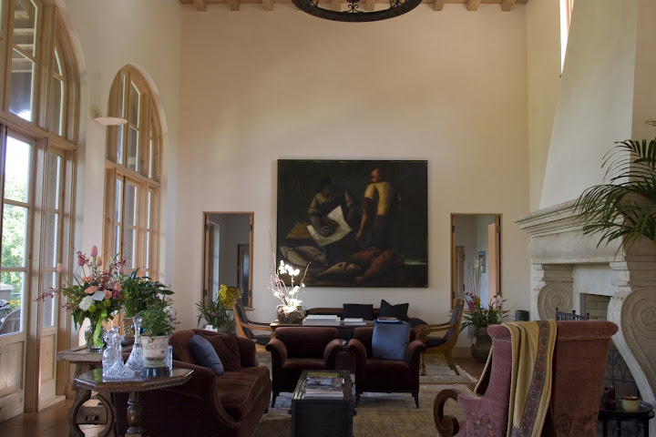
The Staglin Family Vineyards – here is how the living room looks furnished by the owners. Meyers replaced all the furniture, it appears, but the glorious and important painting – Fischmarkt. Painted by Thomas Schindler in Berlin, 1989, it depicts the “common man” in 1970s Europe. The poor worker is buying his dinner at a local fish market – just a few small sardines - yet he is surrounded by the much larger, whole fish. Art plays an important role in some of Meyers movies. In particular, the art used in SGG was an outstanding choice.
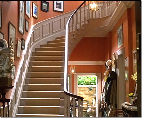 In the Parent Trap, this is the London townhouse where Annie’s mother and Annie live. Meyers said that she wanted the background to play up Lindsey’s coloring. In It’s Complicated, she chose the cream and peach palette to make Streep’s complexion glow. Matching paint colors to the owner’s complexion is a good trick to use – I’ve done it a few times and it really is wonderful.
 Meyers and Shyer coaching the young and innocent Lindsey Lohan in The Parent Trap – London location. This scene where Hallie tries to make the guards move didn’t make it into the final cut.
Meyers on the set of the Something’s Gotta Give – the master bedroom. This house is her Oscar winning performer – none before or since is as wonderful as this Southampton beach house!
The Holiday, her last movie, featured two houses. This one, Amanda Wood’s L.A. house, was more cold feeling than most of Meyer’s interiors. Or course – this matched the owner – Amanda had emotional issues.
Iris’ Cotswold tiny cottage was the favorite – the living room filled with Robert Kime fabrics, suzanis, lanterns, tickings, bamboo, and all sorts of wonderful clutter – was cozy and charming. Everyone wanted to move in here!
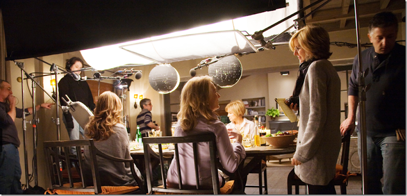 The long awaited It’s Complicated. Meyers takes a year off between movies, then spends two years making one. It’s three years between her films – too long for interior design aficionados to wait!!!! Meyers says she removed the walls between the living room, dining room and kitchen to make it all one big space. Here – in a scene reminiscent of SGG, a lively meal is shared by friends. Meyers is a casual dresser – seen here in what seems like a uniform, a sweater and a scarf - her own interiors are as casual as her clothing.
In 2004, on the heels of the success of Something’s Gotta Give, In Style Home magazine visited Nancy Meyers at home in the Pacific Palisades. At that time the house was five years old – its construction started during her marriage, but Meyers was single by the time it was completed. At first she wanted an East Coast shingle styled house, similar to the SGG version, but a trip to France changed all that, along with Cote Sud magazine. She attacked the design the same way she does movies – with great attention to detail and much research. In the end, the house’s architecture was very French inspired, with a tiled roof, thick walls, stone fireplaces and floors, and beamed ceilings. She and James Radin, her interior designer, went back to France to shop for the furnishings. The interiors are more similar in decorating style to the Father of the Bride house than the SGG house. It’s yellow walls and toile, while French inspired, actually lend an English vibe. There are similarities in rooms to different movies of hers: her kitchen is said to have been an inspiration to the famous SGG kitchen. And similarities exist between her real life study and Erica’s workspace. Her sunroom shares elements of the Cotswold cottage from The Holiday. Meyers bought the house for her two girls, but she is now an empty nester. She claims no deep attachment to the house and instead is ready to pass it onto a younger family so they can raise their own children there. She is moving on. Armed with more notebooks of pictures and clippings, she is planning her new house and hopes to purchase some of the furnishings in the It’s Complicated house for its interiors. I wonder if she will be changing from French to Belgian. Will life imitate art? After all, there is a distinct Belgian feel to the Santa Barbara house that Jane lives in.
Nancy Meyer’s Personal House in the Pacific Palisades:
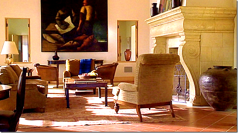
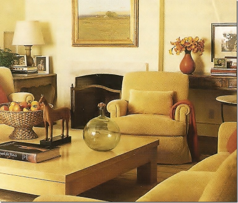
The living room in Nancy Meyers’ Pacific Palisades house is casual – done in gold chenille with orange accents. The fireplace has a limestone mantel. This room reminds me of the living room in It’s Complicated.
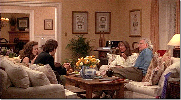
It’s Complicated Living Room
The casual, cluttered and cozy living room in It’s Complicated resembles Meyer’s living room – though here the furniture is covered in white slipcovers. Where Meyer’s living room has a French feel to it, this living room is more Belgian inspired. Despite these differences – it isn’t hard to see that the same woman is behind both rooms. Both are “living rooms” but both seem more like casual family rooms. Meyers is definitely not one to live with fancy, “no touch” interiors.
Nancy Meyer’s Office
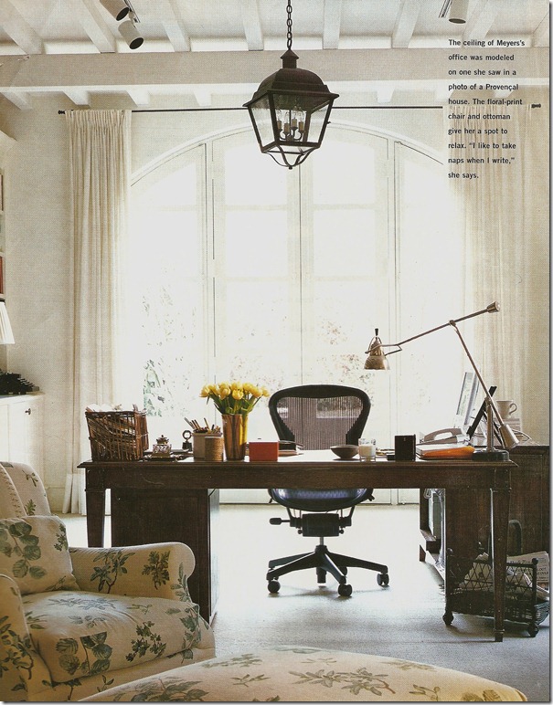
Meyers’ home office is off the living room and the octagonal library (not shown in the magazine.) The ceilings were copied from a house she saw in France and the wood desk in front of the windows is eerily similar to Keaton’s writing area in Something’s Gotta Give. The beautiful chintz covered chair and ottoman are English styled, giving Meyers a spot to nap while writing – something she likes to do. I love the wicker magazine holder and in-box on her desk. The brass lamp is great, as is the lantern. The ergonomically designed desk chair needs to go, though! Maybe she could slip cover it???? I have to say I am in love with that chair and that fabric! It reminds of the fabric used in the dining room of SGG.
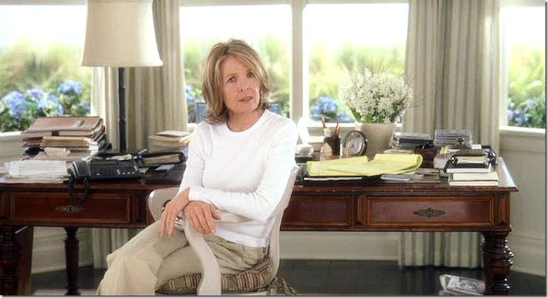
Something’s Gotta Give: Erica’s workspace resembles Meyers workspace.
While both desks look antique, Erica’s has turned wood legs and Meyers’ desk legs are straight. Isn’t this desk from the movie fabulous? Poor Erica – she looks so unhappy here!!!!
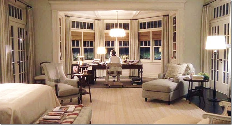
Something’s Gotta Give – Erica Berry’s work space
Erica, unlike Meyers, has a charming chair – an old fashioned office chair - probably from Pottery Barn. What a beautiful room, what a beautiful house! One day I would love to write a book about it and how it influenced houses across America!!!!
Nancy Meyer’s Dining Room
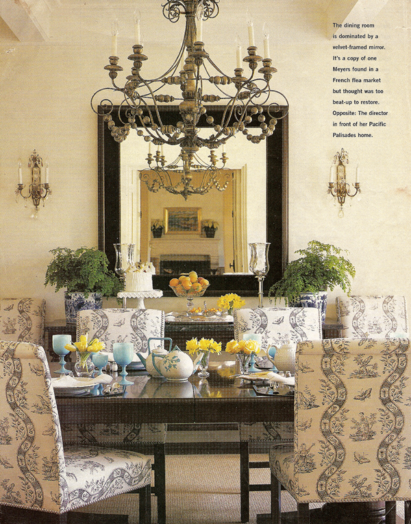
The casually elegant dining room in Meyer’s house is my favorite room. The chairs are covered in Bennison’s toile in charcoal. The mirror is a reproduction - velvet framed – a copy of one Meyers found in France that couldn’t be restored. The mirrored and crystal sconces are charming and the wonderful antique chandelier is perfectly reflected in the mirror. I’m not sure where that fireplace seen in the reflection is located – perhaps the octagonal library has a fireplace? I covet her blue opaline goblets! Of course some type of textured rug is used here – it looks like a sisal. The dining room really doesn’t remind me of any of her movie houses. Though the SGG house has patterned covered chairs, the rooms are totally different.
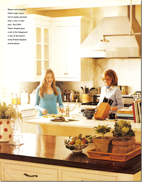
The kitchen in Meyers house is said to have been the inspiration for the famous SGG kitchen. A major difference is the white marble used here versus the black slate used in the SGG house. Meyers says she loves kitchens – she wrote It’s Complicated around a kitchen remodel after all! She spends a lot of her time here along with her two daughters - the younger one Hallie is pictured here. Though some of the cabinets have glass fronts like the SGG kitchen – I don’t think the two are all that similar, do you?
Something’s Gotta Give – the famous kitchen inspired by Nancy’s own.
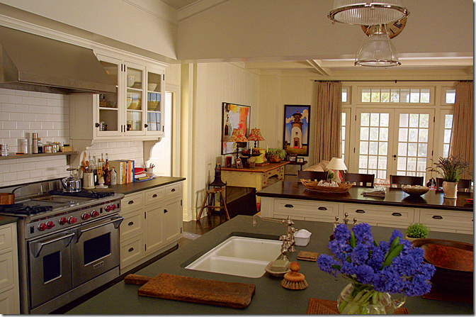
Similar in some elements, but mostly different. The black countertops make a big difference, as does the subway tile. Meyers’ kitchen has the marble slab backsplash. The stainless hood is similar. Today – six years later – a more decorative wood or stucco hood might have been used in both kitchens. But one similarity is the second island with the wood countertop! Those are exactly the same in the real house and the movie house.
Nancy Meyers – The Sunporch:
Another wonderful room is upstairs - the sunporch, which Nancy reports is also a much used room. Again, this room has an English feel though the house was modeled after a French country home. The furniture is cushy down English styled upholstery. The ticking on the chair is wonderful – as is the antique drum doubling as a table. The walls are yellow, the curtains toile. The tufted ottoman doubling as a coffee table is very similar in size and function to the SGG living room coffee table. But – surprisingly, this room resembles The Holiday’s Cotswold cottage the most.
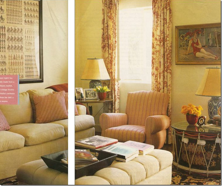 A full view of the sunporch – from the magazine In Style Home – pardon the missing portion of the picture! I love this room!
The Holiday: The Cotswold cottage
In The Holiday’s Cotswold cottage, there is the tufted ottoman and similar curtains to Meyers’ own sunporch. And, the antique drum is a dead ringer for Meyers. Both rooms, though so different in their architecture, share many similar elements: tickings, patterned fabrics and rug, and a general cozy, cluttered feeling that is prevalent in both houses. I’d bet Nancy would love to have the Cotswold house for a second home. Like some of her movie houses, the exterior was built for the movie and the interiors were filmed on a sound stage.
In SGG, the tufted ottoman makes another appearance, although a throw covers much of this one. I love this shot from the movie!
Nancy Meyers’ Master Bedroom:
Meyers’ bedroom has white walls and light blue fabrics used throughout. This room is the most French in feel - the headboard is French, as are the yellow silk bergere and end table.
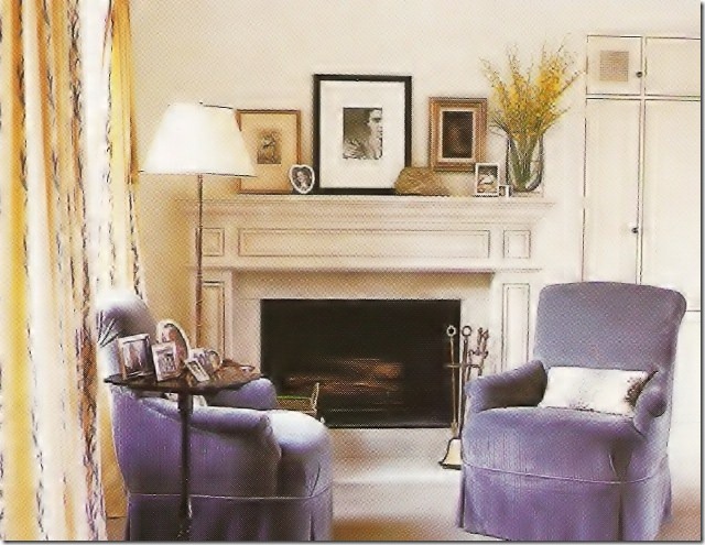
Two vintage styled armchairs in blue velvet sit in front of a fireplace - the curtains are cream with a blue vine running through them. The bedroom was inspired by London’s Dorchester hotel. Not sure if their furniture is French too? The blue bedroom doesn’t resemble any of her movie bedrooms that I know of. None come close. But the blue and white decor theme is found in the SGG house – it’s famous living room is a vision in the same colors!
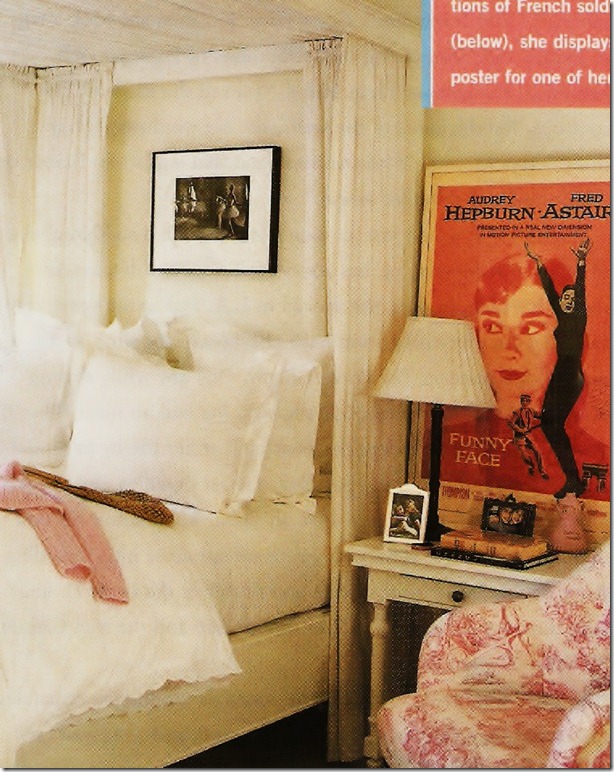
Hallie’s bedroom is a typical teenager’s room – with a canopy bed, white linens and a red toile chair. Her father, Charles gifted her the poster of her favorite movie, Audrey Hepburn’s Funny Face.
The teenaged daughter’s bedroom in It’s Complicated.
This bedroom is much different from Hallie’s– colorful and textural, there is no really no similarity between these two rooms. Nor does Hallie’s bedroom resemble the twin’s bedrooms in The Parent Trap, either.
Now 21 and living in New York, she is collaborating with her father Charles Shyer on scripts. She is going into the family business she quips. A bit of trivia – Hallie’s older sister is named Annie. The twins played by Lindsey Lohan in The Parent Trap were also named Hallie and Annie! And both the real Hallie and Annie had bit parts in the movie as girls at summer camp.
Nancy Meyers back porch.
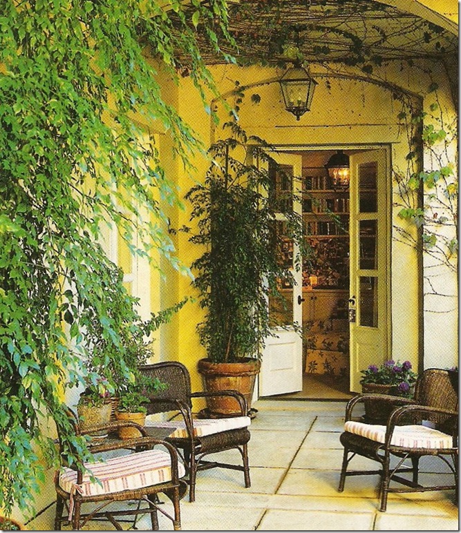
The porch leading off Nancy’s office is French inspired with its wicker furniture, French doors, and lanterns. In the doorway, you can see into the office, with its chair and ottoman and lantern above. The house is painted yellow, with blue shutters in true French Provence fashion. Similarly, the movie It’s Complicated has several outdoor locations similar to this:
It’s Complicated: The Porch.
It’s hard to believe the It’s Complicated house was actually built in New York for the movie – though it’s supposed to be in Santa Barbara! Here the porch is not French like Nancy Meyer’s house, but the outdoor space has a similar feel. Wicker and lanterns are similar elements.
![[outdoor+2.jpg]](https://blogger.googleusercontent.com/img/b/R29vZ2xl/AVvXsEgcD5hlLM0RN-QSOJGgJe7BfeGWC1HAJfWaQ-BWpvE4KsTMhSBOxz8YdPLNqOebGD3kEVGPt9NNfHFlBpqhr9fZgKgSANkwVUPRMZdRe7epgsnT2jF4EfkhJYy2ikxDvcb-z7uSelWSVyY/s1600/outdoor+2.jpg)
Another sneak peek at It’s Complicated. This porch looks into the living room and the brick is painted red here, not white – I wonder why?

It’s Complicated.
I can’t wait to see the movie!!! What a charming work space!!

Here you can see the red tiled roof of the Santa Barbara house from It’s Complicated. Meryl Streep’s character owns a bakery and apparently she is a avid gardener too, judging from the pictures.
![[mbr.jpg]](https://blogger.googleusercontent.com/img/b/R29vZ2xl/AVvXsEgQRXXtJTfK9Sz2pjVRlRmLyVRnH6PVVZ0Yc-v1aedBaOdlRygKY8A8iJekEMszgib9daT_8Pyl53-6Mb67H_MPXgCk4AOrZbJLXrY6-mvixZtkhlfs8sMhAKxrVSE2LHHybDCcqN7l9GY/s1600/mbr.jpg)
The Master Bedroom from It’s Complicated. It’s nothing like the light blue master bedroom Nancy Meyers sleeps in at night.
A very special thank you to a Cote de Texas reader who graciously mailed me the pages from In Style Home of Nancy Meyers’ house. It is so interesting to compare her private house to her movie houses. I definitely see a commonality between the interior designs – mostly casual, cluttered, warm and cozy, lots of wicker and linen, slips and sisal, the houses are all welcoming and inviting – spaces you would love to spend time in. It will be fascinating to see what her new house will look like – will she go Belgian like the It’s Complicated house, or will she go East Coast like the SGG house? Perhaps she’ll go Colonial like the Father of the Bride house.
And while anxiously awaiting Christmas day to hopefully sneak off and go see It’s Complicated - I remember well Christmas night of 2003. I received a call from a client – she was hyperventilating. She had just left the theatre after seeing Something’s Gotta Give: “That’s what I want my house to look like, exactly that!! The dining room, the living room – that’s what I want. OMG, you HAVE to go see that movie asap.” A few days later, I dragged Elisabeth with me to go see it – though on reflection, she clearly was not old enough for the subject matter. Of course I had the same reaction to the movie that most who saw it did. I’m hoping it’s repeated again with the It’s Complicated house, but I’m not convinced. The SGG house was special, so very special – even the two The Holiday houses couldn’t touch it. I don’t have high hopes that the It’s Complicated house will knock SGG off its throne – but who cares? The movie itself looks fabulous.
Here’s wishing everyone out there (not sure anyone is reading blogs though!) a very Merry Christmas!!! Be safe, no drunk driving please, and stay warm!!! It’s going to be freezing here in Texas so that means it’s probably freezing where you are too!!!!












No comments:
Post a Comment