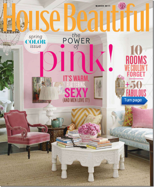
Did the cover of the new House Beautiful look familiar to you?
Maybe it’s because just one year ago, the House Beautiful cover story was the same – Windsor Smith’s new house?
The 2009 story of Windsor Smith’s new house featured her gorgeous pink sitting room with its collection of wonderful chairs. Who could ever forget a room like this? Almost everyone in the design blogosphere was head over heels in love with Windsor’s house, and especially this pink room. I can’t tell you the number of blogs that talked about that cover story of Windsor’s house. So, why in heaven’s name would House Beautiful repeat that room on their latest cover? What is going on over at House Beautiful with its new editor in chief?
To tell you the truth, I was confused when I first saw the magazine this month. I thought, are they featuring Windsor’s house again? Or, wait, maybe another magazine featured it last year, maybe I’m mistaken??? This cover certainly had me doubting my recall. Surely, one magazine wouldn’t repeat the same cover story twice in one year? Who at House Beautiful thought it was a good idea to confuse their readers? If you carefully read the cover, you notice it does proclaim: “ten rooms we couldn’t forget” – well, neither could we.
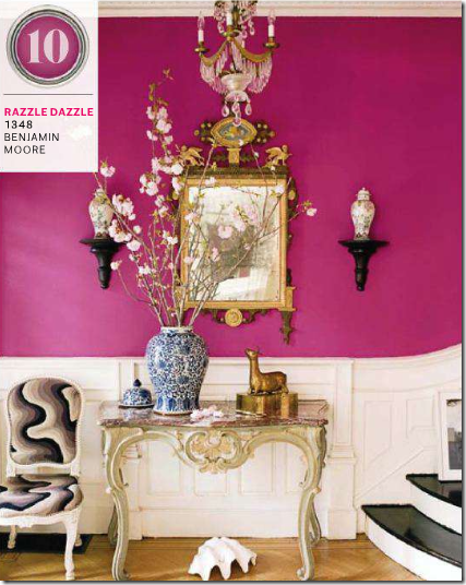
As it turns out House Beautiful’s new issue is all about the color pink, since Pantone has named Honeysuckle Pink as the color of the year. In the Pink cover story, page after page of previously run photographs were shown again (yawn) to illustrate the color pink (double yawn.) For instance, this picture above is repeated from a previously run story. Remember how the blogs oohed and awed over this stairway? Until someone noticed what a terrible paint job the stairs got. So, here we go again – staring at the awful paint job.
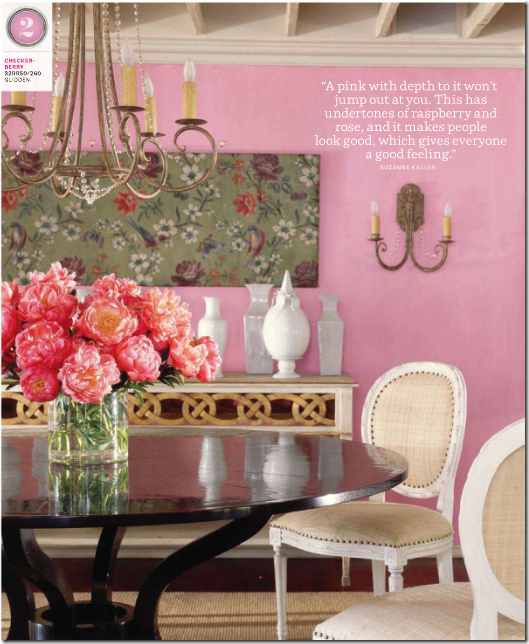
And House Beautiful runs this picture of a Suzanne Kasler dining room- yes, again. Jeez. How many blogs have shown this picture on Pink Breast Cancer Awareness Month? Hundreds? Thanks House Beautiful for running it one more time.
If House Beautiful wants to talk about the color pink – give us something new and fresh, like this photograph from this month’s Cote Sud. Now, THIS gorgeous photograph made me stop and stare. I certainly didn’t have to wonder where I had seen this photo before – because I hadn’t! It’s totally original and fabulous.
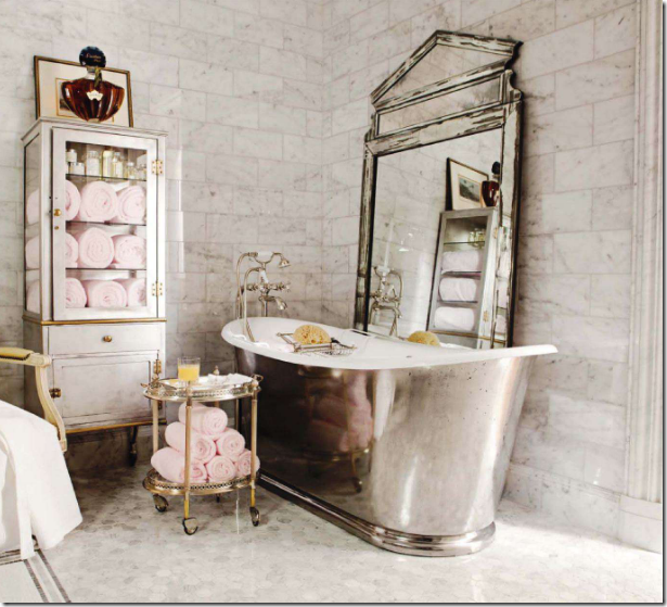
Even House Beautiful’s Bathroom of the Month has been seen before – its Betty Lou Phillips master bath, straight off the pages of her latest book. God forbid, they go photograph a bathroom we haven’t seen before.
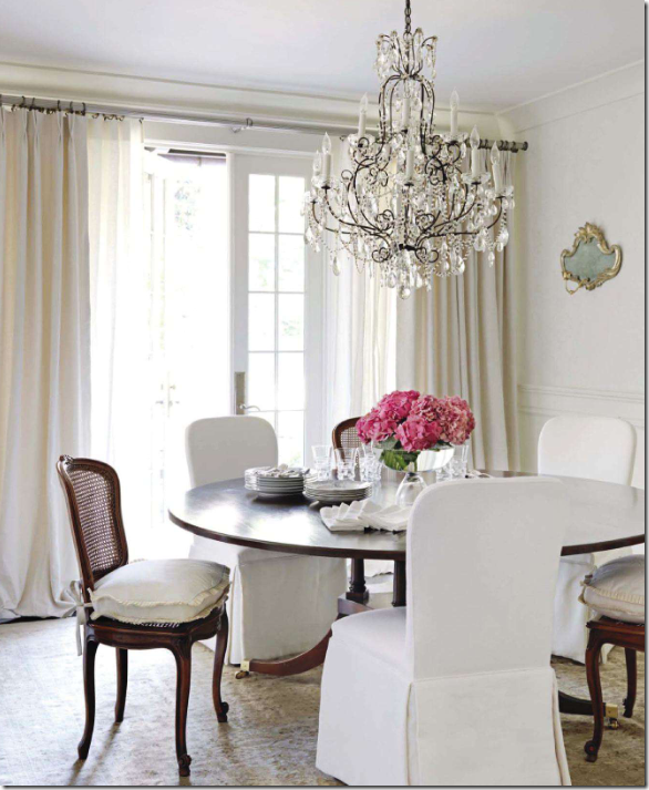
Let’s make nice. I did love that House Beautiful showed this gorgeous all gray and white house by Tracery Interiors. To tie this all gray and white house in with the Pink theme, they added pink flowers everywhere. Poof! Now, it’s a pink house! OK, this house is gorgeous, as were the others shown this month.
To be fair, the houses featured this month in House Beautiful are beautiful. The Tracery house above, is, spectacular. And this one with the pink curtains by Ruthie Sommers is fab too. Gorgeous entrance hall.
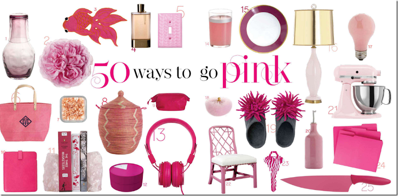
Why all this talk about House Beautiful? Because on the newest Skirted Roundtable, we discussed all of this and more. One topic we talk about is the Picks Section found in most magazines, online and at the newsstand. Does anyone read these types of stories? Seriously – does ANYONE read these pages filled with all kinds of little things to buy? Picks have become a large and must-have part of the new online magazines, Rue, High Gloss, and Lonny. Why????? Is it even possible to publish a design magazine without a Picks page? Someone should try.
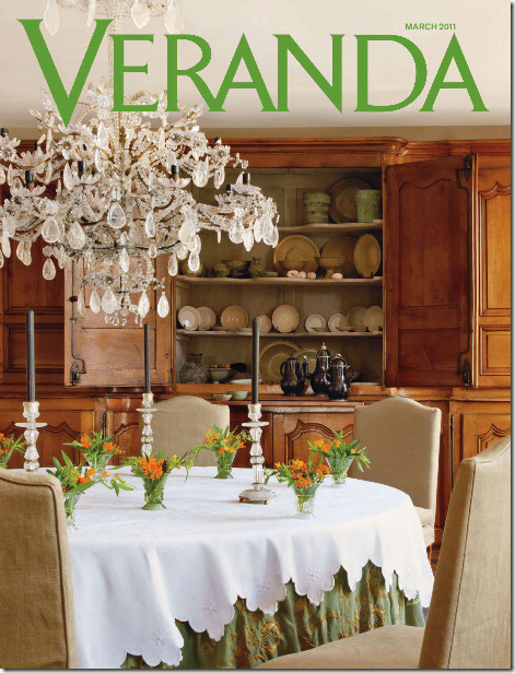
On the Skirted Roundtable, we don’t just crucify House Beautiful. Veranda was back at it again, recycling a house we’ve all seen before, ad nauseum. The gorgeous Belgian house owned by antiquarians Brigitte and Alain Garnier that has been seen in countless international magazines and all over the blogosphere, is this month’s cover story. People, PLEASE, give us something new for our money. I will say this, if you have never seen the above house before, it’s worth the issue price – it’s gorgeous. But, if you’ve seen it before and before and before, you’re out of luck. Of course, the current Veranda does have many other houses worth seeing. If Veranda could ever just give us all new content, we would be on the band wagon, shouting it from the rooftops. Despite all the unfortunate repeats, I am loving the direction of the new Veranda. The magazine is evolving and growing. It’s leaving its southern roots behind and is looking more and more Elle Décor edgy each month. Whether you like that or not is personal preference. All I want is to be surprised each month by something new and original.
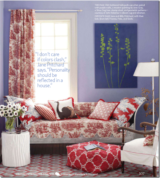
Country Living gets it right. Never have I seen a recycled house or story in this magazine. For years Country Living was the Cinderella to the better produced Country Home. Today, I can barely remember Country Home. Each month, Country Living consistently give us what we didn’t we wanted. March’s issue has columns on both Dave Matthews AND Lucinda Williams. WOW. Someone at Country Living has good taste in music. This month, they give us new houses, new stories, new features and none have been seen before in the magazine or the blogosphere. It can be done.
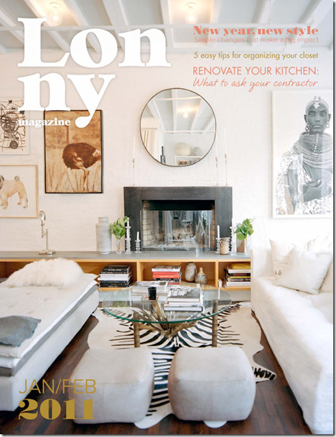
Lonny – the premier online magazine – FREE.
While we are dishing out lots of money for magazines each month – more and more fabulous FREE online magazines with fresh, original content are vying for our attention. It makes you wonder - who’s going to win this battle. Is it even a battle? Can the FREE Rue, Lonny, High Gloss and all the other online magazines take over the business, stealing the paying readership? The content of these online magazines certainly rivals the paper versions. Do you think Hearst, et al, has discussed Lonny at a board meeting? Do they care? Are they worried? Do you think that IBM discussed those snarky teenagers who started a little business in their garage called Microsoft and Apple? Are High Gloss and Rue the Microsoft and Apple of the magazine world?
Join us for this week’s Skirted Roundtable HERE where Linda, Megan and I discuss all this – House Beautiful’s Pink issue with all the repeats, Veranda’s status, Town and Country tidbits, along with online magazine gossip.
And now, for something totally different: Budget Buying News:
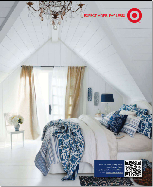
Target must have hired a new photostylist. I can’t remember ever seeing such a beautiful ad from them! This new line looks so cute!!!
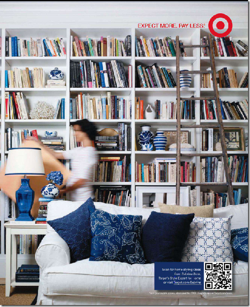
And another new ad from Target. Too bad they don’t sell that sofa! They could make a million on that item.
Listen to The Skirted Roundtable vs. Pink/Repink HERE.
Pink/Repink: Dishing on House Beautiful
Subscribe to:
Post Comments (Atom)






No comments:
Post a Comment