Email, we get email! Oy! I love to get emails from readers with leads on stories and pictures of houses they either live in, know, or saw somewhere. Recently two readers sent in pictures of cute houses they saw in real estate online listings. One is from Dallas, which is pretty fair game for this blog. But the other house is in Tennessee! A first here! It’s located in Franklin, Tennessee to be exact and I have NO idea where that is! But, the house is really cute as you will see. So, here are two from readers, and one from me and one from the WTH department. Enjoy!!!
HOUSE #1:
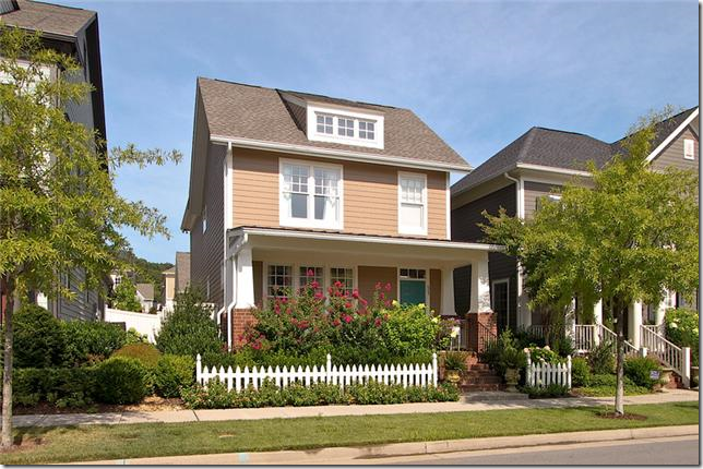
The house in Franklin, Tennessee has a really cute exterior with a picket fence. It looks like this might be some kind of planned community. The house was recently reduced to $389,000. and is 2,030 sq. ft. Built in 2006, it was renovated in 2008 with new hardwoods. It’s 3 bedrooms and 2 1/2 bathrooms. One thing that is great about new planned communities is that a lot of them have rear loading garages (garages on back alleys.) This keeps the street free of unsightly garage doors. I have no idea why America gave up on alleys because our streets are so much more charming without all the driveways, garages, and cars everywhere. At least the planned communities are bringing alleys back into favor.
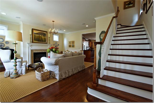
The stairs are right up front, living room to the left. Hardwoods on stairs really make a difference over carpeting. It just always looks so crisp and nice.
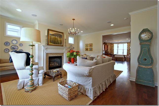
Cute Mora clock! What room doesn’t look great with a Mora clock in it? Slipcovered sofa, textured area rug, and window seats flank the fireplace. This room looks monochromatic, right? Well…….
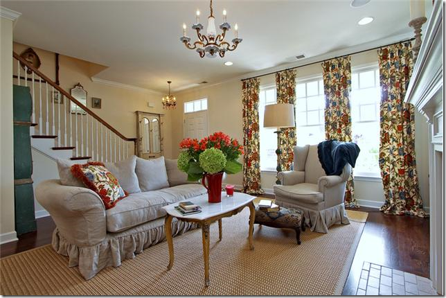
Here, you can the room is NOT monochromatic at all! Don’t the curtains make a huge difference? I’ve gotten to where I really like pattern fabrics mostly on curtains and pillows. These curtains change a room that seemed to be monochromatic into something very bright and cheery.
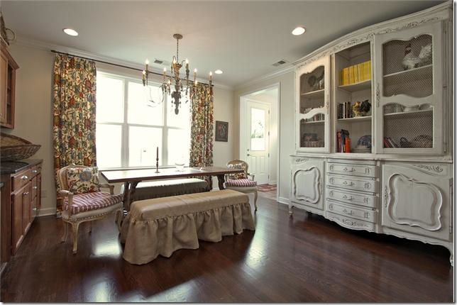
It looks like they used the same fabric in the breakfast room, but I can’t be 100% for sure. This is so cute with the linen slipcovered benches and French chairs for the host and hostess. I keep seeing slipped benches instead of chairs and I really do like this look. Not sure how practical or comfortable this is though! Great antique piece on the right.
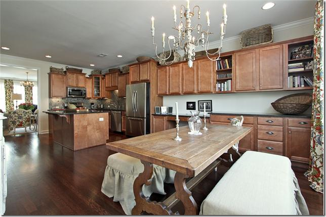
Looking the other way, pretty light fixture and dining room table. This must be the dining room too. I would probably paint the cabinets if I lived here.
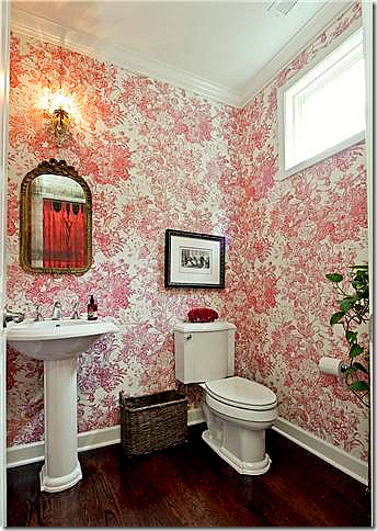
The powder room is wallpapered in a cheery red and white pattern which picks up the reds found in the curtain fabric in the living room. If you like wallpaper but are scared of using it, the powder room is a small enough space to try it out.
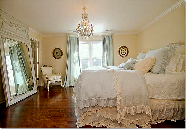
The master bedroom with touches of blue. I keep seeing rooms with just touches of blue and I really love that color combination (although the walls are too creamy – should be painted a little more white than yellow with the blue.) The hardwoods were a great investment. They look so pretty.
The master bathroom replaced the big plate glass mirrors with two small round shell mirrors – which makes such a huge difference. Also, it looks like they fauxed the cabinets – again, a big difference. The blue walls in the bathroom pick up the blue curtain fabric in the bedroom.
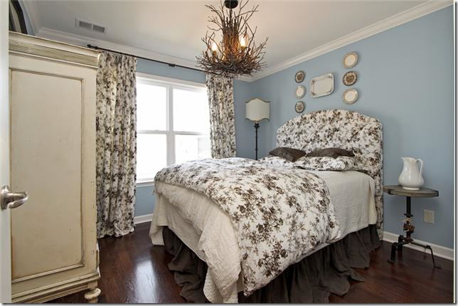
Cute, cute fabrics in the guest room – all grays and blacks and white. And blue! The new accent color. Really cute. Love the long dust ruffle.
The link to the listing for this house is HERE.
HOUSE #2:
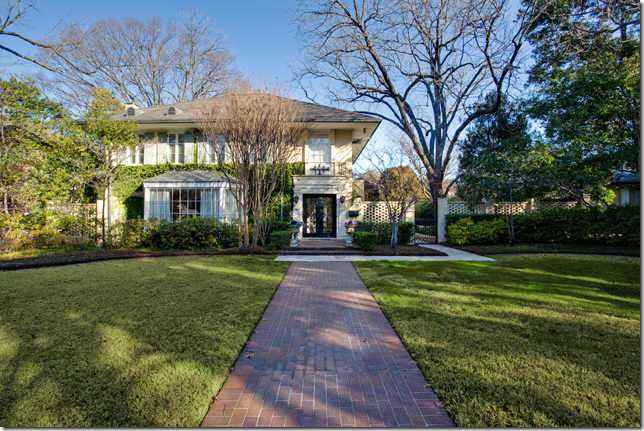
The second house that a reader found is located in Dallas, Texas and is at the opposite end of the spectrum. It goes for $3,995,000.00 and is 5 bedrooms and 5 1/2 baths! It was built in 1917 which really surprised me – houses that old are very rare in Texas.
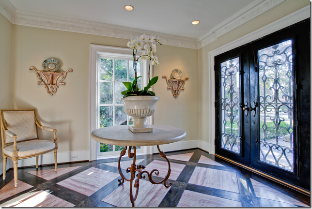
Mixed wood floor and a center table in the entry hall.
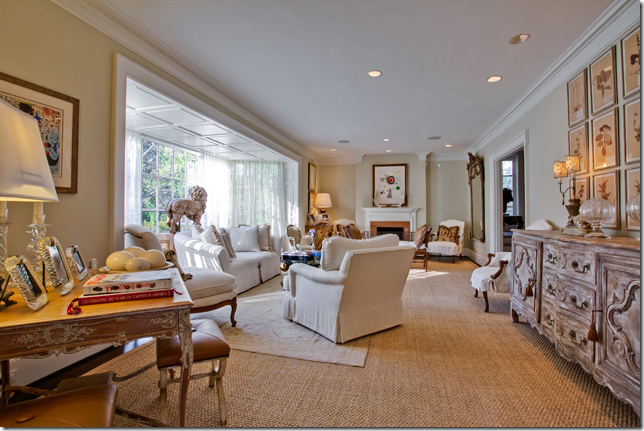
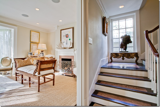
Of course I like the living room with the white furniture and seagrass rug. The big bumped out front window is so interesting. And I love the botanical set over the enfilade.
In the living room, there is an antique French bench in front of the fireplace. Notice the mixed wood stain on the stairway treads. Unusual.
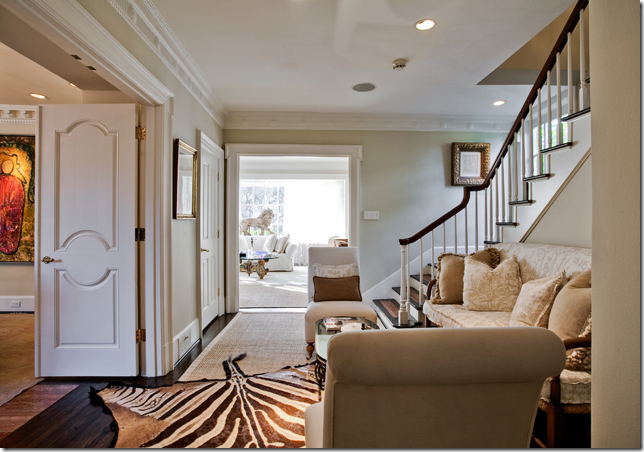
This small area next to the staircase is so cute! Love the sofa and the zebra rug. I still love zebra rugs – I don’t think I’ll ever tire of them even if they are so trendy now.
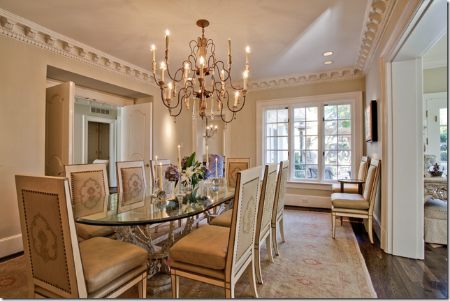
And off that stair landing room is the dining room, with the trendy Italian chandelier that seems to be everywhere today. Again – yes it’s trendy, but I still love this kind of fixture.
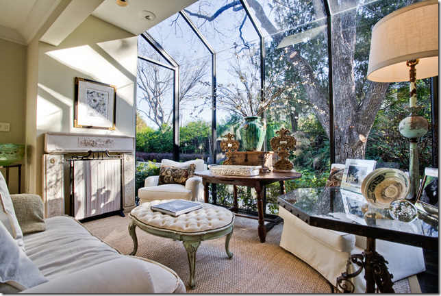
An added study space in a greenhouse type room. Pretty antique accessories and furniture. I love that ottoman.
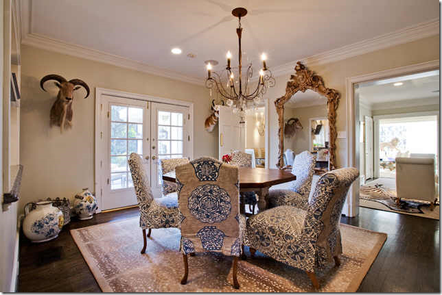
The breakfast room is very dressy and could double as a dining room! Slipcovered chairs in two fabrics and an antelope area rug. Love the oversized mirror and the chandelier. Doesn’t it look pretty next to the stair landing room with the view to the front living room?
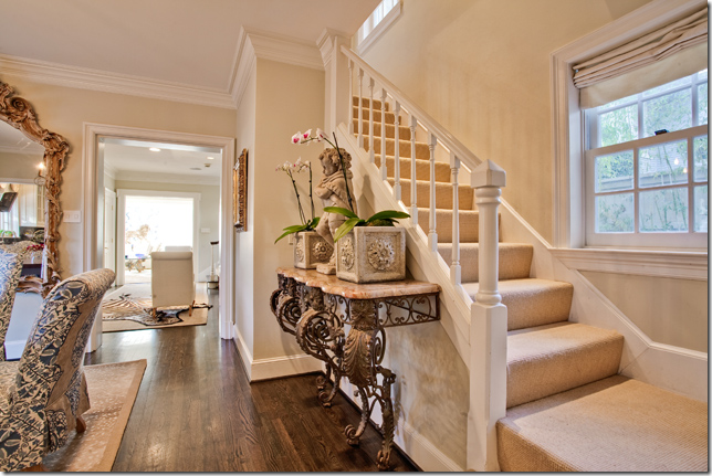
And, a second staircase off the breakfast room. Remember, the house is from 1917 – so there are a lot of changes in the original floorplan I’m sure. I would guess this whole back section is an add on. I like what she put on the buffet – a concrete statue and two planters. Nothing expensive, but it looks like a million.
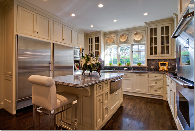
The kitchen is all new – I love the three plates hanging above the sink.
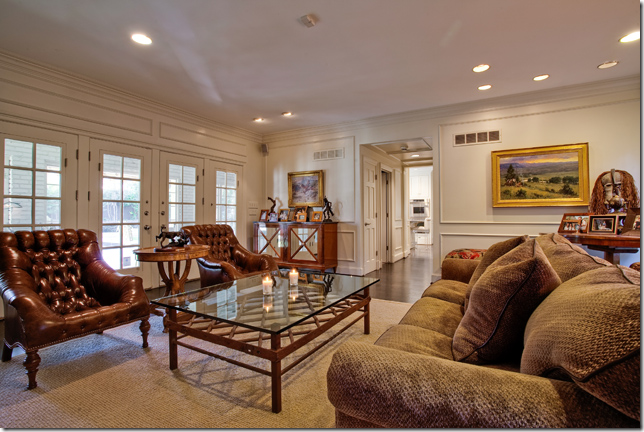
The family room, off the kitchen.
Blue, again! Pretty linens. Thanks to the reader for sending this house in! The listing is HERE.
HOUSE #3:
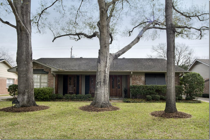
And, my listing from Houston, is a small house in Briargrove, a neighborhood filled with young families just starting out who buy these houses from older empty nesters. Built in 1961, it has 3 bedrooms and 2 baths and is $600,000 – high for the house, but you are paying for the close in location.
This particular house caught my eye because of the updates that have been done – like these beautiful wood French doors that replaced small aluminum windows. They make such a difference. The doors open to a front porch. And to those who think all Houston homes are white slipcovers, here you can see they aren’t! I love those toile covered chairs and ottoman – the furniture is overscaled and really fills up the room nicely – makes it warm and cozy. In new houses, the rooms are always so large and there is never enough furniture in them – making the rooms seem cold and empty. Always try to fill up your rooms with furniture if you want that cozy environment.
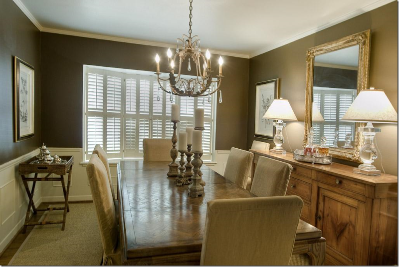
The adjoining dining room is painted darker for effect. Restoration Hardware lamps.
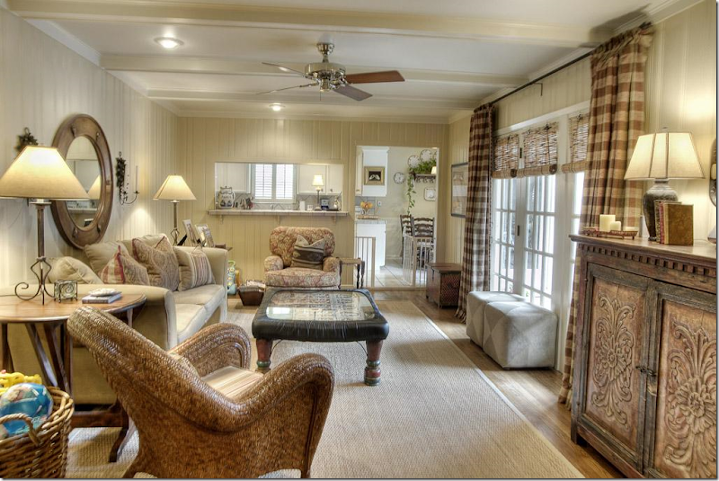
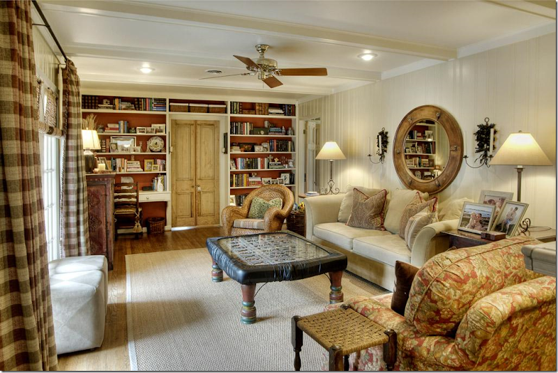
The paneled family room was painted light – which is a great way to update dated paneling from the 60s. Notice how much the curtains add to this room. They really brighten up the space and provide warmth and interest.
Looking the other way – I love how they painted the bookcases the persimmon color, which comes from the chair fabric. I do think they should have removed the baby proofing from the coffee table for these pictures! hehe!!!! And notice the wood doors here – this one small change adds so much to the space, creating architectural interest where there really isn’t any. Great idea! Great family room.
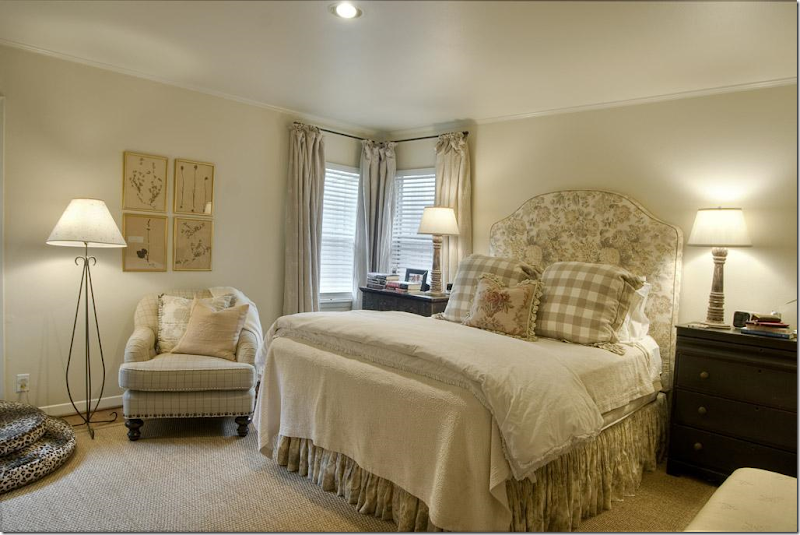
More checks. The use of checks in each room is another nice way to visually tie the house together – creating a flow of a design element. The owner has checks and plaids in the living room, the family room and the master bedroom. Cute headboard.
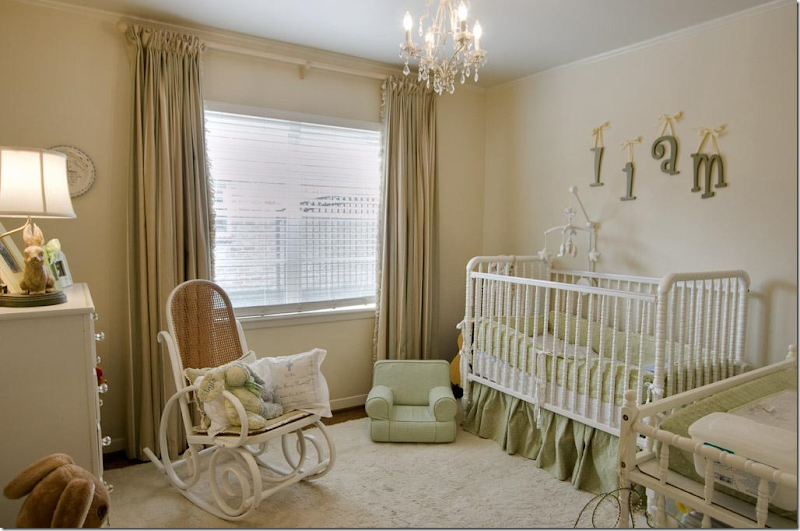
Nursery – more curtains which soften the room. Again, the room might have seemed bare with just the shades and no curtains. Always go for curtains if possible.
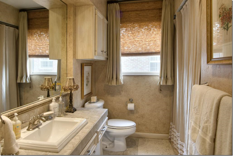
And a redone 1960s bathroom with new countertop and sink. I like the window treatment – good idea for an awkward shaped window. To see the listing go HERE.
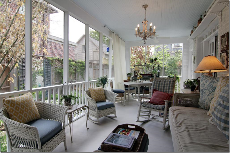
PORCH #1
I found this screened in porch from a HAR listing in West University. I would LOVE to have a porch like this!!
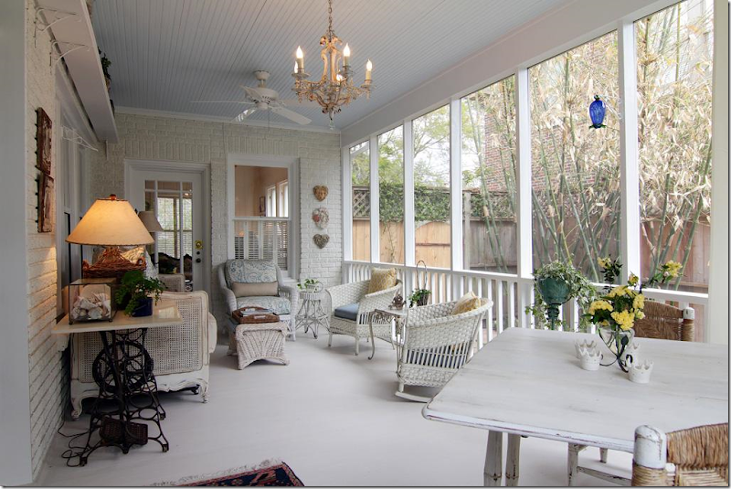
And looking the other way. Houston has so many mosquitos that screen porches are almost a necessity if you want to sit outside.
Kudos to HAR.com for coming online with these new super large images. So great!!!
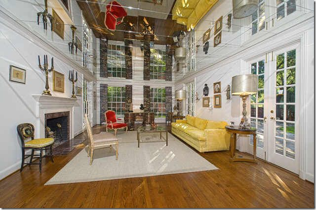
And finally, in the WTH is this department???????
I found this living room in a house for sale in Dallas. It took me a while to figure out exactly what the heck it was. Is this a two story living room with double windows???? No! If you look closely, you can see that the ceiling is mirrored tiles! OMG – this would give me such headaches. I suppose this was done to make the low ceiling appear taller – which it certainly does, but at the same time, it makes it look like there is a chair and sofa hanging upside down in the room. Crazy!!!!
Thank you to the readers for sending in these houses today. If you see a listing you think we would like to see here, please, please send it in!!!!!
AND FINALLY – HOUSTON WELCOMES BUNNY WILLIAMS THIS THURSDAY!!!!!
SOOOO Exciting!!!!!! Come see Bunny Williams at Greenwood King’s for a Discussion at the Lobby!!!
Readers Picks: Two Houses
Subscribe to:
Post Comments (Atom)





No comments:
Post a Comment