My client’s curtains that made me want some just like hers!
You know the old adage – don’t start redecorating unless you are ready to redo the whole place. Updating one thing makes everything else look dated. That’s exactly what happened when, on a whim, I decided to change out the tile countertops in my kitchen for white marble. While the new gleaming marble looked great, everything else then looked … not so great. At the time all my walls were painted a light, warm yellow with gray trim and my entire downstairs décor was designed around those yellowish walls. Once the marble countertops arrived, everything else in the house was out of sync: yellow paint and white marble doesn’t look all that great together. It drove me crazy. It’s been a slow process to rectify since I couldn’t afford to just redo everything all at once and truthfully, I wasn’t mentally ready to do that either. I hadn’t a clue what I wanted or which direction to go, but, it was obvious the yellow paint had to go, immediately. After testing about 15 gray samples, the downstairs and upstairs landing were painted a soft, taupe-ish gray (Pratt and Lambert Feathered Gray.) Afterwards, the family room and kitchen looked a little better, but the living room and dining room with their yellow fabrics made no sense. I’m still working on those front rooms, but I’ll show you what I’ve done to the back ones.
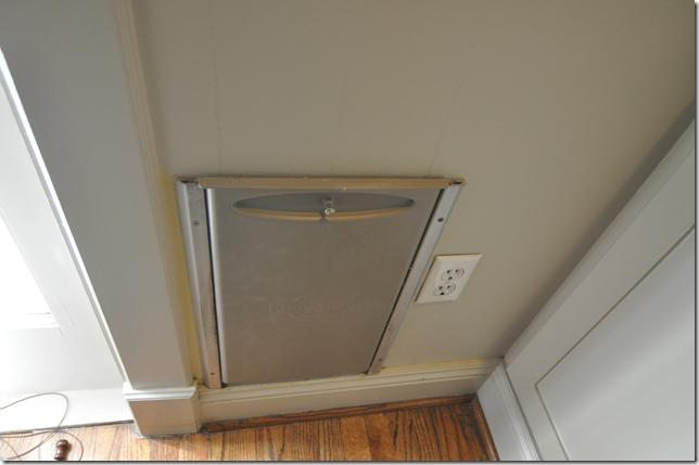
The dog door: for 17 years, the door was right next to the window, prohibiting any curtains which would have blocked it.
I finally had the brainstorm that in order to have curtains, I would have to move the door to the breakfast room! Took me 17 years to come to this conclusion.
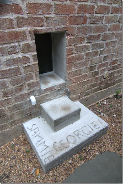
The new dog door: Raul added the concrete stairs on which we carved out the dogs names. Now, how do we keep possums and other critters out of the house?
Ever since I worked on my neighbor’s house last year and added curtains to her family room, I’ve been wanting to do the same to mine. Our two rooms are similar with windows all along the back of our houses and seeing hers looking so good made me just a little jealous. When we moved into our house about 17 years ago, I wasn’t as into curtains as I am now. I installed them only in my bedroom upstairs and in the nursery. For the rest of the house, we couldn’t afford wooden or even faux wooden shutters, which were so popular then, so we settled for the much cheaper faux wood blinds instead. Truthfully, we couldn’t afford the faux blinds either and had to put the entire purchase on a credit card. As time went by and I became a huge curtain fan, I added yellow silk ticking curtains to my dining room and living room. Those curtains made a huge difference and even Ben liked them, which was shocking because he was so against getting them. I eventually added more curtains upstairs and one by one, every single faux wooden blind was removed from the house. I would have loved curtains along the family room’s back wall as well , but there was the problem of the dog door. The dog door was installed right next to the windows and any curtains placed there would have become filthy dirty with the two pups running in and out 24/7. That misplaced dog door ruled my interior design! While I was busy insisting all my clients get curtains, I made my own excuses not to get them because of that stupid dog door. After lusting over my neighbor’s curtains, I finally admitted to myself that in order to move forward, I would have to find a new home for that dreaded dog door. In the end, it was ridiculous how something that took just two days to rectify – had taken me years to act on! In the breakfast room, my painter, Raul, expertly put a hole in our sheetrock through to the brick leading out to the back yard. He even added two concrete steps for the dogs to be able to reach their new entry. The pups quickly acclimated to their changed routine and, finally, after all this time, I was able to get curtains in my family and breakfast room. Here’s how the room looked before - with the yellow walls and no curtains:
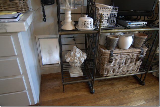
Before: yellow walls and no curtains. The old dog door is hiding right behind the lamp table on the right side.
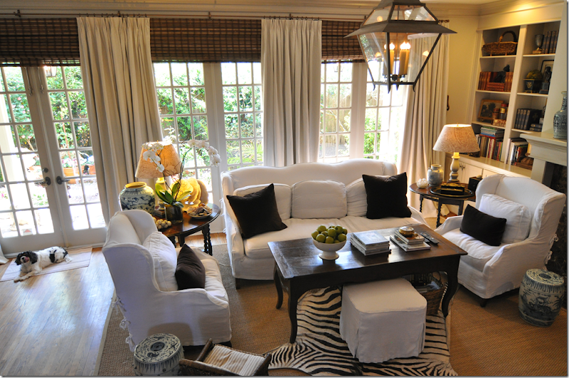
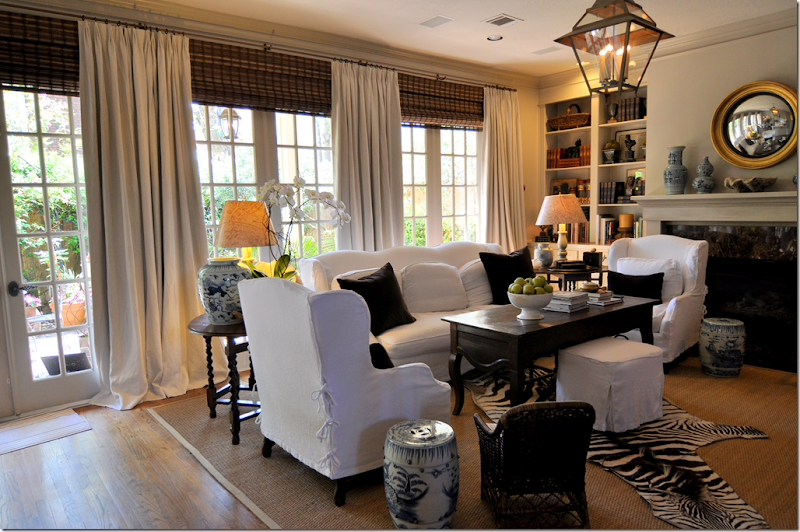
The new gray paint and the new curtains! I used a Pindlar and Pindlar linen in white with a thin gray pinstripe. The woven shades are pulled up to the molding to visually elongate the line.
We made one long rod from left to right by connecting five smaller ones. The discounted brown shades were ordered and installed by Monica who does all my curtains, bedding and installations for clients. For details on the shades, email her at custcrea@sbcglobal.net
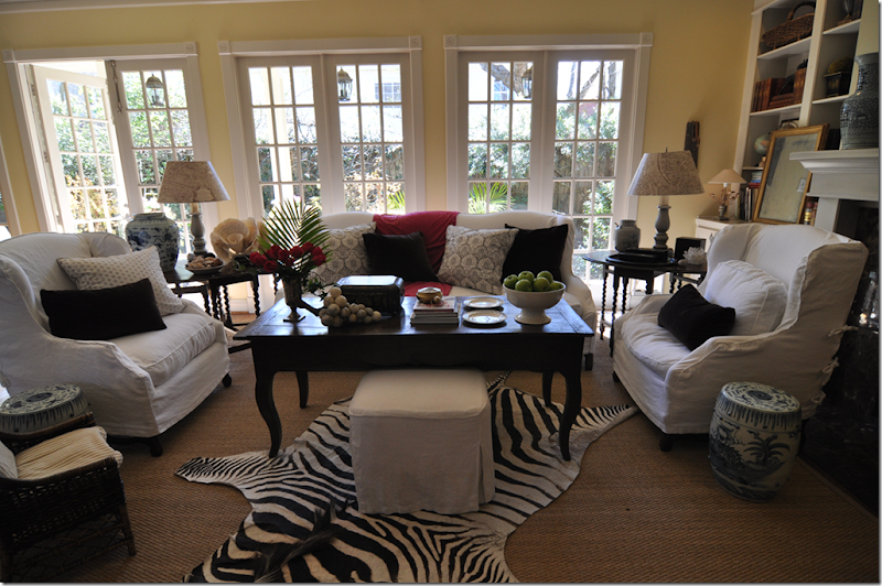
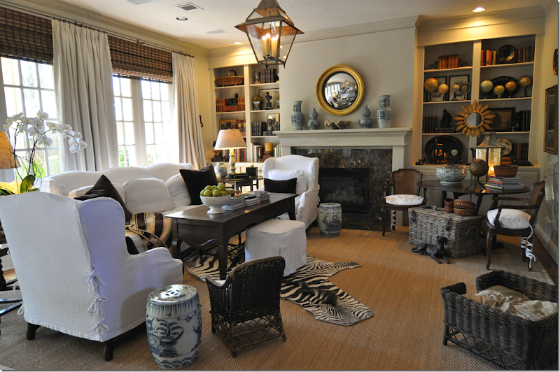
And a view of the entire room. It’s so much quieter now with the curtains. It’s like all the sound is muffled.
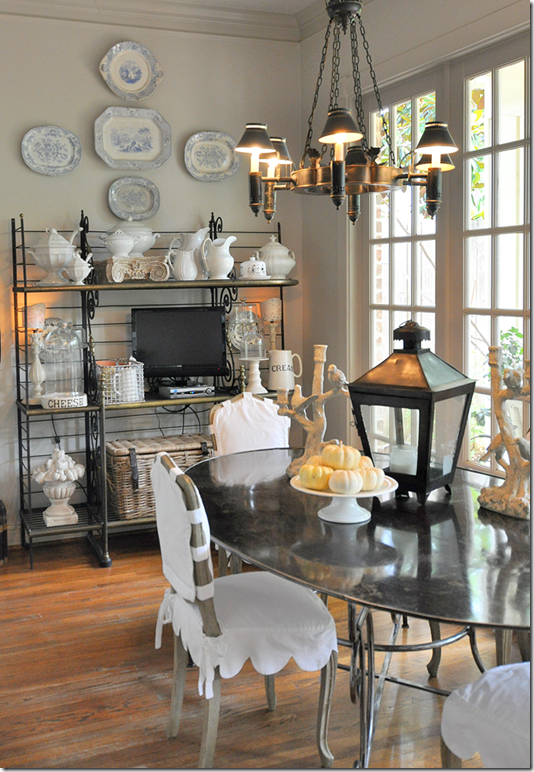
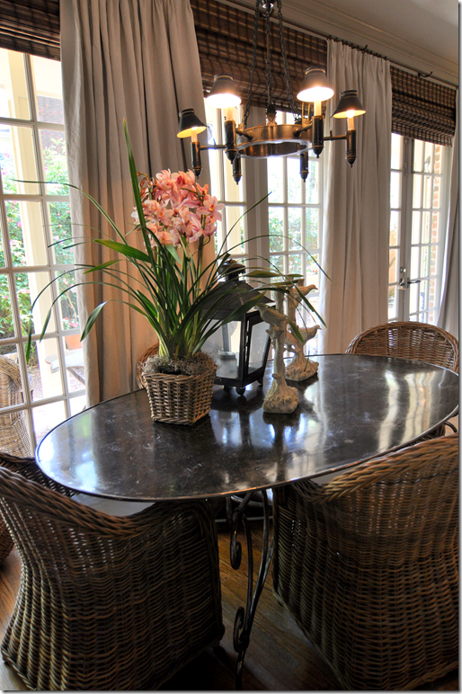
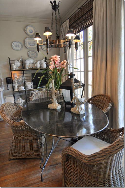
So, did you notice I haven’t shown the breakfast room yet? Well…remember my obsession with Koobo wicker chairs?
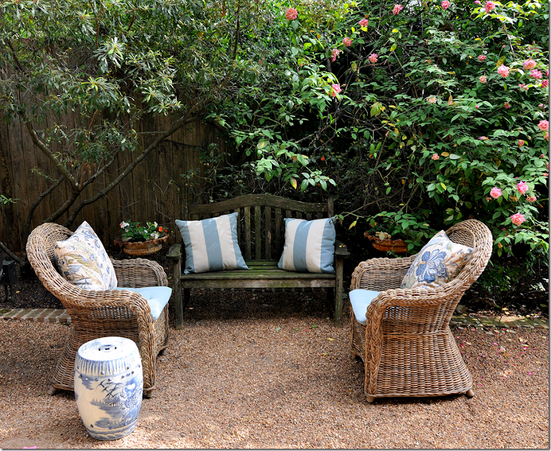
I’ve been debating back and forth whether I wanted to get the Koobo chairs for my breakfast room. While I love the French chairs I got from Tara Shaw, I just really wanted to try the wicker ones. I thought that if they didn’t work out, I needed some for my backyard anyway….so….
I ended up getting the Koobo chairs and loving them. But, it’s a long story from there to here, and maybe you can learn from my HUGE mistakes.
Originally, I couldn’t decide between the Koobo chairs from Pottery Barn or from Cost Plus World Market. My thinking was that I should order the Pottery Barn chairs since they were a little bit bigger than the Cost Plus World Market chairs, plus PB delivers and I didn’t want to schlep the chairs back to my house. So many things were wrong with my thinking. First, the PB chairs are three times more expensive at $349. versus Cost Plus at $129.00 (on sale.) Second, yes the PB chairs are bigger, but I needed smaller ones for my space! I have no idea what I was thinking!!!! Comparing the two chairs – the PB chair does have a nicer, thicker woven trim than the Cost Plus chair, BUT their seats are unfinished! You have to use cushions with the PB chairs, while with the Cost Plus you either can or not use the cushions, your decision. Plus, I waited over four weeks to get my PB chairs – while I could have had the Cost Plus chairs that same day.
This is what the PB chair looks like under the cushion. I know – shocking! At three times the price, too!!!! Why did they leave the seat unfinished? It’s ridiculous.
These are the Pottery Barn chairs. You can see the trim is somewhat nicer and thicker, but this is the only visible difference. They are a tad bit bigger than the Cost Plus, but it’s not that noticeable at all. And, of course their bottoms are not finished out. Plus they are three times the price of the Cost Plus chairs. IMO, there is absolutely NO reason to buy these chairs over the Cost Plus chairs. I just wish I knew all this, then.
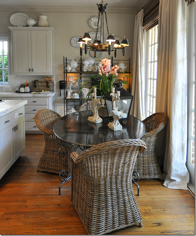
In the end, I lived the too big PB chairs for a week and then went to Cost Plus to check out their chairs. I ended up schlepping the four chairs home, something I had tried to avoid in the beginning. These chairs fit around the table much better than the PB ones. Two of the extra PB chairs went outside where I needed them, and the other two went into my guest room and office.
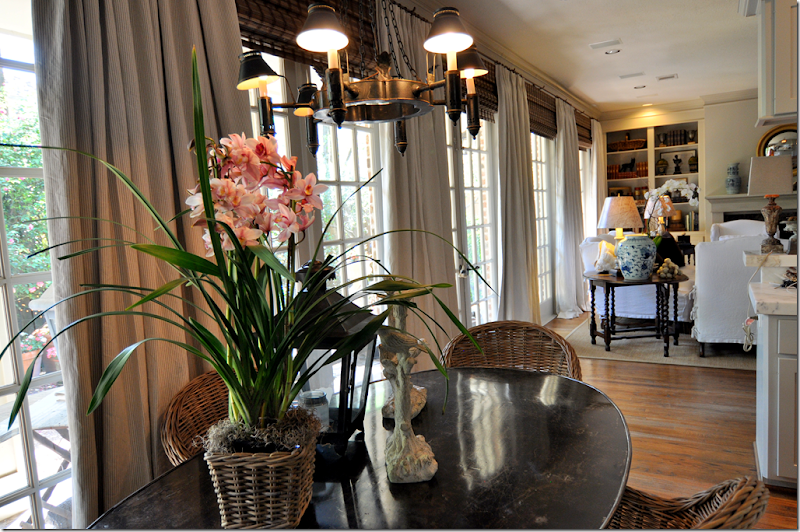
Here’s a view of the curtains from the breakfast room looking towards the family room. I can’t tell you how much better the back of the house looks now with the curtains. They add so much warmth and coziness, it’s a huge difference. Even Ben was stunned when he came home. I probably should have never told him of the change before hand because he was so negative about me adding the curtains. It would have saved me a lot of grief to just surprise him!!!
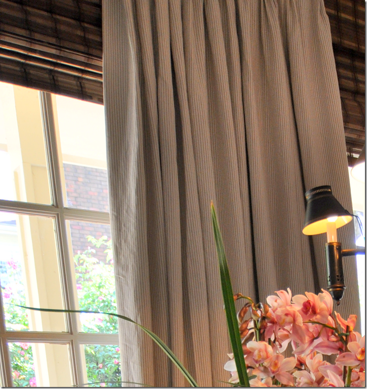
Here’s a close up of the P&P linen – you can see the pinstripe here. Looking at the fabric from afar, the stripe is really too subtle to make out. It took me months to decide on this fabric. I couldn’t make up my mind if I wanted a pattern or a solid. I was hooked on an ikat and then a damask for awhile. I even considered a toile. But, I kept coming back to this fabric, so I decided I must really like it. We used a black out lining to keep the sun from shining through the fabric and fading out the stripe. We also used two widths per panel for fullness. There are no ironed in pleats and the drape is puddled just an inch or two on the floor.
The cushions that come with the Cost Plus chairs are adequate, but one day I will need to make covers for them so that I can keep them clean looking.
Looking at the row of windows towards the breakfast room.
I’m really happy with the results and there are just a few things on my wish list that will probably never happene. I would love to add doors to my shelves just like Jill Brinson’s HERE. And one day, I would love to get a stone mantel. I still need to refinish my wood floors, or paint them, something I am dreading and keep putting off. As for the living room and dining room, those changes are coming along and hopefully I’ll show their modest updates in the next few months.
Coming soon – three really great giveaways – so be sure and watch for them!!
Decorating Updates at Cote de Texas
Subscribe to:
Post Comments (Atom)






No comments:
Post a Comment