 As you know, if you read Cote de Texas, I have been working on the Tanglewood House. What started as a simple job to pick out marble tile for a bathroom ended up as a rather large redecorating job for a good portion of the house. Today, we finally finished up everything after working together for about six months. When I first met my client, she was someone who read my blog and from there had called me to help with her bathroom remodeling. When I left her house today, probably not to return for quite a while, it was a sad occasion. You see, my client and I have become friends over this experience – something that usually happens when you work together with someone, day in and day out. Of course not all clients end up as friends, that’s for sure. With some, when the job is over, you run for the door and pray they never call you again! But with most, the ending is bitter sweet. We were talking about this and my client said – it’s like when you have a baby – your OB/GYN doctor becomes such a major part of your life and after the baby is born, you rarely see him/her again. Exactly! Redoing a house IS a lot like giving birth. All the planning and preparations for that one day when the installation happens – an event akin to labor itself – and then it’s all over, except for tallying up the final bill. So, leaving today was sad for me. I know it’s not going to be the same between us – and that really upsets me! My client is so sweet and nice and fun, I’m going to miss her and her family and Mimi!!!!! Awwwww – MIMI!!!!! – the cutest little Cavalier King Charles puppy you’ve ever seen. Mimi – you can come visit me when I’m still in my glasses and pajamas any time you want to, ok??????
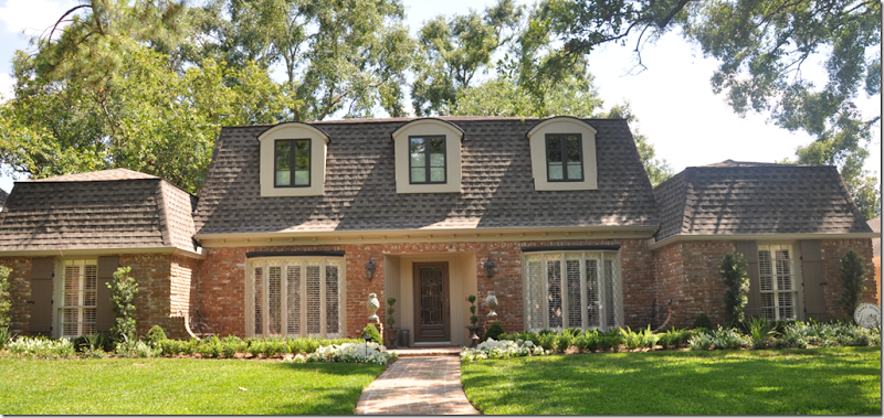
BEFORE: The Tanglewood House facade.
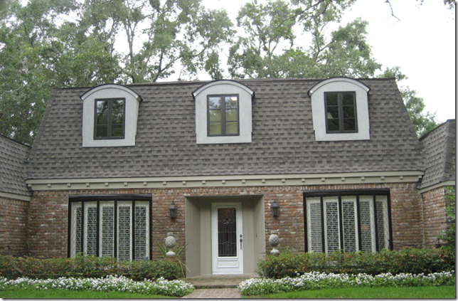
The old dormers were removed and replaced with more up-to-date windows. A new roof was put on and French styled plank wood shutters (designed by my client!) were added to the far left and right windows. Fresh new landscaping went in. Working with clients is a matter of give and take – some battles are lost along the way, some won. For instance, I really thought the roof should have gotten darker shingles, but I lost that one. And I fought hard to have the brick painted a beige color instead of the varied red color. I lost that one too! I also recommended the bow windows be replaced with something more updated – but agree the cost wasn’t worth the change it would bring. One recommendation I made – to paint the bow windows’ trim in the same dark color as the dormer windows - turned into a fiasco and was a huge mistake. The bow windows with the dark painted trim stood out and looked so exaggerated, it was relief when they were repainted to a less attention-grabbing taupe. I certainly am not a designer who isn’t willing to admit a mistake – which the window trim paint clearly was. Thankfully my clients agreed with me that I had royally screwed up. You will too:
In the middle of painting – the trim on the bow windows was tested. Yikes!!!!!! The horror!!!!!! The horror!!!!!!
OMG!!! So much better!
A side note – comments about the Tanglewood House left by you, the reader, have been almost 100 percent positive and that is something I am most thankful and most grateful for. As always – you are so kind and supportive, it boggles my mind! Of course, the three negative comments I DID get, ended up being the only ones that stuck in my mind! It’s not so much my feelings that get hurt, but I hate that the clients have to read them – especially when the negativity is really a troll aiming at me, personally. But, one negative comment bears repeating – just in case you missed it! An architect berated my choice of ruffled and scalloped slipcovers because the house’s lines and detailing, she said, was clearly modern – and my design would have been better suited for a chateau. That comment made me laugh. Does this house look modern to you? With its mansard roof, it clearly is a French styled house, or chateau – exactly why the slipcovers made sense!
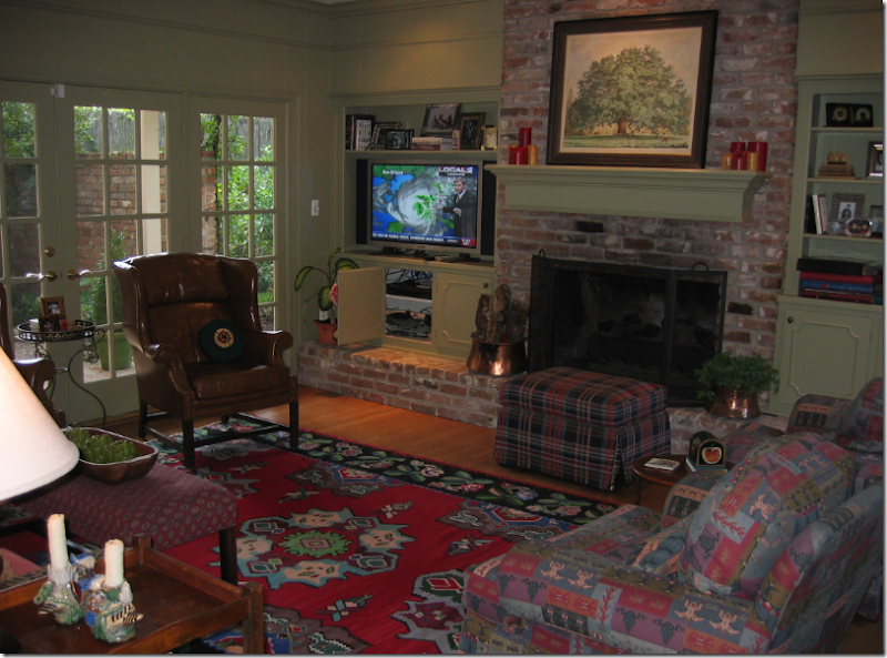
BEFORE: It started like this – the Family Room.
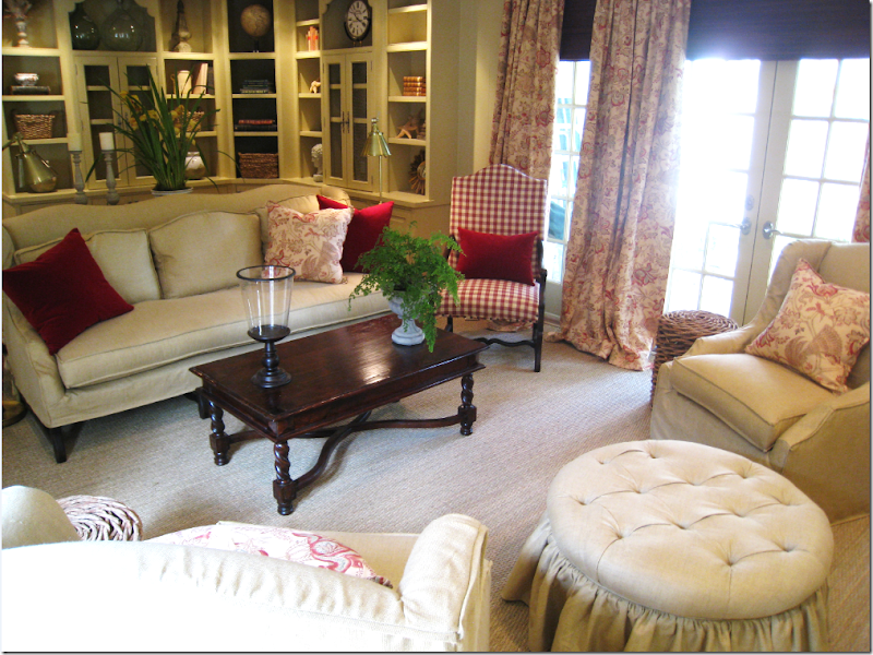
And after.
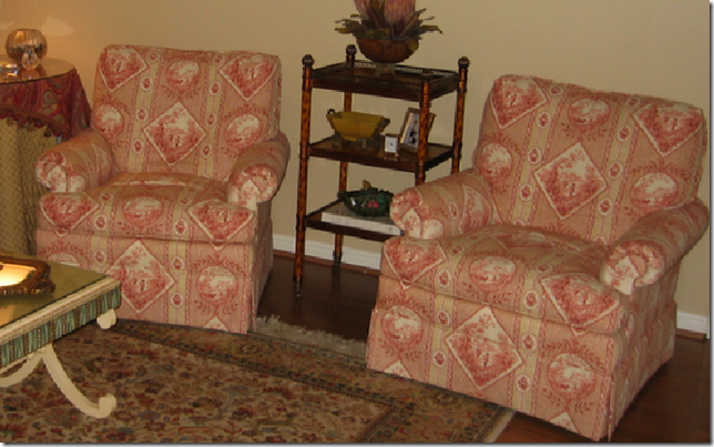
BEFORE: The Living Room looked like this until a few weeks ago. These chairs, completely remade, ended up in the Master Bedroom.
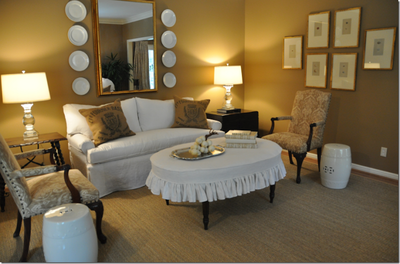
AFTER: The Living Room today.
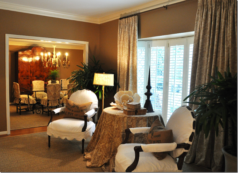
AFTER: The Living Room.
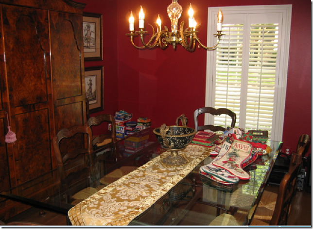
BEFORE: The Dining Room
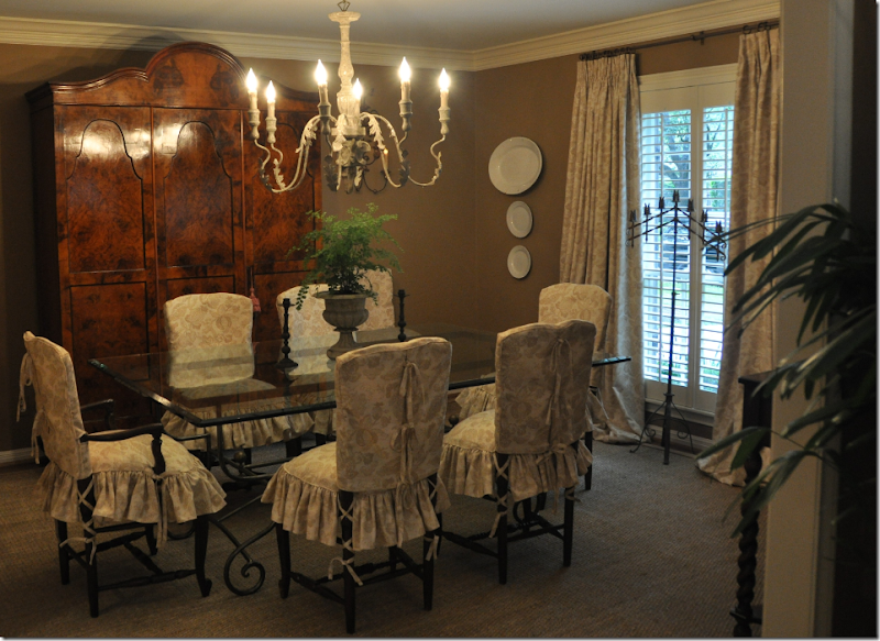
AFTER: The Dining Room
The last room to be finished is the master bedroom suite. First the bathroom had to be tackled. The master bathroom connected to the powder room – which was an unacceptable arrangement for the clients. From the combined large space, a separate master bathroom was created along with a separate, small powder room. The construction was a huge mess and it took a few months to finish, but in the end – it was mission accomplished.
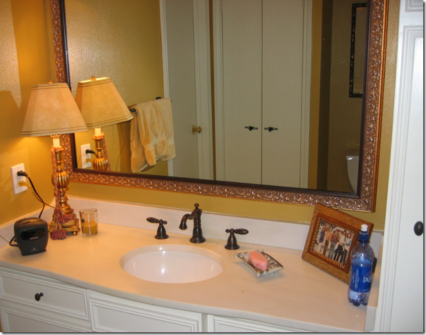
BEFORE: The Master Bathroom was a series of small rooms that contained the tub and toilet area and led to the powder room area out in the foyer hall. During construction, two separate rooms were created – a master bathroom and a powder room in the foyer hall. This mirror was antiqued and is now hanging the living room!
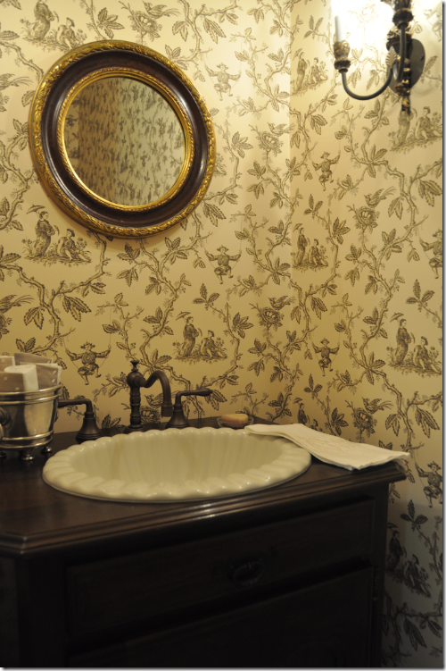
AFTER: The Powder Room is now a very small, but totally functional and private space for guests. The wallpaper is Colefax and Fowler Chinese Toile in brown and cream. We hung two double light sconces from Festoni and a mirror that was the client’s own. This round mirror is just the perfect size – and the gilding gives off a slightly dressy vibe. The floor is Creme de Marfil marble.
The sink is ivory colored and scalloped – a nice, extra detailing.
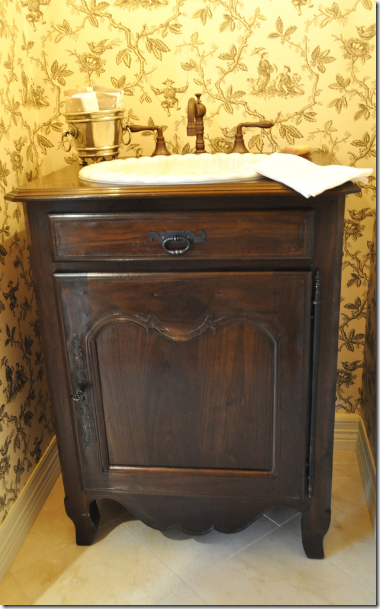
The sink was set into this French styled cabinet custom made by J. Tribble. The cabinet is wonderful – notice the authentic hinge hardware on the door. In such a tiny space, the sink becomes very important – and I think this was the perfect choice - understated, casual, and so good looking!!! Rather than mess up the walls with towel holders, my client put a few rolled guest towels in a small pewter bucket.
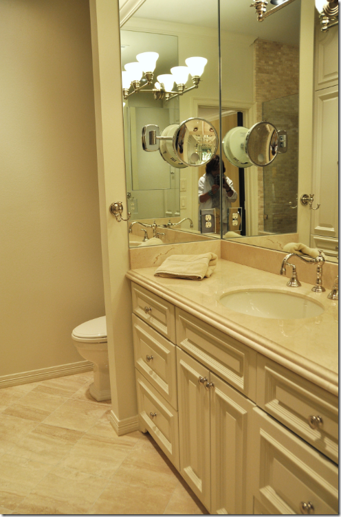
AFTER: The Master Bathroom – again, a rather small space, the clients chose to have one sink to gain countertop room. A cosmetic mirror was installed on the space-stretching mirrored walls to keep the sink area clear. Besides using mirrors to make the space appear larger, the color choices were kept monochromatic – another . Creamy marble was used for the countertops and floors. Before, the bathroom was a series of small rooms behind closed doors. Now it is all open, again helping to make the room appear larger. The toilet area is hidden behind the wall to the left of the vanity and the shower is across from the vanity. And yes, I know, I look like a total nerd in the mirror!!
The shower is large and luxurious. It is lined in a cream colored mini subway tile and to further streamline the edges, a frameless door was chosen. Inside the shower, we installed a regular shower head and a rain shower head.
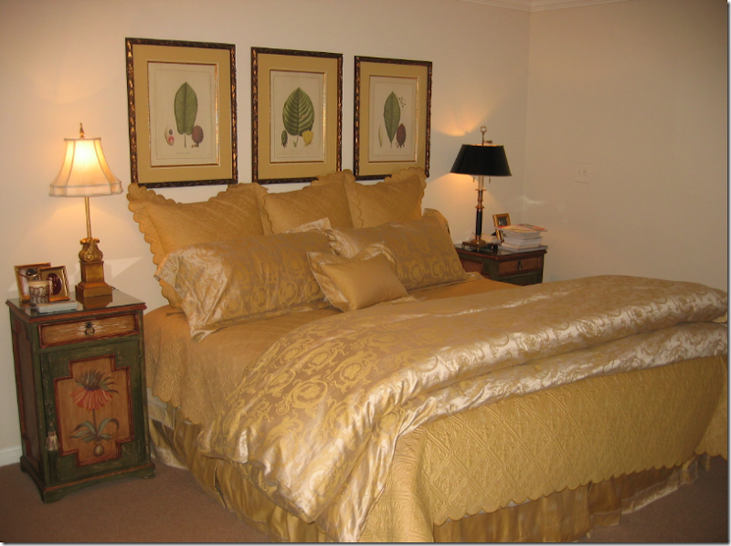
BEFORE: The Master Bedroom.
Once the messy master bathroom remodeling was completed, we started on redecorating the master bedroom suite. The client wanted to keep her bedding which she had recently purchased – so we chose a soft golden yellow as the color scheme. First, we took down the botanicals, and along with a fourth one, reframed and rematted them to hang in the stairwell. We wallpapered and replaced the carpet, bought a new ceiling fan (!!!!), added recessed lighting, and a flat screen TV was purchased to hang on the wall in front of the bed. The nightstands were not matching, nor were the lamps – so these were also replaced. Additionally, there was no headboard, so we added one in a shape the client had seen in a magazine.
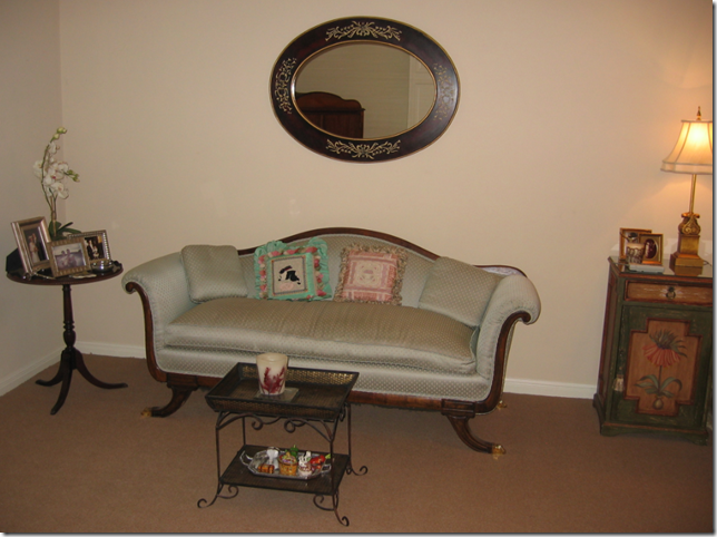
BEFORE: The bedroom is long and narrow, which allows for a nice sitting area on one side. The furniture was an accumulation of Grandmother’s goodies, which will now come in handy for college apartments!
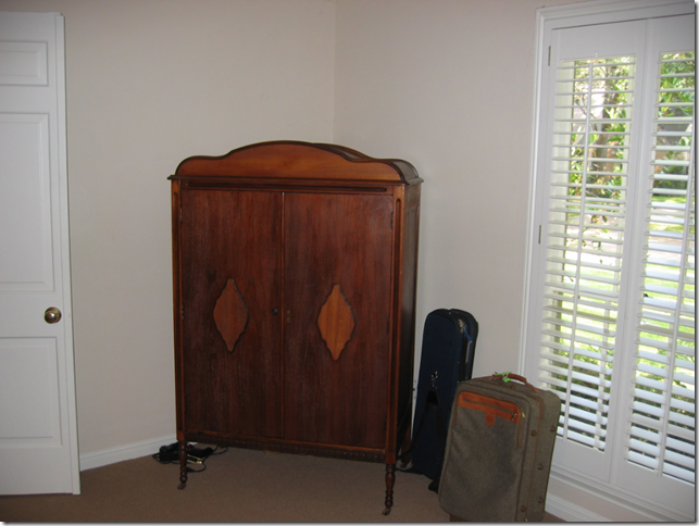
BEFORE: Like the dining room and living room, there is one window in the master bedroom – facing north – which makes the room rather dark. The sunny golden yellow color scheme helps to brighten it up, as does the newly installed recessed lighting. Granny’s armoire held the TV – which made watching from the bed awkward. Now, the flat screen hangs on the wall directly in front of the bed – much better!
BEFORE: We took the two toile chairs in the living room and had them reworked and recovered in a soft chenille. To update the chairs – we had new cushions made, with no welting – just seams. The fabric was softly pleated on the rolled arms and a “dressmaker” skirt was added instead of the more “granny” short skirt.
AFTER: The Master Bedroom.
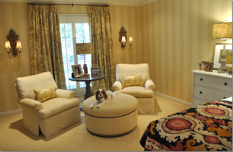
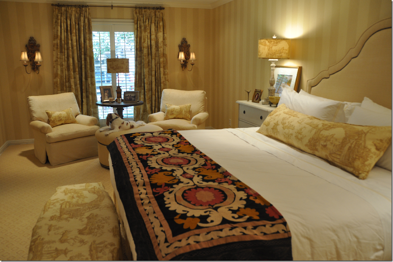
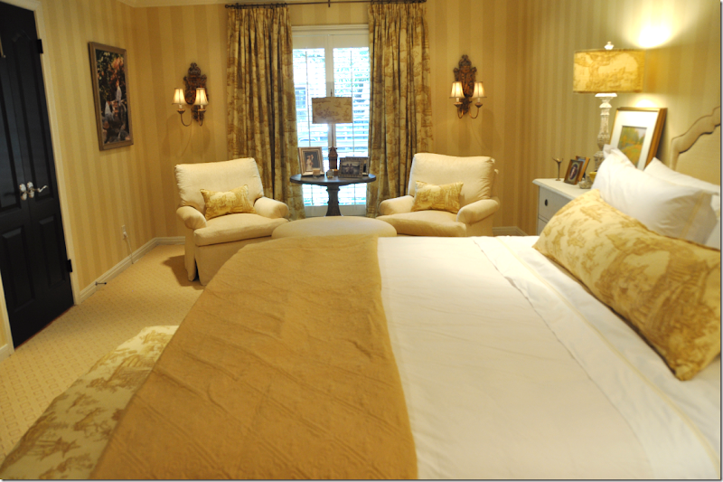
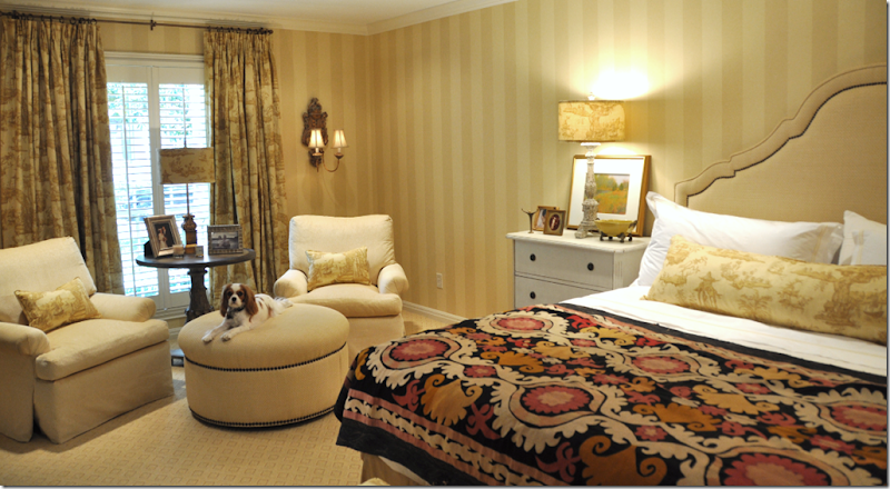
MIMI!!!!! This shows the sitting area in the master bedroom suite. To get the “bones” of the room freshened up – we wallpapered it in a muted two-toned golden yellow stripe – the stripe was chosen to visually raise the low ceiling. The beige berber carpet was replaced with a patterned, flat weave rug in the same color tone. We painted all the doors black for accent. There is only one small window in the room – with plantation shutters – so we added curtains fashioned out of a toile linen. To make the window appear larger, the curtains were hung a foot past the moldings on each side and we raised the rod to the ceiling. Each panel consists of two widths of fabric, lined in blackout to create weight for proper draping, and finally, the hem rests 3 inches on the floor. This formula is one I use for curtains over and over again and it really seems to work in most situations. We installed wood sconces to flank the window to further widen the long, but narrow room. All three lampshades in the room were made out of the toile fabric - a detail which adds a nice finishing touch. The round table between the chairs came from Aidan Gray and the round ottoman is upholstered in a raffia fabric, with nailhead trim, which is duplicated on the new headboard.
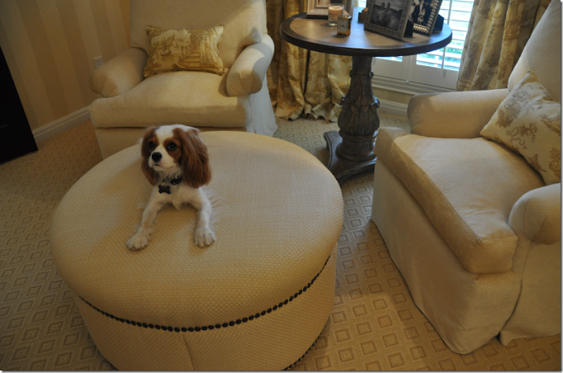
Close up of the sitting area. Note: The ottoman and table were both chosen in round shapes to soften all the square lines in the room.
MIMI!!!!! Such a good girl!!!! Here you can really see the pattern in the carpet and the raffia fabric on the ottoman. Also – notice how the chairs were updated with no welting, pleated arms, and dressmaker skirts which softly flow from the deck – without the need for a short skirt.
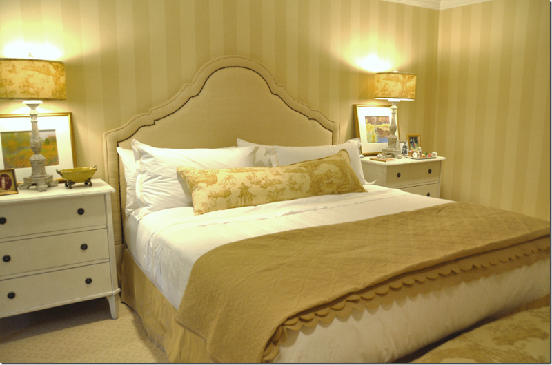
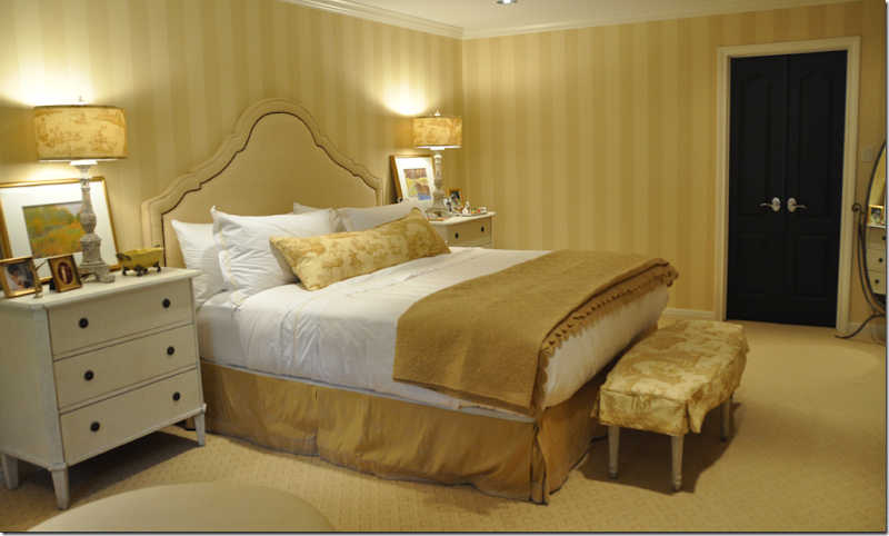
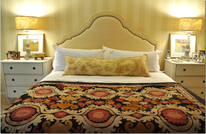
The headboard was designed to be flat, instead of the more padded upholstered headboards of the 90s. The nailhead trim further updates it. We purchased matching reproduction Swedish nightstands from Halo Styles and lamps from Aidan Gray. My client wanted to reuse her bedding, but I felt using all of it was too much gold and visually heavy. To lighten the bedding, we purchased a set of “hotel” sheets from Restoration Hardware, trimmed in gold. Now the white sheets and shams pop the gold bedding and headboard. A large lumbar pillow was made from the toile fabric. The three Euro shams in the gold were put away. And, I prefer the flat, scalloped matelasse to the more poufy duvet.
The slipcovered bench at the foot of the bed is from the Swedish line at Halo Styles.
Another bedding option she has, is this antique suzani. The golds and creams are great matches, and the black picks up the color of the doors.
Which do you prefer, the suzani?
Or the matelasse?
It’s a discussion in progress, as are all very important decisions! I’m not sure which one I prefer myself.
So, this is it for the Tanglewood House – I’ve hope you have enjoyed the series, as much as I have enjoyed designing the interiors!! Go here to read Part I and here to read Part II. Now, say goodnight Mimi!!
Oh, wait, someone else wants to say goodnight too! Now, don’t get excited, but she’s a Hollywood Star and I’ve kept my client’s identity a secret until now – didn’t want the Papparazzi to get wind of this.
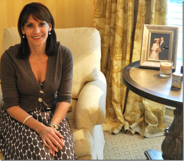
Meet my client, my friend, the great Ms. Sandra Bullock! Well, she IS a dead ringer for her, isn’t she??????
Please, don’t kill me for this!!!!! ;)









No comments:
Post a Comment