In Houston, there have been many architects who have left their mark on the city. Perhaps the one most associated with Houston is John Staub, who designed some of the original houses in exclusive River Oaks. There were others, greats, like Philip Johnson whose soaring buildings certainly changed our landscape. Today, there is a new crop of younger talents who have risen up along with all the custom houses built, many on lots where the older ones have been torn down. One of my personal favorite of today’s residential architects is Kurt Aichler. So many of the houses I admire are ones he designed for clients – each is different, each unique. Over the years his reputation has grown along with his portfolio. Any house designed by him is always proudly identified as such in real estate brochures and on neighborhood tours. My own dream house was built by Aichler and every time I drive by it, I slow to a crawl and look at it longingly – as if one day it might truly be mine.
While Aichler has mostly designed custom houses for clients from the ground up – there are some that he tastefully and sensitively renovated. One of the houses shown here today is a true addition, made to a house built in the 1930s. The other house shows an addition to a house he originally designed. These two houses are vastly different – which certainly shows the range of the man. I hope you enjoy them!
Kurt Aichler House #1
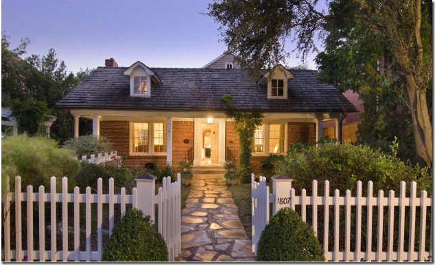
An eagle-eyed Cote de Texas reader emailed me about a house that was just listed for sale in Houston: “Quick – go look, you are going to love it!” Of course I did – what is not to love about a charming cottage with cute as can be dormer windows? But really got my attention was that Kurt Aichler had designed its addition. Addition? What addition? All you can really see is how adorable the house is – a small cottage with a picket fence and a cobblestone walkway. Once the house had truly revealed itself, I was wondering if I could afford it and how fast could I move in? The facade is an illusion - Aichler left it untouched so that it would blend in with the neighborhood. His goal was certainly reached: from the front it is virtually impossible to see how large the addition is. It is also impossible to see from the street that this house was designed by Aichler.
Once inside the picket fence – an English styled garden is revealed with flowerbeds on all sides.
The house for sale is located in one of Houston’s older and more beautiful neighborhoods, Southampton, the one area I would truly love to move to. House after house is just as charming as this. Unlike in my neighborhood, West University, many houses here have been restored instead of torn down. Even the newly built houses in Southampton are special – most avoid that cookie-cutter red brick faux Georgian style that plagues my area. But, without a doubt, what really makes this neighborhood special (besides all the towering oak trees and lush landscaping) is the alleys! Alleys mean there are no front loading garages overshadowing the houses. And alleys mean there are no driveways up and down the street. Instead, without all the excess concrete, Southamptons’ front yards meld into one another with large expanses of grass and flowerbeds. The current trend against alleys is certainly regrettable especially in areas where the lots are so tiny that all you see are garages on top of garages.
The Front Living Room.
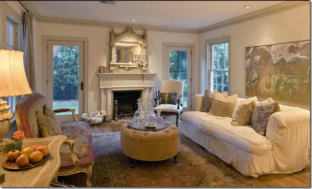
Ready to go inside? To the left of the front door is the living area – are you drooling right now? I am, for sure. The white walls are highlighted by gray painted moldings. Newly installed doors on both sides of the fireplace lead to the side yard. A wonderful, worn antique rug in pinks and greens blends with the French settee which is covered in a pink and cream antique textile. A large canvas behind the sofa is in perfect proportion – almost as if it was painted to fill that space. I love this type of designing – where each piece was purchased because someone loved it – as opposed to because they needed it. Nothing here screams decorator or interior designer – instead it looks like the house is owned by someone who knows herself, her style, someone who doesn’t need any help with her house, someone who is probably as chic as her interiors!
The Formal Dining Room.
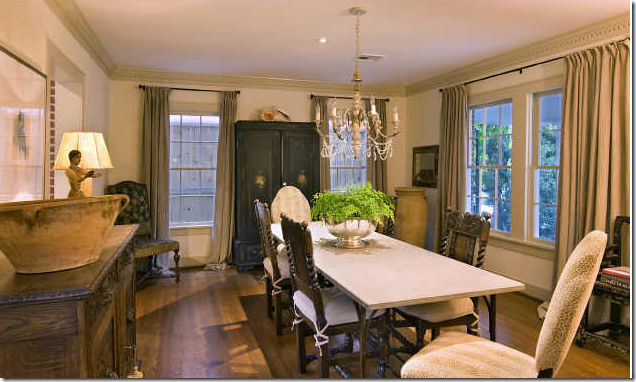
Across from the front living room is the dining room with its mixture of antique furniture. Simply hung linen curtains soften the look. A trendy Italian styled candlestick fixture lights the room, while a large armoire anchors it. Two different styles of chairs surround the stone topped table creating extra interest.
The Kitchen/Breakfast Room.
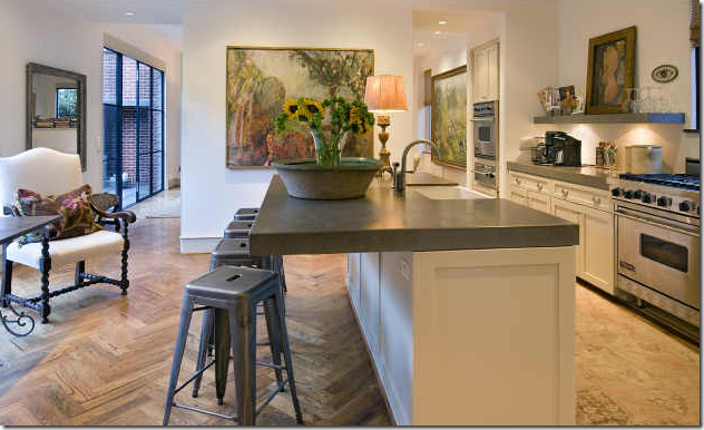
Once past the living room and dining room – you enter into the two story addition where the drama of the Aichler addition begins. Here, the flooring changes from wood planks to a wonderful herringbone pattern which has a very Belgian look to it. In the kitchen, thick countertops and no overhead cabinets sets the mood - saying this is no ordinary kitchen. Instead of being a utilitarian space, it almost looks as if it is an art gallery with all the paintings. I wonder if the owner is an artist? Notice the worn antique runner in the long galley area: using decorative items such as the rug and the lamp in a kitchen is a great way to warm up the space and humanize it. The bar stools are fabulous and add an industrial touch - all the different styles make the space eclectic and interesting.
The Breakfast Area.
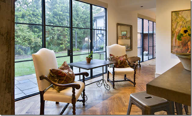
Looking from the kitchen sink out towards the breakfast area and the side courtyard. Notice the wonderful wooden shelf holding all the dishes, glasses and cookbooks. Two antique chairs surround a small iron table. But, to be sure, it’s the huge steel door that steals the show here. How glorious it is!!!!! Of course there are no curtains here – the windows are a work of art! These steel beauties, along with the wood floor further the Belgian vibe that runs through this space.
Kitchen and Breakfast Room.
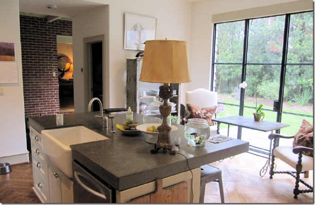
In this view of the kitchen – you can the wonderful farm sink – I just love these large sinks! And to the left – is the brick wall from the original house, left exposed. Through this opening – you can see into the front living room.
One last view of the kitchen/breakfast room – showing the opening that leads to the family room and music room beyond it.
Family Room.
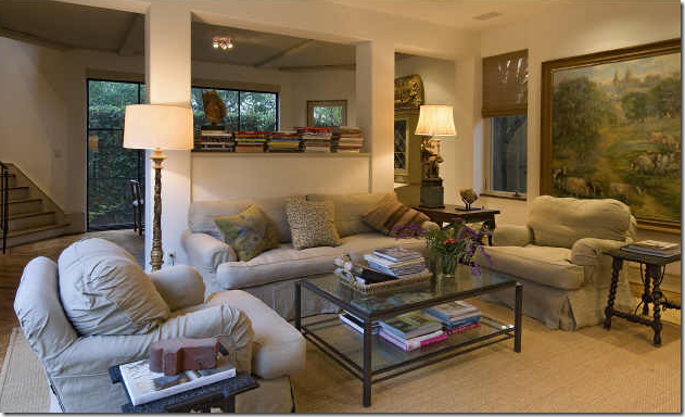
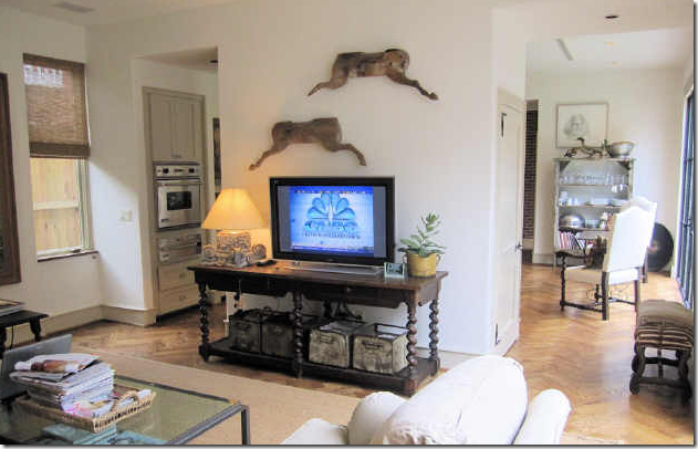
Walking past the kitchen and breakfast room is a large family room. The space is furnished with comfy, cushy slipcovered furniture in linen along with an assortment of wood antique tables mixed with a contemporary glass coffee table. Another huge canvas provides the color. A pass through divides the family room from the music room on the other side of the wall. Seagrass completes the room – of course seagrass, this is Houston after all, the seagrass capitol of the world!
The view from the family room into the kitchen/breakfast room. A large barley twist console holds the TV.
The Music Room.
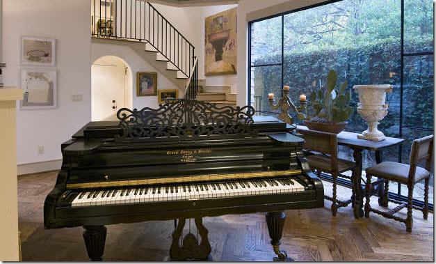
The music room, at the back of the house overlooks the rear of the property with its vine covered fence. I love the Spanish table surrounded by chairs and deftly accessorized with just an urn, a cactus, and an Italian candlestick. Again large steel windows add that something special here. The beautiful and graceful stairs leads to the bedrooms upstairs. The stairs – something so simple – yet there is something so perfect about these. What is it? I’m not sure, but they are definitely designed by someone who knows exactly what he is doing and is doing it expertly. Which is exactly why you would hire Kurt Aichler to design your home. Just wonderful!!!!!
The Master Bedroom/Bathroom
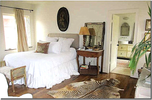
Upstairs, the master bedroom is furnished with more antiques and a slipcovered headboard with dreamy white linens. A vintage zebra skin adds an exotic touch, I love the brown tones in the zebra. This room is so romantic – I halfway expect Karen Blixen to waltz in! Again, this room has that undecorated look that is so hard to capture. Very few people can do this look “right” – and this homeowner has it in spades. Through the door you can see the bathroom with the vanity made from a piece of furniture, a Venetian mirror, and a vessel sink with wall mounted faucet. It looks like there is an antique rug in here too.
The Master Bedroom
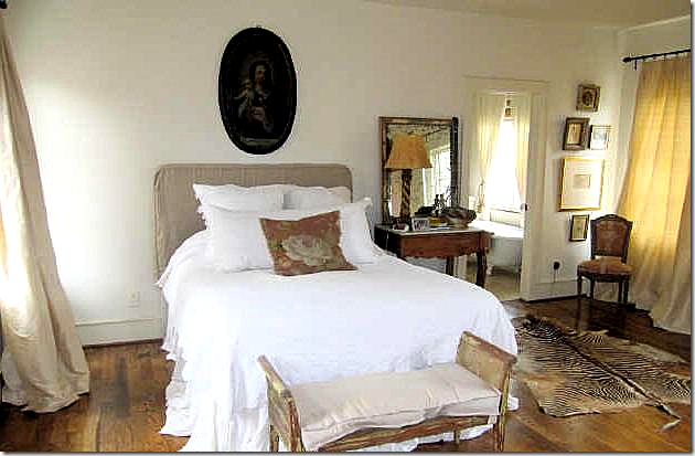
I just love this room – the beige taffeta curtains, the oval religious portrait, the simple bed, the French antique nightstand with its aged mirror. Through the door – you can see the vintage tub that overlooks a window in the bathroom.
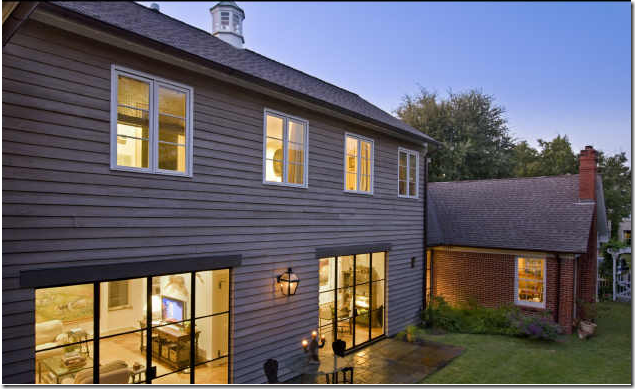
And finally, a view of the original house with the addition. It’s almost impossible to see the addition from the street – thus the house still fits in the neighborhood with all its small cottages. The cupola was taken off the original house and put here on top of the addition. The side yard is huge and there is definitely room for a pool – I wonder if the new owners will add one? Through the steel windows here – you can see the family room, then the kitchen/breakfast room and there appears to be another steel window where the brick house connects to the addition. The formal living room is seen in the brick house, where the window is. The three bedrooms are all upstairs.
Kurt Aichler House #2
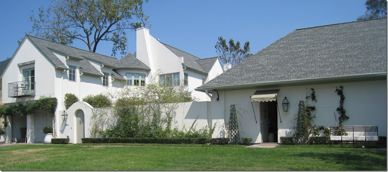
Readers of Cote de Texas may remember that the house where The Fabulous Flea is located was also built by Kurt Aichler. The house was built first, and then a few years later, the adjoining lot was purchased and the fabulous showroom space to the right of the house was added along with a pool house. With the addition, Aichler gave the walled compound a country-like atmosphere in the middle of the city. This is one of my favorite Aichler properties – The Fabulous Flea house.

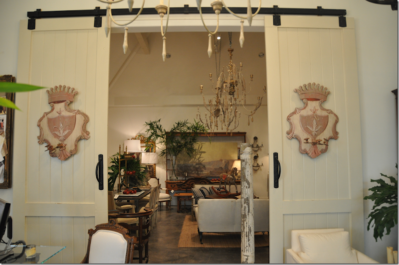
The Fabulous Flea antique business was moved into the Aichler addition – a large space divided into two rooms. The carriage door designed by Aichler is so charming, as is the awning that marks the proper entrance into the shop. The Fabulous Flea sells fabulous, of course! antiques mostly from France, procured on trips taken several times a year. To visit the Fabulous Flea, go HERE and make an appointment. Don’t be shy! They love appointments! And, if you don’t live in Houston – you can still shop there on the web site.
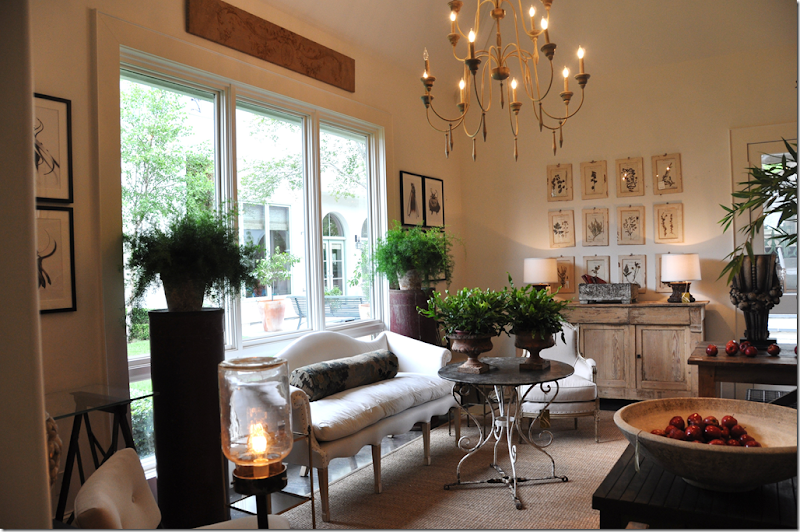
The addition to the Fab Flea house is divided into two areas, the studio with its soaring ceiling is on one side. OMG – it’s too beautiful for words in there!!!!
The left side is the “showroom.” I took these pictures a few months ago and that table with the scrolled base in now in my daughter’s room! I couldn’t resist it! I love that settee too with its scalloped top and bottom – just beautiful. Through the window you can see the main house. Between the Fab Flea addition and the main house is the swimming pool and pool house designed by Aichler. If you have never been to the Fab Flea – I really recommend going – if only just to see this space. I can’t think of many antique stores that are prettier.
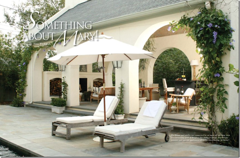 The Swimming Pool between the main house and the pool house.
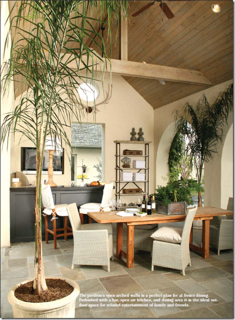
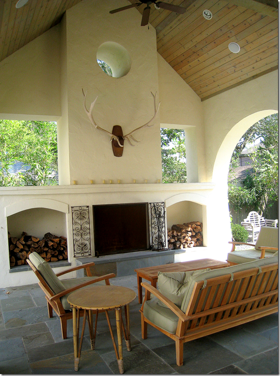
The Fab Flea house and shop were featured in the newest issue of Antique Stores and Designers from which these pictures were taken. Here is the pool house – thick stucco arches lead into the open space where there is a large outdoor fireplace, a bar, and a kitchen. The Fab Flea Shop is set on an axis with the Pool House – all designed to perfection by Aichler.
On this side of the pool house is an outdoor kitchen, bar and dining table. Through the doorway is the Fab Flea shop. Is this Houston or Belgium? Hard to tell!
I took this picture of the pool house last year. The horns are wonderful above the fireplace. I love how Aichler designed the open windows above the niches holding firewood. Notice the play between the arched openings and the straight openings with the circular window topping it all.
The Living Room.
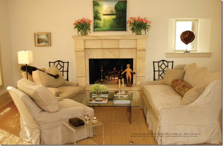
Inside the main house, in the living room – slipcovered furniture in linen is child and pet friendly. The sofa has wonderful lines – I love its tall, scalloped back. The house is almost Spartan in feel – there are no fancy moldings or built ins. The trim is very restrained. The walls are painted white. Everything is calming – there are no jarring colors or patterns. Linen is found everywhere. It would be a very peaceful and quiet house – if it wasn’t filled with a lively family and lots of pets!
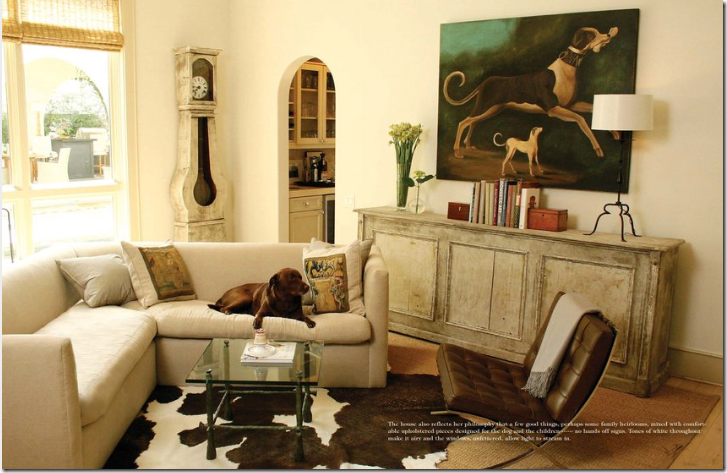
Through arched doors is the family room with its linen sofa and cream colored console. Contemporary pieces blend with antiques. Through this window you can see the pool house.
The Kitchen
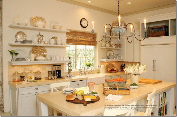
I love the Fab Flea’s kitchen! The light fixture is wonderful – and I really like open shelves. She has a mix of ironstone and silver, which is so attractive together. And of course, there is a farm sink.
The Master Bedroom
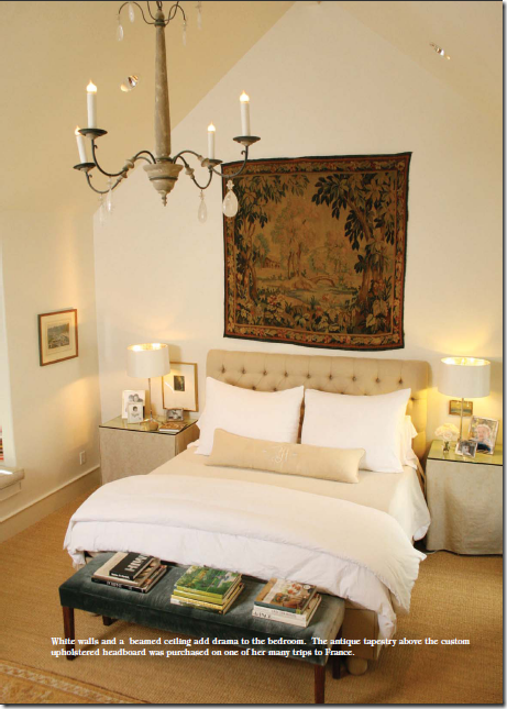
And finally, the master bedroom has a tall vaulted ceiling with an antique light fixture. The end tables are slip covered in linen, and the headboard is tufted. Wall to wall seagrass, of course! The large tapestry brings in the color – as does the bench with its silk velvet fabric. The owner of the Fab Flea is another woman with great style and an instinctive sense of how to put it all together. She is another chic woman who chose Kurt Aichler to design her house. Is there a theme here?
Pictures of the Fabulous Flea were taken from the magazine Antiques Shops and Designers HERE. Photographer: James Farmer HERE.
If you are interested in buying the house designed by Kurt Aichler in Southampton, go HERE for more information.



No comments:
Post a Comment