Last fall, my neighbor directly across the street approached me about decorating her house. What a job! Across the street – who can argue with that? I absolutely loathe taking jobs across town, and as I have gotten older, I am really not accepting work outside the loop – well, outside the beltway I guess. My days of traveling past the airport for work are over, especially now with the blog. I just don’t have the time to spend it fighting Houston’s horrendous traffic. So commuting by foot is definitely tempting – and I gladly accepted the job. My neighbor has two dogs, one senior citizen and one puppy (who once ran away and I had to chase after him for thirty minutes with no luck – even dangling What-A-Burger fried chicken as a bribe, which he scoffed at. Now there’s a new invisible fence around the perimeter of their front yard for the maniac bird dog – but, I digress.) So, with two dogs, two daughters under ten, and lots of entertaining, my client wanted – can you guess? Slipcovers! OK. OK. I am BEGGING my anti-slipcover stalker to just quit reading this now. It’s going to be all about slips from here on out. When you have two dogs and two children, slipcovers are truly the only way to go and yes, I have heard all about the miracle fabrics available, but I happen to prefer NATURAL fibers!
Besides slipcovers, my client also wanted seagrass. Of course! She lives in West University and everyone here either has or wants slipcovers and seagrass. This client was easy. And no, I’m not talking about her morals. She was easy to please and quick to make a decision, in other words – THE BEST KIND!!! Thank you God for small favors!!! I think we decided on the total overhaul of her downstairs in about 2 hours or less. And with a smile! So nice. AND, as if it couldn’t get any better, her husband is actually funny! Like funny ha-ha laugh out loud funny. Which is much better than the husband who hovers and wants to see all the bills and bids and proposals. I’ve been lucky lately, it seems I just keep getting the best clients in the world and my neighbors top that list. Besides the slips and seagrass, the client was firmly decided on white linen and aqua colored walls and black granite, and these were her only requests. She casually mentioned that she wanted a bold second fabric, not bold in color, but in design, something youthful. I knew what she was thinking about: Kelly Wearstler’s Imperial Trellis fabric – but please. Please! Enough of that. Let’s give other famous and fabulous interior designers-turned-fabric designers a chance.
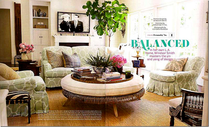 Windsor Smith’s family room as seen in September’s House Beautiful. This picture served as an inspiration for me when designing the new project.
It just so happened that while we were planning the design, the September House Beautiful magazine featured Windsor Smith’s wonderful new house. Before Jill Brinson’s house, Windsor's was my favorite, especially the family room with her famous double sided sofa covered in her new pre-washed linen fabric from Kravet. I had seen the line at the Decorative Center and fell head over heels in love with it, bringing home samples of all the colorways. Once my client mentioned the “trellis” type fabric, I knew that Windsor’s Riad was going to be the one. And it was. Said nice client agreed immediately. And so, apparently, did every other client in the United States. After the publication of the House Beautiful story, Kravet had sold out of her fabric, thousands of yards of it. We had to patiently wait until December to finally get our order. Do you think I ever heard a complaint about the wait? No, I never did. And I never heard a compliant about the wait for the bamboo shades either.
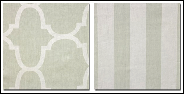 Windsor Smith’s fabrics by Kravet – Riad on the left and Cap Deluca on the right. My client chose both fabrics, the stripe will be the curtains and the Riad will be used for the slipcovers.
While waiting for the fabrics to arrive, we were busy with a small kitchen redo – new matte black granite countertops, appliances, Shaw’s sink and a creamy subway tile backsplash was installed. In the living room turned study, we built a wall to wall computer desk for the girls with shelving. That room was painted a warm chocolate brown to offset all the seafoam paint throughout the downstairs. The dining room was redone too with new seafoam paint but in a deeper, more luxurious tone. In the family room, we reconfigured the built in shelves to hold a nice, huge flatscreen – allowing us to ditch the former faux-antique armoire hiding a large TV. Ah...I loved getting rid of that piece! And so did my client, of course – she’s nice and easy! And then we waited and waited and waited. Until today, when I finally installed the family room furniture and part of the dining room. Unfortunately the before pictures are missing from my computer for some reason. But to explain how it used to look, the downstairs was painted yellow, with deep red walls in the dining room. The fabrics were all reds and greens. The decor was typical West University 1990s, except now it’s now 2010. There were mini blinds on all the windows in the back and beautiful wood shutters on the front windows. The breakfast room is connected to the family room and there was a light oak colored table with matching chairs along with two iron bar stools. In the family room there was an assortment of brass lamps and a skirted table. Of course there was the Pottery Barn rattan chair and ottoman. That must be their most popular item ever! The many bookshelves held even more framed pictures. Thinking about the installation, last night I could hardly sleep, I was so excited. I really wasn’t worried about it, like I usually am. But, it’s been a few months since I’ve had a full install like this (times have slow for moi) so that added to the excitement. The truck was due at 11:00 am. I woke up at 10:15 am – I TOLD you I wasn’t nervous!
Here’s a look at the family room. Pictures of the kitchen and dining room to follow next week:
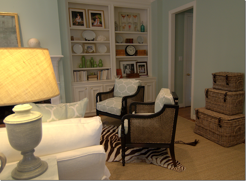
First we covered the entire room, including the breakfast area with seagrass, custom cut 3 inches around the perimeter. The client’s sofa was remade with two new back cushions and one bottom cushion. Her chair and ottoman were slipped in the Windsor Smith fabric, as were the two black caned chairs. The curtains are Windsor Smith’s striped fabric. All Windsor’s linens come prewashed. The kitchen is to the left, behind the curved bar. We replaced the countertops with a matte black granite that is highly textured. (To see the entire picture – be sure your browser is maximized!)
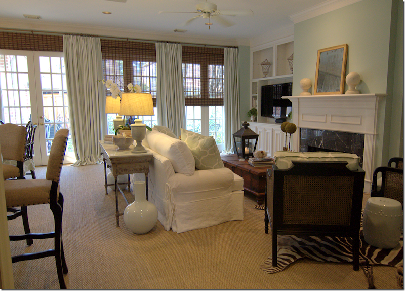
Looking towards the other direction, instead of having two end tables, we opted for a sofa table to put the lamps on. Bookcases flank the fireplace. Two white garden stools are used for drinks tables.
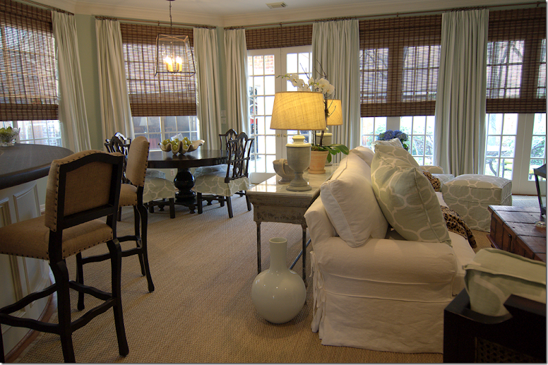 Each window is covered with the Cap Deluca Windsor Smith fabric and bamboo blinds, which we raised to the ceiling for a cleaner look, extending the visual line and hiding that dead space between the window and the ceiling. The curtain rods are the smallest matte bronze rod and rings I can find. The curtains and blinds really made the biggest impact on the room. I know I say this all the time, but it’s true: curtains and blinds are so wonderful to cozy up a room. The blinds cut down on the sun’s glare and gave the room a soft glow.
The breakfast alcove.
The black wood table and chinoiserie inspired chairs came from Noir L.A. The Windsor Smith fabric was used to make slips for the chairs. I put two dozen faux green apples in a large clam shell on the tabletop. The knock-out in this area is the lantern from BROWN in Houston, the best lighting/decor store ever!!
A note about the design process: the client wanted two things – a black granite countertop in her kitchen and bar, and seafoam colored walls. At first we toyed with a Belgian inspired design, using limed woods and painted gray furniture. But with the black countertop and aqua walls, it seemed more natural to go with the black furniture. In the end, I’m really pleased with all the black accents – I think it grounds the room and is a good foil for the white and seafoam linens and paint.
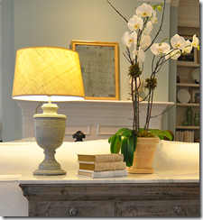
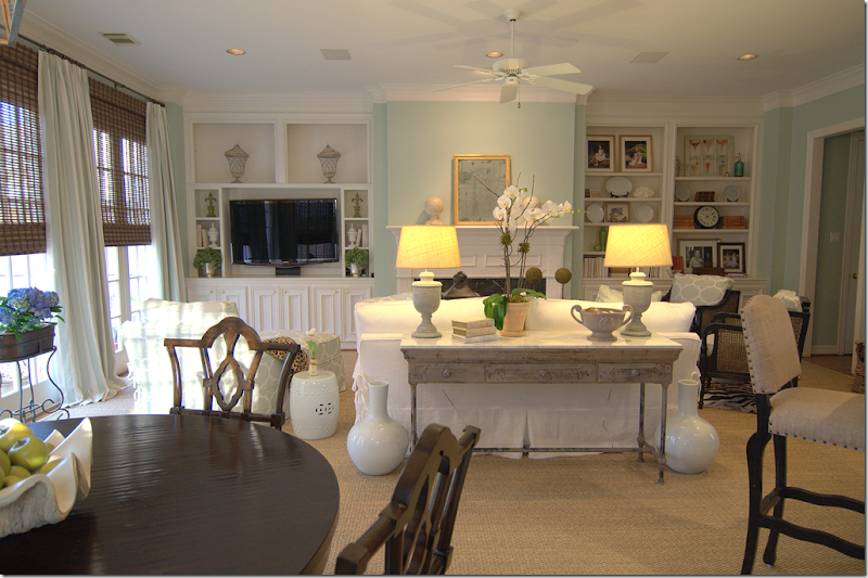 The view from the breakfast area. The lamps came from Ballard Designs and the shades are from Pottery Barn. The barstools from Noir L.A. are covered in burlap with nailhead trim. All the ceramics came from Legends of Asia.
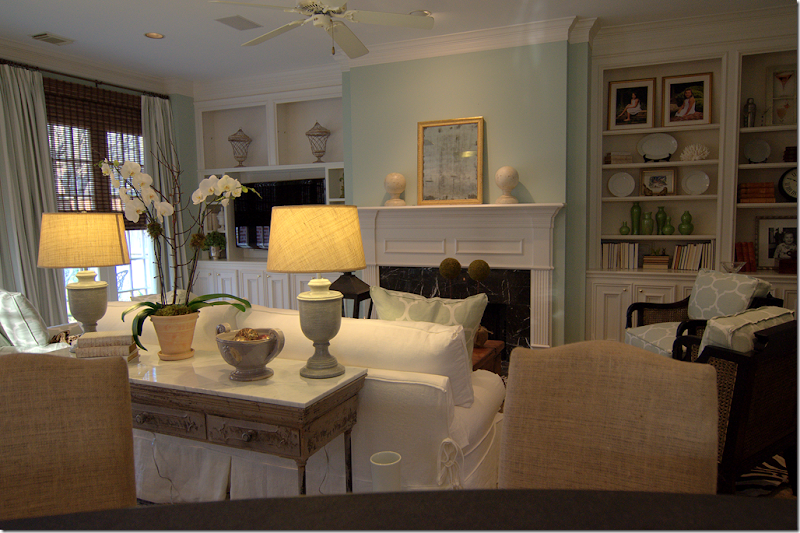 The view from the kitchen, looking over the bar and bar stools. The sofa table from GO Home Ltd. is metal with a white marble top. The mirror above the mantel is 19th century from Tara Shaw Antiques.

Note: I tried the photography tip from Michael J. Lee here. On this week’s Skirted Round Table, he advised taking pictures while sitting down.

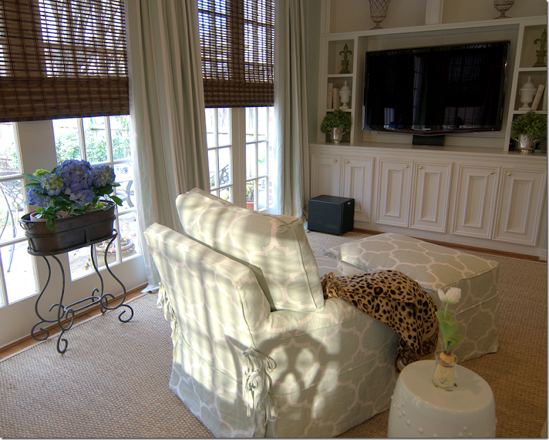 The client’s chair and ottoman were first recovered in muslin and new cushions made, then they were slipped in Windsor Smith’s Riad fabric. The client owned that darling plant stand so I added the blue hydrangeas.
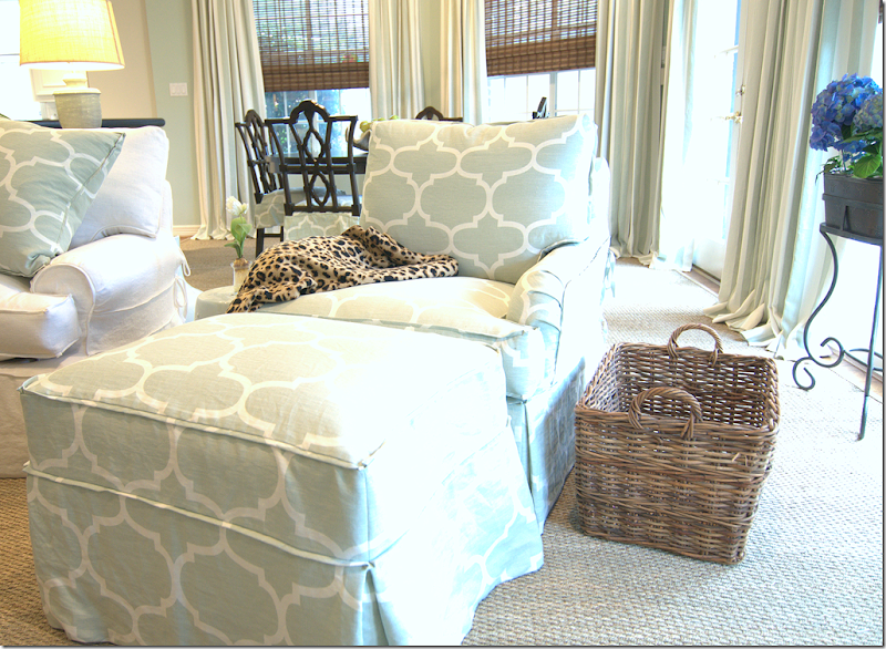 Closeup of the slipcovered chair and ottoman. All the seams are 1/4 inch flange.
View of the right side of the family room.
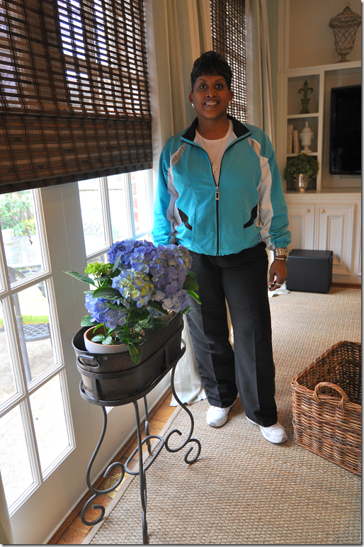 Old Faithful: Custom Creations by Monica does all my soft goods – curtains, bedding, etc. We’ve worked together from my very first job to my last. To see Monica’s web site, go HERE.
Next week I’ll show the dining room and kitchen. I was too tired to style them tonight, plus the curtains weren’t installed yet!




No comments:
Post a Comment