
The cover of Rose Tarlow’s most excellent book shows her Californian house, built with antique elements. Notice the subtle glaze on the plaster walls, the fabulous slipped chair and those floors (to die for!)
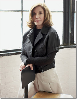
The name Rose Tarlow evokes an image of quality, impeccable taste, uniqueness, patina. Hugely influential, Tarlow sets the bar very, very high; the furniture she designs for the eponymous Rose Tarlow/Melrose House is unquestionably the best on the market today. Many of her designs are based on antiques she once owned, or perhaps glimpsed in an old book. The craftsmanship is beyond compare. Her fabric line was one of the first that featured textiles that looked old and soft, with muted colors and patterns that disappeared as if the sun had faded this one spot and that. Tarlow, the woman behind the name, is a mystery, an enigma even to those personally familiar with her. She is not a well known interior designer, though there are probably only two or three designers in her league. She calls herself an antique seller, but mostly she now sells reproductions. Antiques are her heart, yet some of her better known commissions have been contemporary. She started her career in the antiques business over 30 years ago with a small shop on Melrose in Los Angeles. She says she was embarrassed to admit to her colleagues that she was taking up design. She could have had the biggest career in that business - had she wanted it or sought it out. Instead she hid from it, refusing to play the games that go with the job. A solitary person who prefers to shop alone, the client just gets in her way. She is a perfectionist who obsesses over every detail of a project until it is right in her mind alone - a trait the client must be aware of to give her the space she needs. A job may take five years, perfection never comes easy. In contrast, building her own house went by quickly. Of course there were no indecisive clients to slow down the process. “I hate dealing with clients, so when I do work, I prefer to work with friends.” Oh, the few she has agreed to work with are the lucky ones.
Miss Tarlow: very, very few in the world of interior design are her equal.
In 15 years, Tarlow says, she had 5 clients, such is the level of her involvement and commitment to the work. Not many can claim her, which only adds to the mystique. She is more famous for the jobs she has turned down: “I never take a job unless it intrigues me.” And there is this: “I need to buy furniture and I only ever take on a design project if it’s one that’s going to allow me to buy furniture that I’m interested in buying.” There are no flashy spreads year after year in design magazines. Most of her work has never been seen by the public. Her own house is her biggest advertisement, but one could never expect her to repeat such uniqueness.
Her discerning eye is what sets her apart. She doesn’t see like the average person. She drinks in beauty as if her body craves it for nourishment. “I try to hide from things that are not good for my eye, I only see what pleases me.” A friend of Tarlow’s said “I admire her enormously, though, because she has one of the most incredible eyes for beauty that I’ve ever seen.” The friend recalls a trip to a Mississippi casino where Tarlow refused to stay, “it’s just so ugly and the lighting is so hideous. I just can’t be in an environment like that.” She finds beauty and inspiration in nature, in dusty antique shops, at a dump site. Objects speak to her, furniture especially, and more specifically - furniture made of wood. “Wood is my favorite thing. Someone said I must have been a tree in another life,” she told Mitchell Owens.
Her book, The Private House, was written without a ghostwriter and took eight years to finish. Filled with fascinating stories of her youth, these tales are surprising revelations, clues into what shaped Tarlow into the force she is today. Still, it’s hard to imagine her as an innocent child, she is so focused and knowledgeable, her aesthetic is so unique. Working with her, under her, for her, must be more rewarding than an Oxford education. Her opinions are laced throughout the book becoming edicts to follow. One story she retells illustrates her steely determination:
“I have always had a passion for 18th century wallpapers which are difficult to find. Many years ago, based on my research into rare Chinese papers, I commissioned an artist to hand paint wallpaper panels for my dining room. When the work was finally finished, the room was breathtaking.
The first evening after it was completed, we all sat for hours admiring the walls, but I could not wait to be alone there. Later than night, when the family was asleep, I went back down, took fine sandpaper, fine steel wool, a stepladder and all of my nerve and proceeded to soften the newness of the paper by removing some of the design. I worked slowly and carefully for hours and succeeded in completing only a small section. I was pleased with the results. In the morning, my husband came downstairs and was horrified. I explained that the work had just begun, that it needed to be done, the newness of the walls was intruding on the room.”
Years later, that same wallpaper appeared again in her life. It had been removed from her long-since sold house and a panel was taken to an auction house who were convinced the paper was terribly old and valuable. Her opinion was sought out on its provenance.
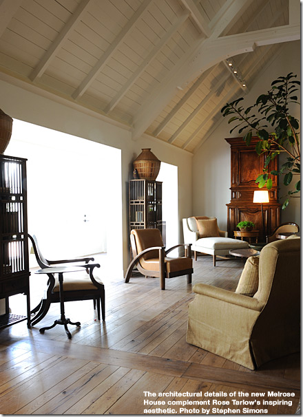
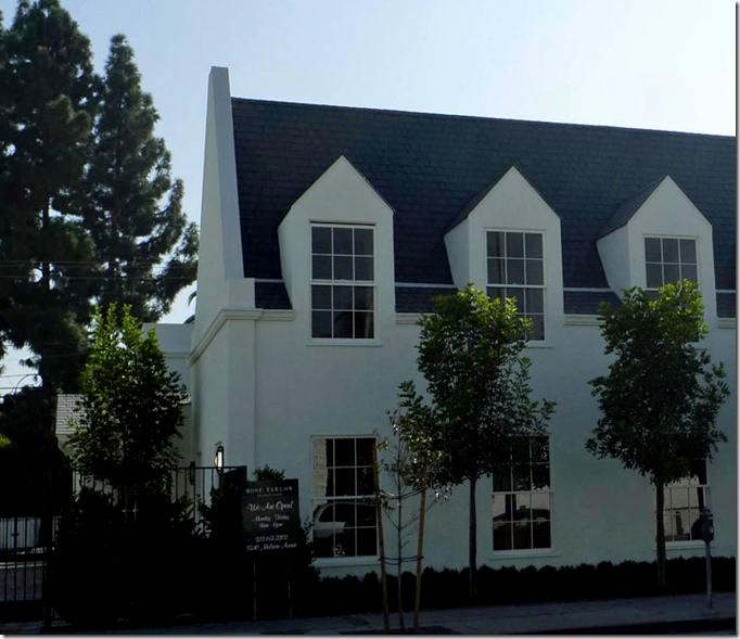
The new Rose Tarlow/Melrose House is a delight. Its architect, Mark Appleton, designed the building in partnership with Tarlow.
Everyone who reads The Private House takes something different from it; advice that Tarlow casually mentions will become ingrained in their own design process. My personal nugget is Tarlow’s view on overhead ceiling lights:
“Having too many recessed lights overhead can destroy a perfectly good ceiling and give any room a disturbingly commercial appearance. While we have rather successfully combated the cottage cheese ceiling, be aware of the Swiss cheese ceiling. An abundance of ceiling lights should be limited to kitchens, laundry room, and shoe shops.”
I had just installed a house full of recessed lights a few years before her book came out and her words stung, my ceilings became my enemy. I never turned on those recessed lights again, instead I use an assortment of sconces and lamps, and now lanterns. The Private House is filled with ideas and strong opinions like this. And rarely, will you disagree with Tarlow. When she tells you to mix plain dirt in your plaster, you know you can trust her. She doesn’t advise or lecture you to do things she hasn’t personally done herself.
The new Rose Tarlow/Melrose House, designed by Mark Appleton. Tarlow started her career on Melrose and has never let the street – she just moves down a few doors every decade or so.
Tarlow’s style, if you could define her taste level so simply, is more like her essence, her creed, her heart. She IS her aesthetic. She surrounds herself with what she loves, what she finds beautiful. Nothing in her life mars her vision. “Quality is crucial, right down to the paper towels. Everything you live with should be wonderful, not expensive, just good.” She finds beauty in odd places – construction sites hold appeal. The lesson though is not to emulate her, but instead find your own simple, interesting object to love. “My only rule is that nothing adorn my life that is not precious to me. I must respect its shape, color, meaning, and quality. An object added for effect instead of affection will always look like an affectation.” She prefers to use many shades of one color throughout a house, while accents of brighter colors comes from objects like antique fabric, a rug, a box. She advises using a neutral canvas – “use color like jewelry, provocatively.” In her book, written so many years ago, she was obsessed with the color green, a lasting effect from a trip to Ireland. Bright pops of green are found throughout the images. It would be interesting to know if she is still as connected to that color, or is there one that has replaced it now?
Tarlow is the consummate perfectionist. “Don’t try to be different, just be excellent.” This attitude, the striving for perfection, is seen on each page, in each story she shares with her readers, many of which are quite humorous. She is surprisingly quite funny in her book – her stories are told with a dry wit. Much of The Private House recounts the story of her own house, one of her greatest creations. It was imagined as “an Old Californian with strong European influences.” Most elements are ancient, wood used inside is so old, it is almost petrified. The house has oak beams from an 11th century church in England, there is 18th century boiserie from France. The floors in her study are from the 17th century. A set of four 18th century French oak doors distinguish the main living area. The hardware,, of course is all old. Obviously, the house is a masterpiece. It was designed by Tarlow at a time when she was single and able to do with it exactly as she wanted. Soon after, she became involved in a relationship which she acknowledges would have produced a different house. It is said another book is in the works about a house she is working on in Provence, I wait for it anxiously.
Last year, Melrose House moved to a new location designed by Tarlow and Mark Appleton. These days, she mostly designs furniture for her company, freed from the daily grind of running the company after selling a large portion of it. Tarlow is now the Creative Director and not surprisingly, the sole designer. Melrose House is her lasting legacy to design.
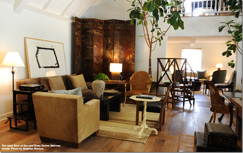
Inside the new Rose Tarlow/Melrose House. Immediately, the library stairs catch my eye.
Recently I was approached by Tarlow’s PR agent, who lured me with the promise of high resolution images from The Private House, bait that only the strongest blogger could resist! These images aren’t new, but the thought of having these quality photographs in my computer, and yours, forever, was too good of a dream to pass up. I’ve added more images taken from Melrose House’s web site, where there is a great collection of press clippings all in PDF form. Naturally, her web site is perfection. Few in the business even realize the importance of good, high quality PDF copies of past magazines articles – saved for eternity on the world wide web. If Rose Tarlow is a new name to you, I highly suggest The Private House. It’s a short and easy read, yet the priceless information contained within its pages is worth more than four years at a design school, unless you are lucky enough to have Rose Tarlow as your professor.
London
Rose Tarlow’s London Residence.
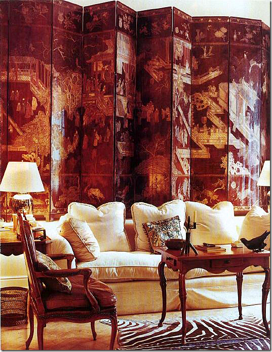
My first awareness of Rose Tarlow came from a 1989 Architectural Digest article that featured her London townhouse, above. I became an immediate and slightly obsessed fan. The residence has not changed since that time. I’m sure things have been updated, like upholstery, but the main design and furniture remains. Why tinker with perfection? That tea table (notice its knees), that screen (notice the patina!)
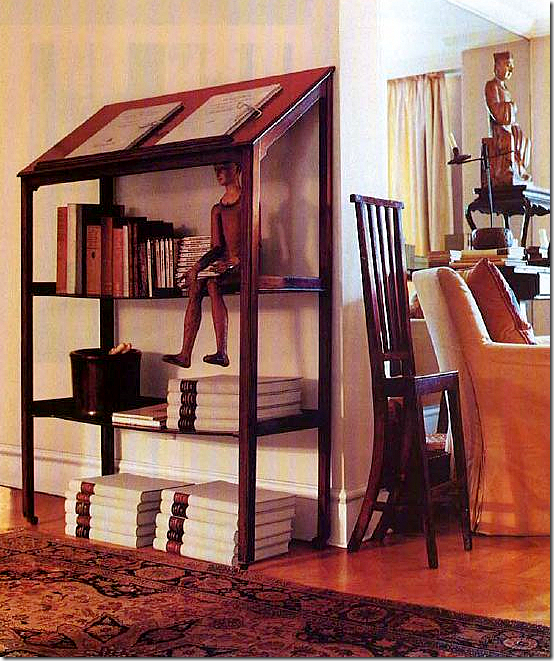
Another image from London. Notice the wonderful book table and antique chair. Tarlow loves quirky or unusual pieces – where either the proportions are exaggerated, or the wood has a beautiful patina.
Los Angeles
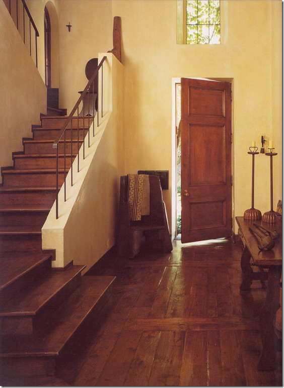 Los Angeles: The house that Rose built. Notice the beauty in the simplicity: plaster walls have unreinforced corners which crumble easily creating a rustic ruin effect. The walls she says “look like they were carved from butter with a knife.” Tarlow allows her look is “masculine” and yes, there are few frilly elements here.

A close up of the plaster, iron and wood staircase.

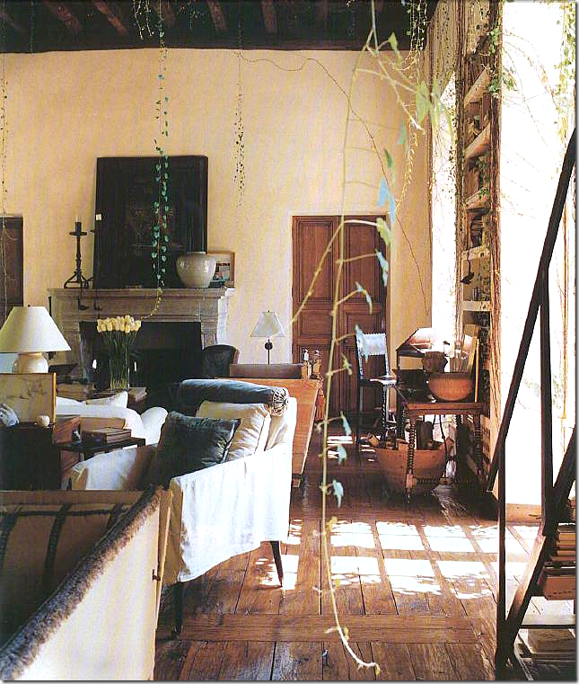
The view from the living room into the staircase room. A bamboo ladder holds newspapers.
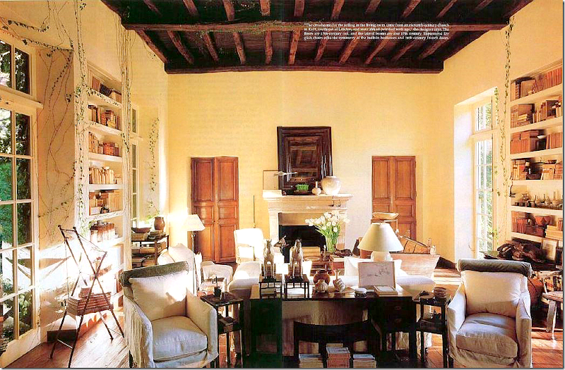
A picture taken from the pages of Architectural Digest, 1991: Notice the beautiful antique beamed ceiling and the pair of oak doors. This room has two fireplaces, one at each end, and two sets of bookcases on each side. The vines are encouraged to crawl up through the 18th century French doors. Originally the house was three rooms only, all one after another – her bedroom, the great room, the kitchen. Later, she turned her kitchen into a dining room and built a large kitchen/eating area beyond the dining room. Above this, two guest rooms were also added.
Of her house, she told Architectural Digest: “I was trying to prove to myself that you can create an ageless house just as I try to design furniture that has a period flavor but with its own unique personality. Every attempt I have seen to make new houses look old has failed, so I considered remodeling the existing house on the site. But after a week the contractor told me that it made no sense to try, and I tore it down.”

Looking towards the other side of the great room – with its own fireplace. Above the fireplace is a Jean Cocteau.

Looking the opposite way at the other fireplace. There are four sets of matching antique doors that lead off this room. There are two large bookcases built in between the French doors on each side of the room.
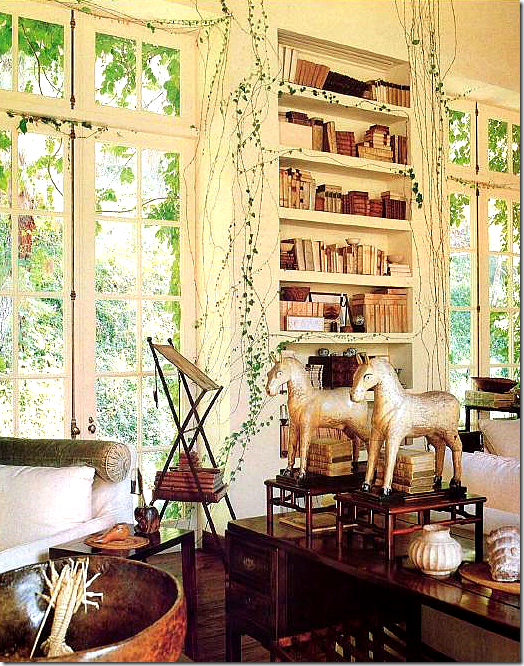 From Architectural Digest, 1991, a view of the desk that divides the room into two seating areas.
Across the room is another bookcase. Library stairs stand in front. Pictured on the right is an antique Knole sofa.

Close up of another bookcase. In front is a second original 1880 velvet Knole sofa.
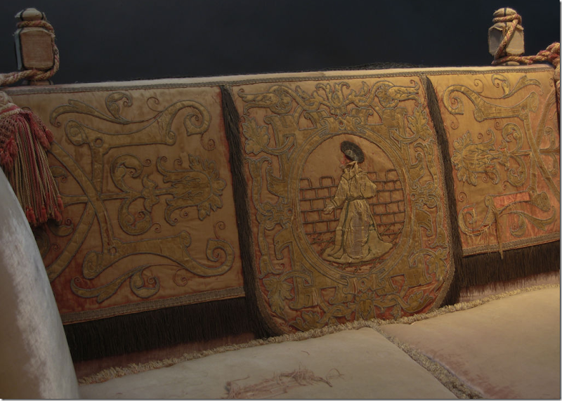 This sofa is now for sale at Obsolete on 1st Dibs HERE. Interestingly, it was once used as a prop in a Helmut Newton photograph. Notice the gorgeous silk appliques.
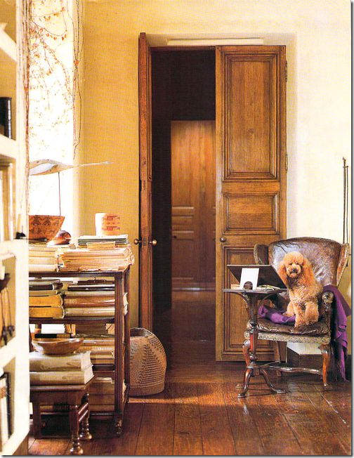 Looking through the doors into the bedroom with its French boiserie. Beautiful vellum books are everywhere.

And, a close-up of the wood cart pictured above. Notice the reeding on the legs. Just beautiful.
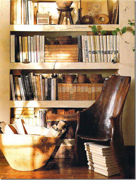 This glorious 1780 dugout chair is typical of the type of antique that Tarlow is drawn to.

Another unusual and unique antique chair that epitomizes Tarlow’s style.
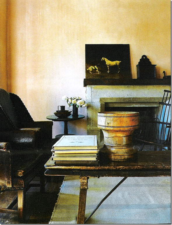
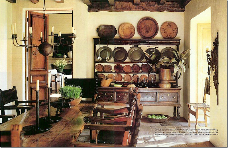 The dining room is off the main living room. Antique leather Spanish chairs surround the table. The large 18th century Welsh dresser holds a collection of treen and pewter. The large wood mortar is filled with tole leaves.

A close up of Tarlow’s amazing collection of treen and pewter plates and 1920s French porcelain square plates.
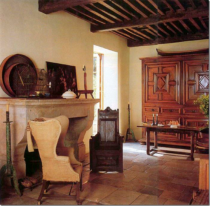 Past the dining room is the large eat in kitchen. The wing chair is 18th century while the wood chair is 17th century French.
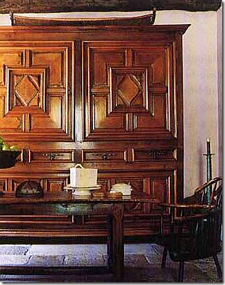 Close-up of the rare and beautiful Louis XIII armoire in the kitchen.
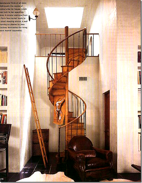 In her study upstairs, a wooden staircase found in a Paris flea market reaches the sleeping loft.

Tarlow paints watercolors in her upstairs study. I love all her bookstands and lecterns. In a shameless act of copying her, for years I searched for one for my own house.

The powder room features a 17th century needlepoint mirror and a wooden sink! Amazing!!
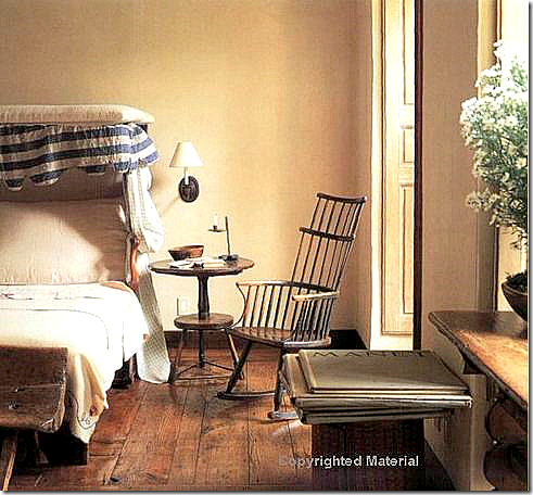
The second guest room features a charming pull out canopy bed.
The sitting area of the guest room.
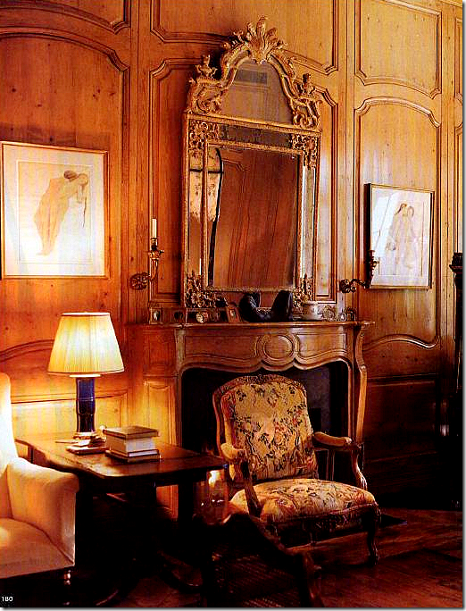
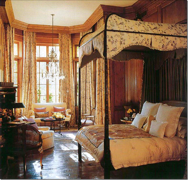 Rose Tarlow’s bedroom is wall to wall antique French boiserie. The only piece of furniture in the house designed by Tarlow is her canopy bed. This room is so authentic, it defies belief that it is in the middle of Los Angeles rather than in a 18th century mas in France. Notice the floor – so gorgeous. I love how low she has hung the chandelier in the alcove – perfect – as is everything she does. This room is the most feminine area in the house as it should be! Even the sofa’s arms are sensuously curved.
A close-up of the fireplace and paneling in the master bedroom.

The pool was placed as it might have been found in nature. The pool house’s old slate roof was brought over from England.
Rose Tarlow/Melrose House:
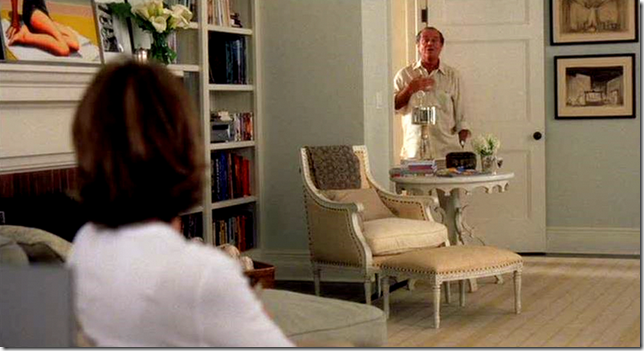
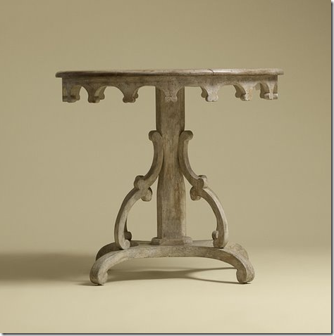 For those on the design blogosphere, one of Rose Tarlow/Melrose House’s most well known pieces of furniture is the Nantucket side table. I’m sure you will recognize it from the bedroom in Something’s Gotta Give. Over the years, so many people have asked either Linda Merrill or myself – where can I buy that table? It is slightly gorgeous, no? Things That Inspire wrote a wonderful piece on this table HERE.
The famous Something’s Gotta Give bedroom with the Melrose House table.
Cote de Texas and Rose Tarlow/Melrose House:
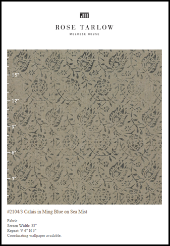
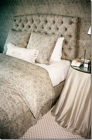
Many years ago, on one of my first big jobs, I designed a bedroom for a client using this Rose Tarlow fabric. On the walls, I placed the matching wallpaper, and most of furniture wore this fabric, save for the skirted table which was a Rose Tarlow plaid. Recently I discovered a few pictures of that room filed away in a drawer:
The headboard was tufted and upholstered in the Calais fabric as was the duvet and dust ruffle. The walls were papered in the matching pattern. The skirted table is a Rose Tarlow plaid. The carpet was a cream colored flat weave with a small dot of the darker ming blue.
The bedroom is located in a high rise apartment overlooking Uptown Park in Houston. The sun is treacherous up there, so the windows were covered in blackout lined curtains, made of course in the Rose Tarlow Calais fabric.
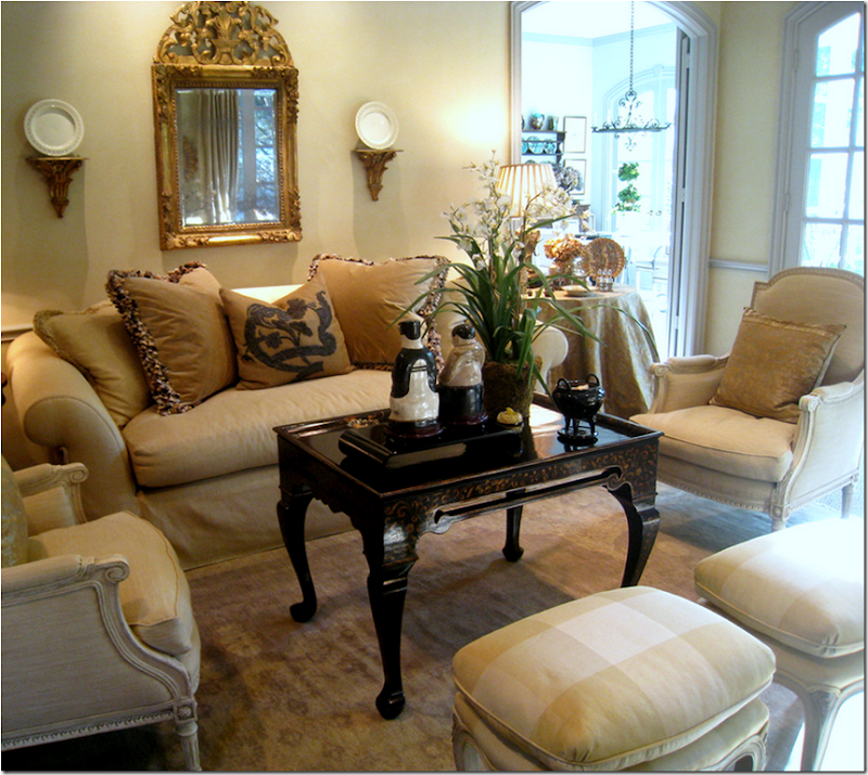 In another client’s house – I used this Rose Tarlow/Melrose House tea table. But I believe this table may now be discontinued – it isn’t on the web site.
The Rose Tarlow/Melrose House Sophia Chair is another much beloved and copied piece in the collection. The lines and proportions are beyond beautiful.
Imitation - the sincerest form of flattery? For this client, I used the Sophia chair as an inspiration – in order to save time, I had it made in Houston. Although the chair looks very similar, you can see that Tarlow’s exaggerated proportions were out of the abilities of the upholsterer – the copy is not quite as tall, the arms not quite as gracefully thin. To do it over again, I would have ordered the Tarlow chair instead of trying to copy it, although I do think the chair is beautiful as is.
Last December, The Peak of Chic asked Rose Tarlow what are her favorite books – to read her list, go HERE.
To order The Private House, go HERE. To visit the web site of Rose Tarlow/Melrose House, go HERE. And finally, a huge “thank you” to Eric Perez for all the luscious hi-res images!





No comments:
Post a Comment