Sally Wheat’s Famous Gray Kitchen
Today, we have another kitchen to show that was inspired by Sally Wheat’s gray kitchen. When I first posted about Sally’s house a few years ago HERE, I had NO idea how popular she and her house would become with readers. I also had no clue how many people would actually be inspired into action by Sally! I will say that most questions and comments about Sally are regarding her kitchen with it’s gray painted cabinets, Shaw’s sink, and marble countertops. She certainly inspired my own kitchen redo. After seeing Sally’s kitchen, I was spurned on to finally remodel my own outdated one HERE. And, remember this: a few months I showed a kitchen/house remodel HERE whose owner told me she was directly inspired by Sally Wheat’s kitchen.
The latest Sally Wheat inspired kitchen comes from Sara of the August Fields blog. Sara’s blog is all about building her new house and when she recently featured her kitchen, she gave credit to Sally Wheat. To read Sara’s kitchen story go HERE. I must say that nothing gives me greater pleasure as a blogger than to read about these inspiring kitchen designs. That these design inspirations would ever even occur certainly never crossed my mind when I started this endeavor over three years ago. But, it has been a very rewarding aspect of this solitary sport. So, a huge thank you to all of the readers who have sent in pictures of your kitchens and homes. Keep them coming!
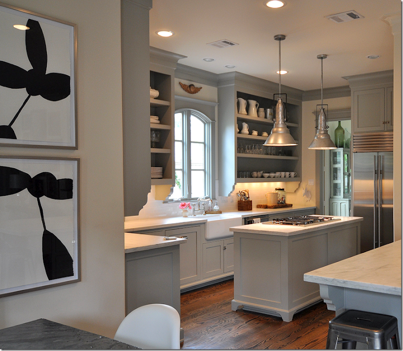
Sally Wheat’s gray kitchen. The color, Benjamin Moore Fieldstone seems to be a favorite with so many readers. I get asked over and over again – what color did Sally use on her cabinets? Also – many people love her open upper cabinets with their carved brackets. In both kitchens directly inspired by Sally, they each copied these cabinets. Also, many people love her pendant lighting which she purchased at BROWN.
When it came to remodeling my own kitchen, I used gray on the cabinets – but a much lighter gray which was custom mixed so I don’t know the name of it!!! Also, I used Calacutta Ora marble instead of Carrara. I copied Sally’s Shaw’s sink and I used a polished nickel bridge faucet. I was also inspired by Sally’s window and so I replaced mine with this beautiful casement window, which much made a huge difference.
The First Sally Wheat Inspired Kitchen:
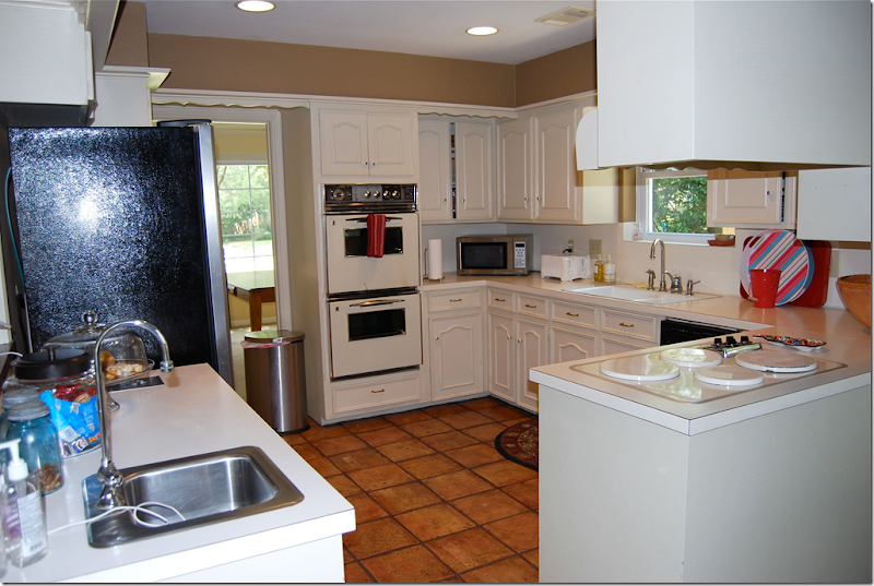
BEFORE: This is a before picture of a kitchen in Houston that was inspired by Sally Wheat’s.
AFTER: This homeowner chose black granite instead of white marble, but she modeled her upper cabinets after Sally’s. Also, she used a farm sink and the same type of bin hardware as Sally. Notice the brackets on the bar mimic Sally’s own overhead cabinets. The subway tile backsplash is also like Sally’s as is the style of cabinetry. The pendant lighting was another Wheat inspiration. I’ve heard through the grapevine that this house is going to be featured in a magazine!!!! To read all about this redo, go HERE.
The Second Sally Wheat Inspired Kitchen:
The August Fields Kitchen, inspired by Sally Wheat
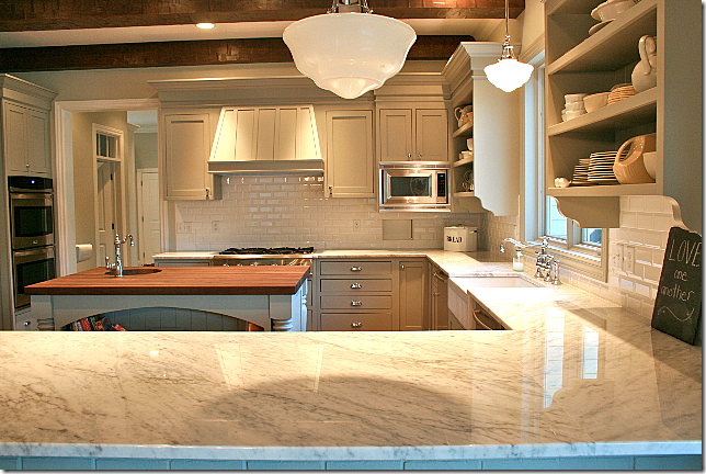
Here is Sara’s new kitchen. As you can see, she chose white marble – not Carrara, which Sara explains is now really a gray marble. I agree! That’s why I used Calacutta Ora. Sara used White Italian marble with walnut on her island. In this picture – one of the pendant lights is missing as you can tell. These pictures were taken right after they moved in. On her blog, Sara says that originally she wanted black soapstone countertops with white cabinets. That was until she read the blog about Sally Wheat’s kitchen – that’s when she totally changed her design plans for her kitchen.
Sara used a beveled white subway tile for her backsplash, which I just love. And she used the exact same gray on her countertops that Sally Wheat did: Benjamin Moore Fieldstone. The gray on the walls is Benjamin Moore Vapor Trails. Be sure to notice the ceiling!! I love the beams. NOTE: Under the microwave is a little pass-through door to Sara’s schoolroom. As the mother of 5 young children – she home schools them. The schoolroom is adorable – with black and white vinyl tile floor.
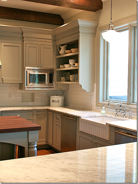
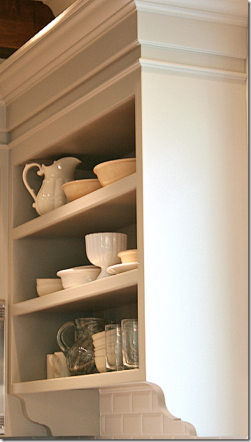 Here is a picture of her upper cabinets – with the extra thick shelves. These really look exactly like Sally’s cabinets because Sara took a picture of them to her carpenter so he could copy them.
Another view of her upper cabinets. I love her cabinets and I love the pendant lighting.
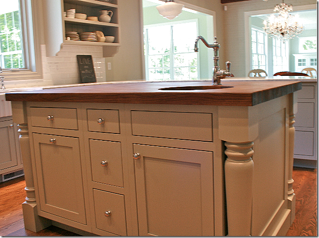 I really like her island with the columns on the corners. And, there is another sink here too.
A close up of Sara’s farm sink – it has such a pretty apron. I love her bridge faucet too. I think the bridge faucets are my favorites.
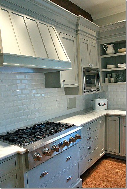 Sara added a cute wood hood for her cooktop. The hardware is from Restoration Hardware. I wish I had used this hardware myself.
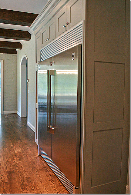 Sara used the Kenmore pro refrigerator and freezer pair and then pushed them next to each other. By using a stock trim kit, it looks like it is all one unit!
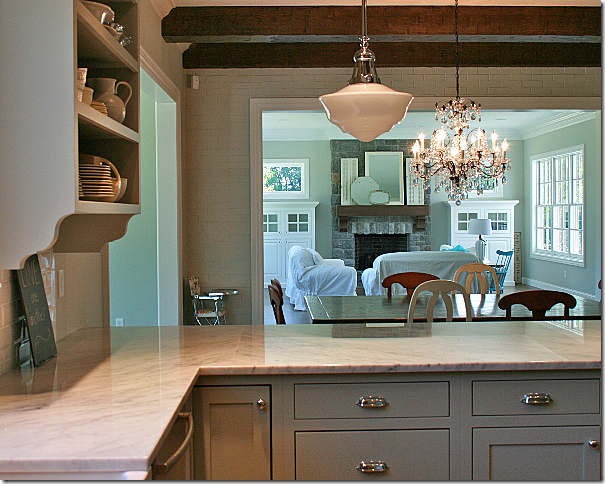
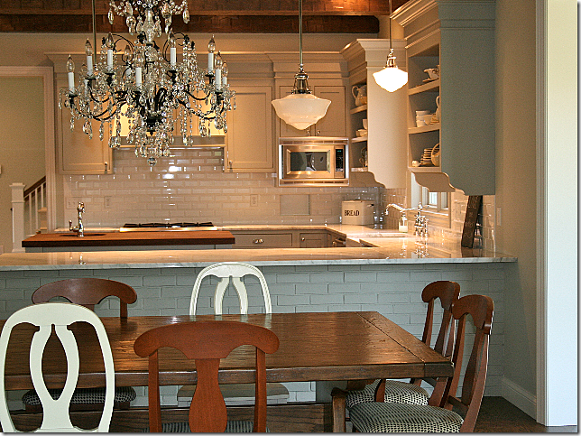 Looking from the family room and breakfast room into the kitchen. There is a brick veneer on this side of the countertop. This large table was custom made and it seats 12 – new chairs are coming.
Looking past the breakfast room into the family room.
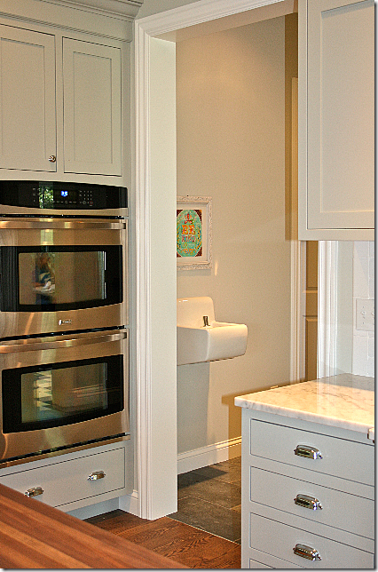 Sara has five little ones and she home schools them all (except the baby!) Look what she put into her house – a drinking fountain!!! Isn’t this the best idea? She said she has already saved a bundle on paper cups. The schoolroom is right behind the kitchen – across from where the fountain is.
Thank you Sara so much for sharing your beautiful new house with us. To read all about her kitchen, go HERE. Remember, Cote de Texas welcomes pictures of all redos, renos, remodels, and even new houses!!





No comments:
Post a Comment