House #1
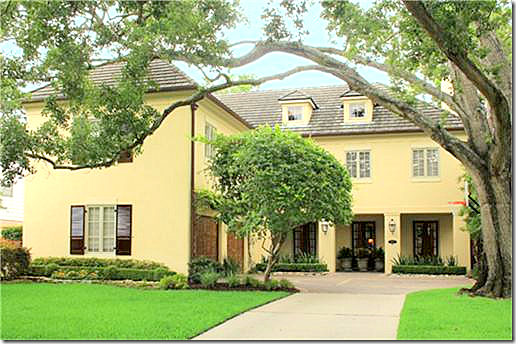
The first house from West University today – the “Large” home is one I’ve loved since it was being built. It’s on a great street with a large esplanade – rare for West U., plus it’s custom built, not your typical West U. home. Of course I should have known why I’ve loved it – Kurt Aichler designed it. It was built in 1997 with a stucco and Austin limestone facade. It’s 3 stories, 4 bedrooms, 4 1/2 bathrooms, with a pool and a screened in porch. It measures at 5,454 sq. ft. Listing Price is $2,050,00. Interiors are by Katie Galliano – see her web site, go HERE. To read its listing, go HERE.
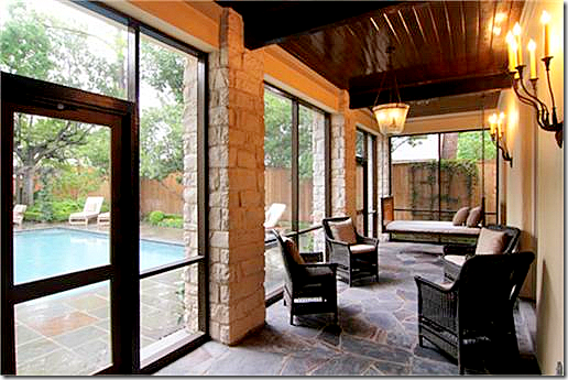 The stucco and limestone screened in porch is off the long living room/dining room. The ceiling is wood planks.
Close up of the beautiful screened in porch with the swinging bed and wicker chairs.
A pergola covers the back terrace. The large den is off to the right where the limestone fireplace is. The screened in porch is at the other end of the pool – the porch leads off the living room/dining room.
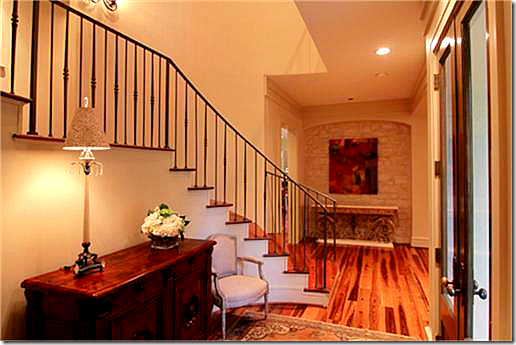 Beautiful entry with iron railing and limestone accent wall.

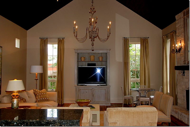
Close up of the living room, designed by Katie Galliano.
The dining room end – I love the chandelier and the fireplace. It’s so romantic to have a fireplace in your dining space.

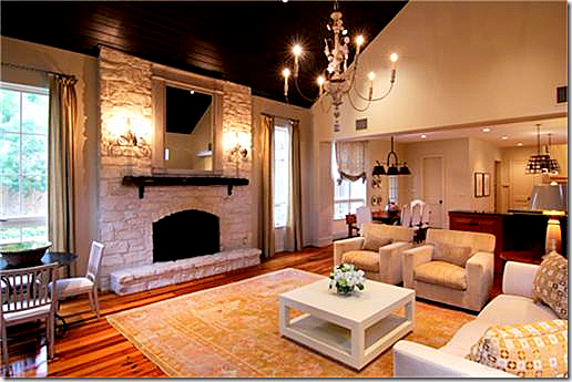 Looking the other way – into the kitchen and breakfast room. The pool is seen through the windows.
Interior Designer Katie Galliano worked on this house and kindly sent me some of her larger pictures. I wish I had more of this quality to show you!!! To see her web site, go HERE.
Another view from Katie of the family room.
I love this view of the beautiful curtains and rods. The Swedish chairs sit around an iron French table.
Looking from the kitchen into the family room.
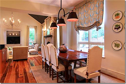 The breakfast area has a wonderful light fixture that really grabs attention. Love the nailhead chairs.
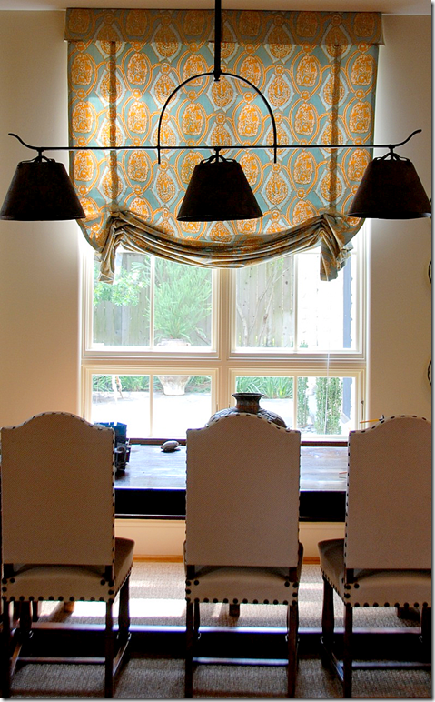 Another picture by Katie of the breakfast room with its fabulous light fixture.
The master bedroom has heated marble floors and a footed tub. Typical of the custom details found in an Aichler home.
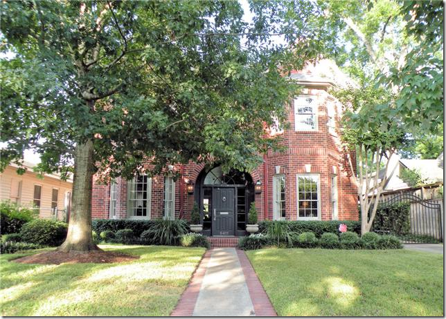
The second house shown today was built in 1988 and is a more typical West U home from the 80s and 90s. This house was updated in 2005 and is 5 bedrooms and 3 and 2 1/2 baths and has a large pool. This house is also three stories and is 3,885 sq. ft. Asking price is $1,125.00. The listing can be seen HERE.

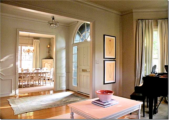
The front door opens to the living room on the left and the dining room on the right. The updating is seen right away with a new paint job in trendy light gray. This is the only picture of the dining room, unfortunately – it looks like there is a Swedish table and chairs in there.
The entry hall leads to the back family room and kitchen. Love the trumeau and the lantern!
Custom cut seagrass is found in the public rooms and up the stairs. Notice the banister is also painted gray, as are all the moldings and the ceiling. This is a great way to update your house’s paint job: paint everything, including the moldings and ceilings one color. I wish there were more pictures of the living room!!! It looks so cute with the high Swedish coffee table and light blue silk drapes.
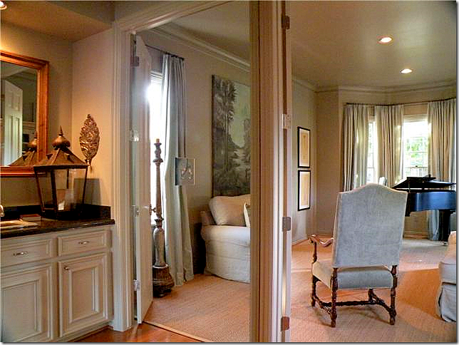 The bar connects to the living room. There is a wall to wall mirror along the back wall which makes the bar look twice its size. Here you can see in the living room that a piano sits in the bay window.
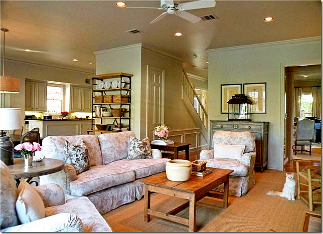
The family room connects to the kitchen. Cute linen slipcovers in a muted floral pattern.
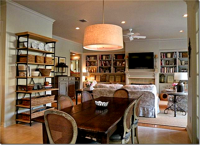 The breakfast room connects to the family room. Love the chairs and table and all the baskets.
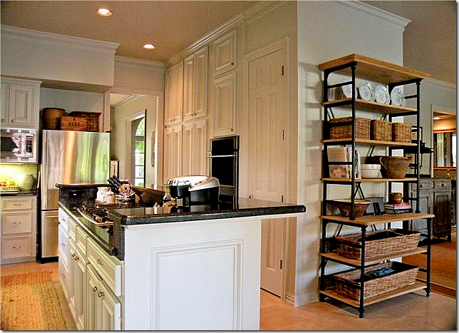 The kitchen was updated with new stainless appliances. I love that shelving unit in the breakfast room!
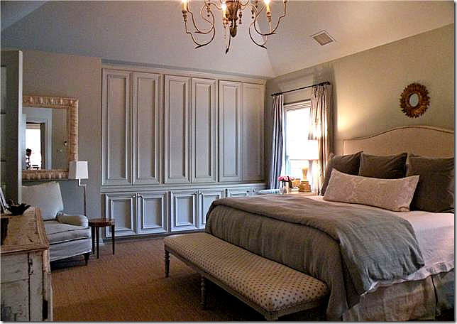
The master bedroom – seagrass and Italian light fixture. I love the linens on the bed and the long French or Swedish bench. I wish we could see the painted piece on the left side of the picture! Really nice bedroom.
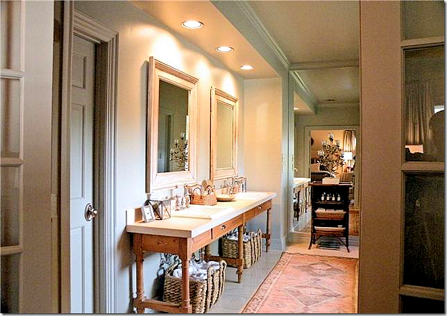 Updated bathroom – they removed the built in cabinet and placed this long console with two sinks in it. They then added bifold French doors leading to the bedroom. This is what I really want to do to my bathroom. By removing the built in counters, it really updates a typical bathroom. I have no idea, but I wonder if Ginger Barber decorated this house? It certainly has her “look” to it.
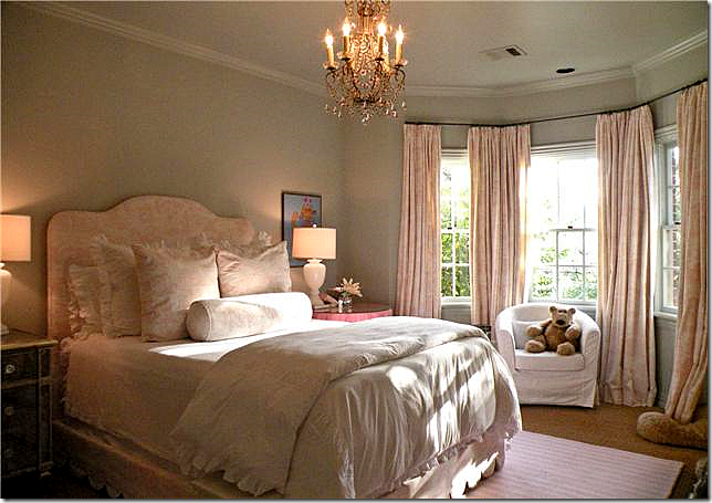 One daughter’s bedroom is adorable. Love the curtains, the scalloped bedding, the chandelier, the lamps, the mirrored chest. Really cute.

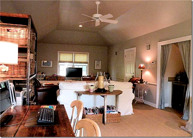 The third floor media room also has wall to wall seagrass and slipcovers. I love the way the kitchenette has portieres. To visit this house’s listing, go HERE.
House #3
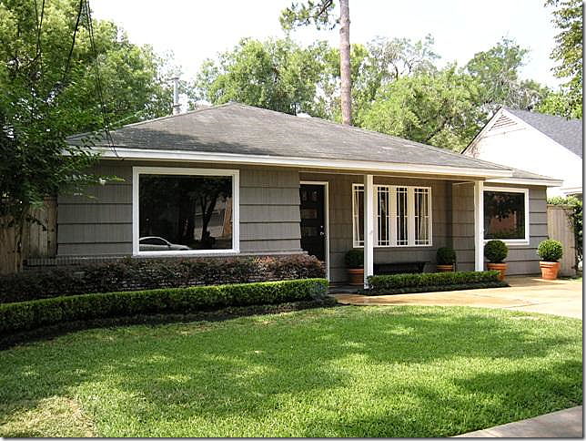
The third house today is located in an original bungalow from the 1940s. So many of these original houses have been torn down instead of remodeled, that they are becoming a rarity. This house was decorated by an interior designer and it really shows. The furnishing are top rate. It’s 3 bedrooms and 1 1/2 bath, with no garage. The sq. footage is only 1,420 and it is on a typical 50 x 100 lot. The asking price has been reduced to $539,000. To see this house’s listing, go HERE


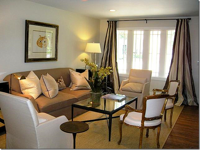
Just perfect! Great silk pillows and contemporary chairs and coffee table. Love the striped silk curtains.
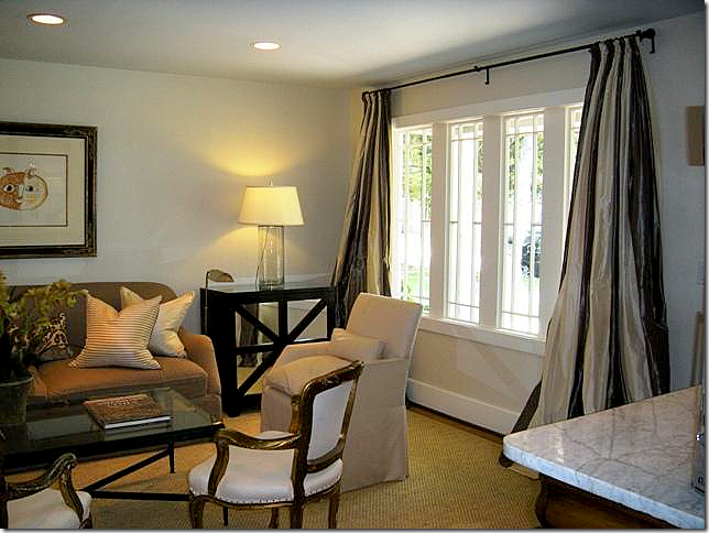 Close up of the curtains. I love the mix of the antiques with the contemporary. This decor is so fresh and youthful.
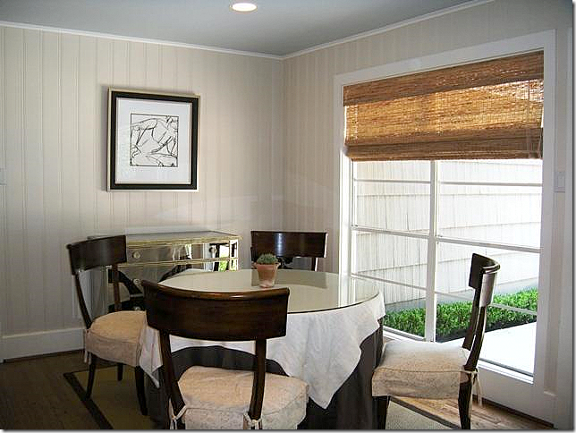
The dining room has wood beadboard and slipcovered chairs. A textured shade is used here instead of curtains. Again, a mirrored chest mixes the old with the new.
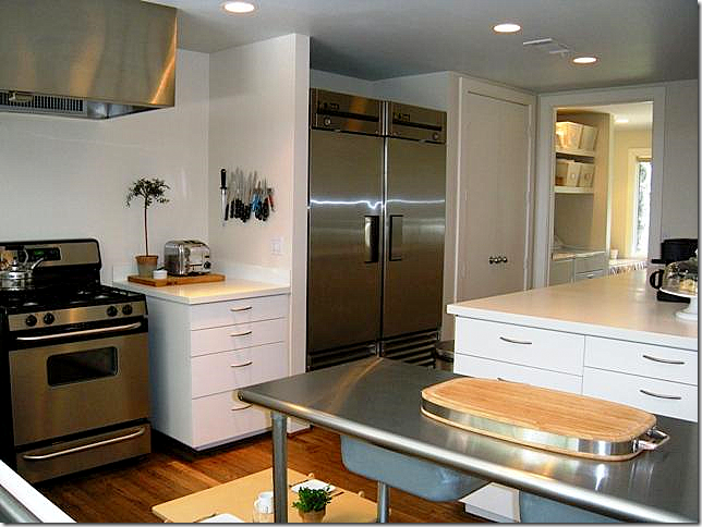
The kitchen is a fabulous space for this sized house. Notice the sink! I love how its styled with the simple white ginger jars and ironstone. No overhead cabinets make it look fresh and contemporary.
Another view of the kitchen with its refrigerator/freezer. The kitchen is really wonderful.
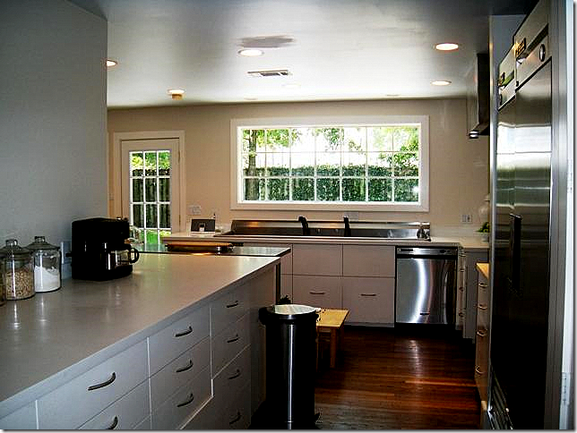
The large kitchen overlooks the backyard. Great window. And great wraparound counter.
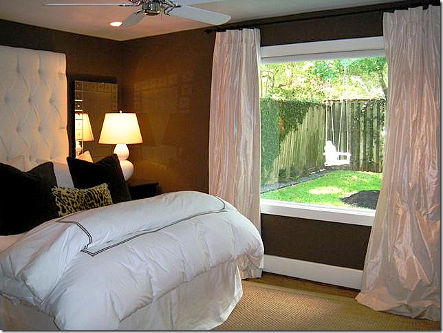
The master bedroom is painted deep brown and has ivory silk curtains. The headboard is oversized for drama. Love the lamps and the velvet pillows. This room overlooks the back yard.
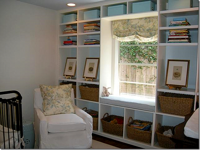 The nursery has a wall filled with baskets – great idea to keep it neat!!
The bathroom, like the rest of the house, has been completely updated – all in quiet whites.
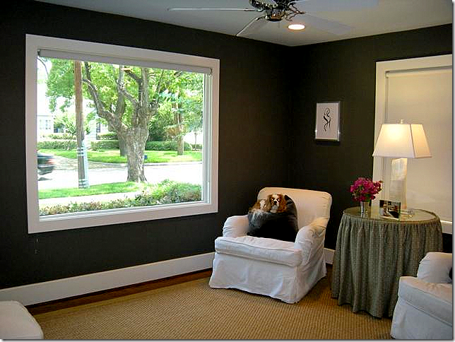 The front bedroom with its brown/black walls is used as a sitting room. Great lamp!
An amazing array of three houses available in the same exact neighborhood – one newer custom at almost 5,500 sq ft, a second spec house at 3,880 sq ft., and a third – an original bungalow at just 1,400 sq ft. Each professionally decorated and landscaped. Which would fit your lifestyle and pocketbook? Does the architecture matter the most to you? Or does the interior decoration matter more? I’m keeping my own choice a secret!!!! What’s your choice?









No comments:
Post a Comment